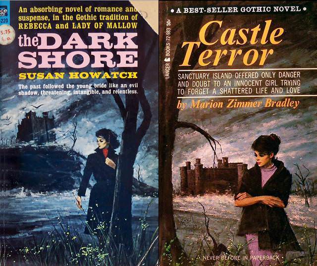
Brooding skies, wind-tossed trees, and a stark shoreline set the stage for two classic Gothic romance paperback covers, where danger feels as natural as the landscape itself. Each composition places a solitary woman in the foreground—dark coat, tense posture, downcast gaze—while a looming mansion or castle crouches in the distance like a memory that won’t release its grip. The typography shouts in bold, vintage lettering, promising “terror,” “suspense,” and a love story shadowed by doubt, perfectly tuned to the genre’s anxious pleasures.
What makes this kind of cover art so psychologically sticky is the push-pull of flight and fascination: the heroine appears caught between escape and return, as if the house behind her has already written part of her fate. The long path of water and snow, the thin branches, and the empty horizon heighten isolation, turning setting into a silent antagonist. Even without seeing motion, you can feel the implied narrative—someone has left a door behind them, and whatever happened inside is still close enough to hear.
For readers and collectors of Gothic romance cover art, these visuals are a masterclass in emotional signaling, using color, weather, and architecture to translate fear into desire. The “woman running from the house” motif isn’t only about pursuit; it’s about agency under pressure, the thrill of transgression, and the promise that the story will uncover a hidden truth. In a WordPress post exploring the psychological appeal of Gothic romance covers, this pairing offers a vivid snapshot of how mid-century paperback design turned haunted landscapes into irresistible invitations.