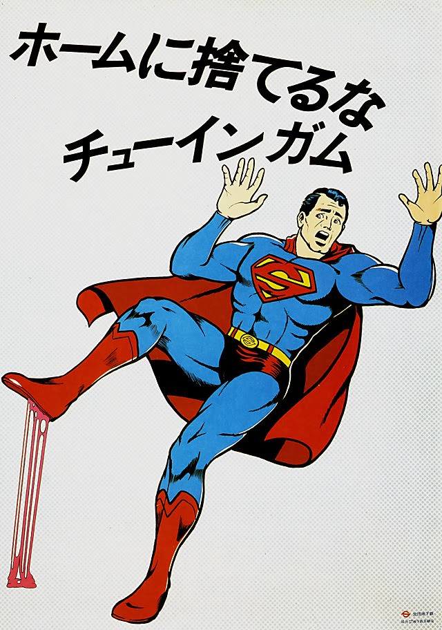
Bold Japanese lettering dominates the upper half of the design, delivering a blunt instruction: don’t toss chewing gum onto the platform. Beneath it, a caped superhero recoils mid-stride, arms raised in alarm as his boot lands in a sticky, stringing mess—an instantly readable gag that turns everyday litter into a public hazard. The clean background and punchy colors keep the message unmistakable at a glance, the way effective station signage has to work.
Dated to September 1976 in the post title, the artwork reflects a moment when public-transport etiquette and cleanliness campaigns leaned on vivid illustration rather than long explanations. Superhero imagery—borrowed from pop culture and rendered with comic-book energy—adds a jolt of drama to an otherwise mundane reminder, making the consequences of a small act feel immediate and embarrassing. It’s a clever blend of humor and warning, aimed at commuters who might ignore a plain notice but pause for a scene like this.
For anyone interested in vintage Japanese posters, railway platform manners, or the history of public service advertising, this piece is a memorable example of how design can police shared spaces without sounding preachy. The visual metaphor is simple: one careless bit of gum can trip up the whole day, literally. As a historical image, it also serves as a snapshot of 1970s graphic communication—direct, theatrical, and built to be understood in a single glance.