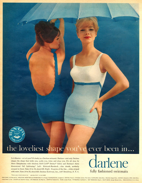
A wash of turquoise and pale blue sets the mood for a classic slice of 1960s magazine glamour, where sleek swimwear doubles as graphic design. Two models pose against a simple, saturated backdrop—one turned to reveal a dramatically low back, the other facing forward with a confident stance—while a beach umbrella adds a playful, summery accent. The clean lines, high-cut legs, and color-blocked panels speak to mid-century modern tastes that prized streamlined silhouettes and bold, readable shapes.
Across the bottom, the cover’s typography leans into advertising’s persuasive poetry, pairing a soft promise with a brand name that lands like a signature. Small-print copy and pricing details cluster near the edge, the way many Seventeen-era layouts balanced aspiration with practical shopping cues for readers. The result is both fashion illustration in photographic form and a snapshot of how teen and young women’s magazines sold style: polished, direct, and irresistibly “new.”
For anyone exploring Seventeen magazine cover art, this post highlights how 1960s fashion and bold ads worked together to define an era’s look and language. The swimsuit styling, studio color choices, and confident posing reflect broader shifts in youth culture and consumer design, where modern femininity was packaged as effortless and attainable. As a piece of vintage fashion history, the cover invites close reading—of seams and slogans alike—while offering plenty of SEO-friendly inspiration for collectors, researchers, and retro-style enthusiasts.