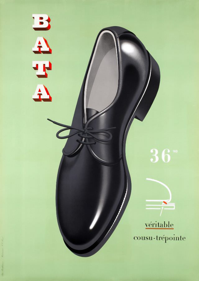
BATA stands tall down the left edge in bold, shadowed letters, framing a glossy black lace-up shoe that seems to float against a soft green field. The spotlighted leather finish and crisp highlights turn an everyday object into a sculptural centerpiece, while the pared-back layout keeps the viewer’s attention on form, shine, and craftsmanship. As a piece of mid-century advertising art, the design balances clarity and elegance with the confidence of a brand speaking to a wide, style-conscious public.
A small price mark—“36” with a tiny “90”—anchors the image in the practical world of shop counters and budgets, reminding us this was luxury made accessible. The French phrase “véritable cousu-trépointe” points directly to construction, emphasizing durability and quality by naming a respected stitched-welt method rather than relying on vague promises. Even the simple diagram-like motif beside the text works like a quick lesson in shoemaking, turning technical know-how into persuasive visual storytelling.
Postwar consumer culture often celebrated modern design and dependable goods, and this 1954 BATA poster fits neatly into that moment. The single shoe, isolated and enlarged, sells more than footwear: it sells polish, reliability, and the idea that good taste can be bought off the shelf. For collectors and readers interested in vintage graphic design, BATA advertising, or the history of shoes and craftsmanship, this artwork offers a clean, striking window into how everyday style was marketed in the mid-20th century.