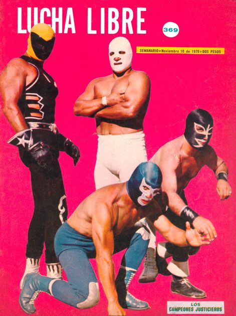
Hot pink explodes behind the bold “LUCHA LIBRE” masthead, turning this 1970s magazine cover into pure arena-style spectacle before you even notice the wrestlers. Four masked athletes pose like living posters—one standing tall in black with star motifs, another bare-chested in a stark white mask and trunks, and two crouched low as if frozen mid-feint. The high-contrast colors and graphic simplicity sell the drama instantly, making the cover art feel as loud and electric as the crowd it once courted.
Masks dominate the composition, each design signaling a different persona: sleek and angular, minimalist and ghostlike, or sharply patterned to frame the eyes. Their stances read as a roll call of archetypes—power, mystery, agility, menace—compressed into a single frame for maximum impact on the newsstand. Even without a ring in view, the body language tells its own story of rivalries, alliances, and the ever-present tease of violence that made lucha libre magazine covers so collectible.
Details on the cover nod to its original context as a Spanish-language weekly, with a numbered issue badge and a date line visible near the top, anchoring the artwork in its era without needing extra explanation. For fans of Mexican wrestling history, retro print design, or pop-cultural ephemera, this piece offers a vivid glimpse into how 1970s lucha libre was marketed—larger than life, fiercely stylized, and built on the magnetic power of the mask. This post explores that visual language of blood, masks, and glory as it played out across magazine cover art that still feels striking today.