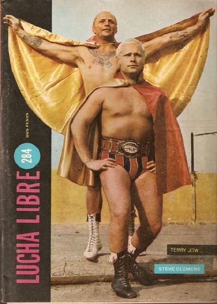
Across the bold masthead “LUCHA LIBRE,” this 1970s-style magazine cover leans into spectacle: two wrestlers pose like comic‑book champions, capes fanned wide, boots planted, and championship hardware centered for maximum impact. The color palette—gold and red against a sun‑washed outdoor wall—turns the scene into a kind of street‑corner mythology, where strength is staged as theater and the body becomes the billboard. Even without an arena in view, the stance and framing sell the promise of action, danger, and larger‑than‑life personalities.
One figure stands elevated behind the other, arms spread to display a shimmering cape that reads almost like wings, while the front wrestler faces the viewer with a steady, unblinking confidence. Their gear—striped trunks, laced boots, and the glint of a title belt—signals the era’s mix of athletic credibility and pulp‑magazine drama. Printed labels with names and issue markings reinforce the object’s origin as collectible cover art, designed to be grabbed off a newsstand and remembered.
For fans and researchers of lucha libre history, covers like this function as visual time capsules: part sports journalism, part pop art, part marketing, all fused into a single, punchy composition. The pose‑heavy design speaks to how 1970s lucha magazines built heroes through iconography—capes, belts, and bravado—hinting at blood, masks, and glory even when the mask is absent. As you tour this cover art, look for the storytelling tricks in the layout and typography, because the print culture around lucha libre often shaped the legend as much as the matches themselves.