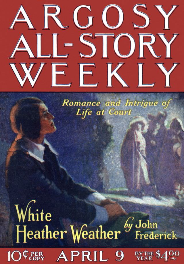
Bold typography crowns the page with “ARGOSY ALL-STORY WEEKLY,” the kind of masthead that once shouted from newsstands and railway kiosks. Beneath it, a moody illustration sets the tone for pulp-era reading: a dark-suited figure in the foreground, half-turned in profile, while a small group gathers in softer focus to the right, suggesting whispers, courtly ceremony, and looming consequences. The palette leans into deep blues and warm reds, creating a theatrical contrast that still feels immediate a century later.
Promised right in the cover copy is “Romance and Intrigue of Life at Court,” and the artwork obliges with a scene that looks staged for secrets—light spilling across a walkway, silhouettes clustered in conversation, and a central character watching from a distance. The featured story title, “White Heather Weather,” appears in large lettering alongside the author credit to John Frederick, anchoring the illustration as both advertisement and invitation. Even without opening the magazine, the cover performs its job: it teases drama, status, and tension in a single glance.
Collectors and historians of early 20th-century magazine covers will recognize how Argosy used painted narratives to sell weekly escapism, blending high-stakes emotion with a sense of place. Details like the low cover price and subscription line at the bottom help situate the publication in everyday consumer life, when popular fiction was bought as casually as a newspaper. For WordPress readers searching for “Argosy cover art,” “1921 pulp magazine,” or “All-Story Weekly,” this issue offers a vivid example of how illustration and typography shaped the era’s reading culture.