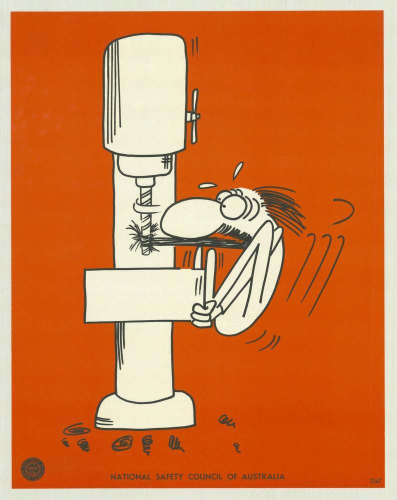
Bold orange dominates this National Safety Council of Australia cover art, where a simple cartoon turns workplace risk into an instantly readable warning. A drill press (or similar machine tool) looms on the left while a startled worker is pulled dangerously close, with motion lines and flying debris suggesting the split-second violence of an industrial accident. The limited palette and thick black outlines deliver a message that doesn’t need many words: machinery demands respect, attention, and proper safeguards.
Posters like this were designed for factory walls, training rooms, and noticeboards, using humour and shock to reach people quickly in the noise of everyday work. The exaggerated features and compressed action make the hazard memorable, a visual shorthand for common dangers—unguarded moving parts, loose clothing or hair, and the temptation to lean in “just for a moment.” Even without a long caption, the art reads as a safety lesson about keeping clear of rotating equipment and treating routine tasks as serious.
As part of a larger set of 1970s safety posters, this piece reflects how public campaigns used graphic design to promote health and injury prevention across Australia. The National Safety Council of Australia branding at the bottom anchors it as an official educational tool, not just a cartoon, and highlights the era’s confidence in posters as a frontline medium for saving lives. For readers interested in Australian industrial history, workplace safety culture, and vintage graphic design, it’s a striking example of how visual messages helped shape safer habits.