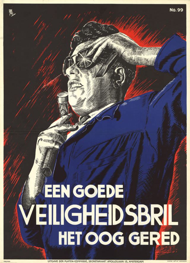
Bold blocks of Dutch lettering dominate the lower half of W. Poll’s 1939 poster, turning a safety message into something impossible to ignore. A worker in a blue coat raises one hand to his face while gripping a tool in the other, and a bright, star-like flash at the eye suggests the instant when debris or sparks could strike. The limited palette—deep black, vivid red, and saturated blue—adds urgency and drama, making the warning feel immediate rather than abstract.
The text “EEN GOEDE VEILIGHEIDSBRIL” and “HET OOG GERED” reads as a clear appeal for protective eyewear, a reminder that industrial safety campaigns were increasingly visual and persuasive by the late interwar period. Rather than relying on long explanations, the design uses a single, memorable moment to argue its case: one small piece of equipment can prevent a life-changing injury. Even without knowing the exact workplace, the poster speaks to factories, workshops, and trades where metalwork and flying particles were everyday risks.
Seen today, this artwork sits at the crossroads of graphic design history and public health communication, offering a glimpse into how organizations promoted workplace safety in 1939. The composition’s close-up viewpoint, stark contrasts, and simplified forms feel modern, while the Dutch typography anchors it in its original audience and context. For collectors and researchers searching for “Poster by W. Poll, 1939,” “Dutch safety poster,” or “industrial eye protection,” this piece is a striking example of how art was used to protect bodies as well as shape behavior.