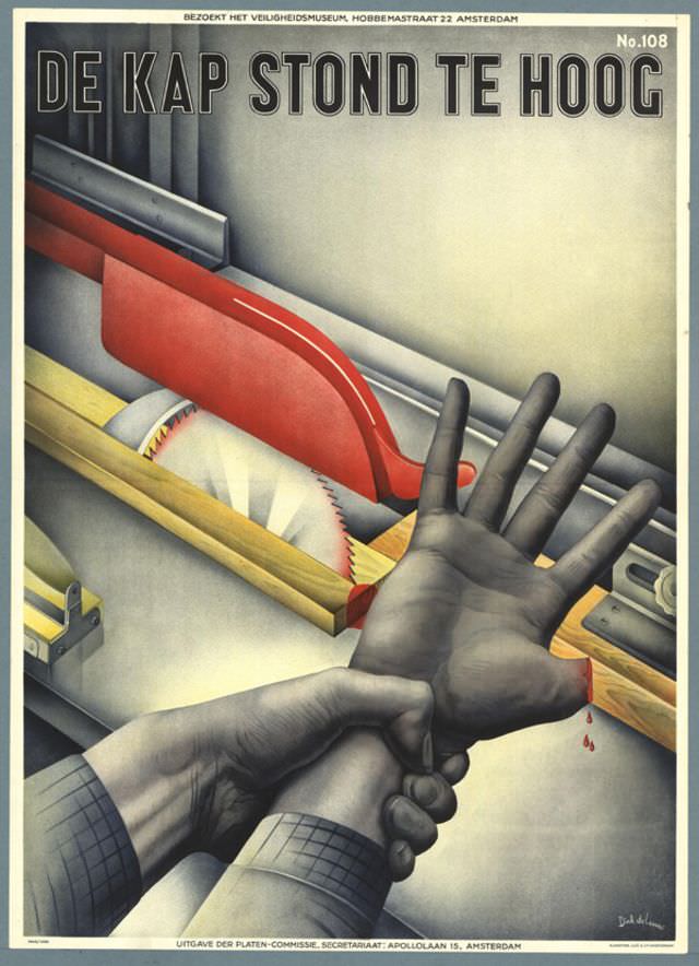
Bold Dutch lettering—“DE KAP STOND TE HOOG”—dominates Drik de Leeuw’s 1940 poster, setting an urgent tone before the viewer even notices the scene below. A circular saw and its red guard are rendered with crisp, almost airbrushed precision, the palette reduced to industrial greys, sharp whites, and warning red. Along the top margin, the printed line inviting visitors to the Veiligheidsmuseum in Amsterdam hints at the educational mission behind the design.
At the center, two hands become the story: one grips the other’s wrist as if to halt a dangerous reach toward the spinning blade. The message reads like a cautionary proverb—when the guard sits too high, the smallest lapse can turn routine work into injury—made visceral by the suggestion of blood at the edge of the frame. De Leeuw’s composition relies on close cropping and strong diagonals, turning a workshop moment into a staged lesson in safety.
For WordPress readers interested in graphic design history, workplace safety, or Dutch posters from the early 1940s, this artwork offers more than period style; it shows how modernist clarity could serve public instruction. The clean typography, simplified forms, and dramatic foreshortening deliver a warning that remains instantly legible today. It stands as a striking example of how applied art translated industrial risk into an unforgettable visual narrative.