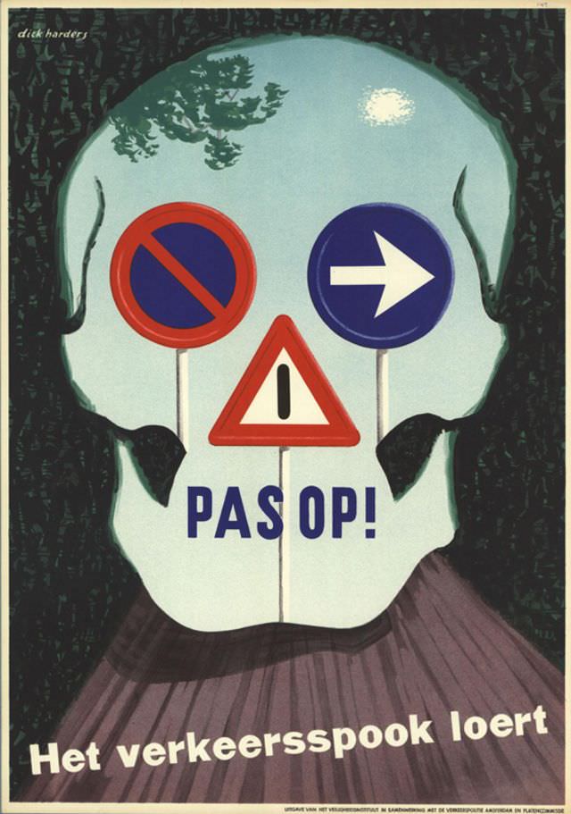
Bold road symbols hover where a face ought to be, turning a human silhouette into a warning sign and making the message impossible to ignore. In this poster by Dick Harders (1952–1953), a red-and-blue prohibition disc, a blue arrow, and a triangular hazard sign stand like a trio of stern sentinels, while the large Dutch command “PAS OP!” (“Watch out!”) anchors the composition in urgency.
A playful chill runs through the tagline “Het verkeersspook loert,” suggesting a lurking “traffic ghost” that appears when attention slips. The design leans on crisp geometry, limited colors, and strong contrast, a mid-century graphic language built for quick reading in the street and in public campaigns—where a split-second decision could matter more than fine print.
Beyond its striking illustration, the artwork offers a window into postwar road-safety education and the rise of modern visual communication. For readers interested in vintage poster design, Dutch graphic art, and transportation history, Harders’ piece stands out as a memorable example of how typography and symbols can turn caution into a compelling story—one that still feels immediate decades later.