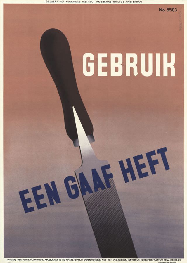
Bold Dutch lettering slices across the page—“GEBRUIK” above and “EEN GAAF HEFT” set on a dramatic diagonal—while a large kitchen knife dominates the composition with its dark handle and sharply rendered blade. The restrained palette and clean geometry give the design an unmistakable mid-century modern feel, turning an everyday tool into a commanding visual symbol. Even without lengthy explanation, the poster’s message reads like a direct public reminder: use a sound, intact handle.
Created by Jack de Rijk in 1955, this piece belongs to the postwar era when graphic design often served practical education as much as advertising. The knife is shown with almost theatrical scale, a clever way to draw attention to domestic safety and proper tool maintenance in the home or workplace. Typography does much of the heavy lifting here—simple, assertive, and easy to read at a distance—showing how designers of the period balanced clarity with striking aesthetics.
Small lines of text at the edges point to institutional context, including references to Amsterdam and a safety institute, grounding the artwork in an organized campaign rather than a private brand message. For collectors and historians of Dutch poster art, the design offers a concise lesson in how 1950s visual culture communicated responsibility through minimal means: one object, a few words, and a layout engineered to be remembered. As a WordPress feature, it’s an excellent example of vintage graphic design, mid-century typography, and the history of public safety messaging in print.