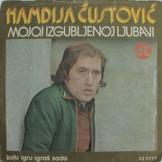
Bold lettering crowds the top of the sleeve—“Hamidja Čustović” over “Mojoj izgubljenoj ljubavni”—while the portrait below feels caught between sincerity and awkward staging. The singer leans against a rough wall, wearing a green jacket and a steady, almost weary expression, framed in muted tones that look slightly faded with age. Even before you hear a note, the cover telegraphs a particular mood: earnest, romantic, and a little raw.
Yugoslav album art from the 1970s and 1980s often lived in that tension between ambition and limitation, and this design hints at why collectors remember the era so vividly. The typography tries to be modern and eye-catching, yet the overall composition is plain, as if a quick photoshoot had to do the work of a larger visual concept. The result is an aesthetic that can read as “ugly” today—flat backgrounds, stark poses, and minimal styling—but also strangely intimate, like a window into the everyday machinery of popular music.
Look closer and the wear along the edges, the subdued color palette, and the straightforward portraiture all function as clues to how these records circulated and aged in real homes. For anyone searching for Yugoslavian cover art, vintage record sleeves, or Balkan music memorabilia, this kind of image is a time capsule of graphic taste and production realities rather than polished nostalgia. The “ugly truth” isn’t simply bad design; it’s the story of constraints, trends, and heartfelt presentation pressed into paper and meant to sell a song about lost love.