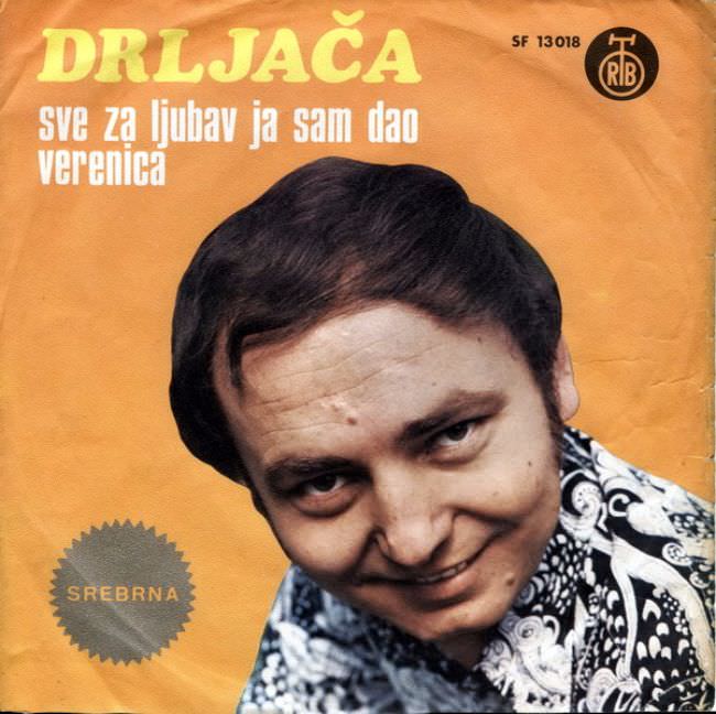
A mustard-yellow sleeve, creased at the edges like something pulled from a long-forgotten crate, sets the tone for this piece of Yugoslav record cover art. The oversized title “DRLJAČA” dominates the top in bold lettering, while smaller text—“sve za ljubav ja sam dao” and “verenica”—hovers beneath, promising romance in a blunt, utilitarian way. A circular “SREBRNA” badge and a small label mark (with catalogue-like numbers) complete the commercial scaffolding that so often framed music culture in the 1970s and 1980s.
What lingers is the uneasy intimacy of the close-up portrait: a tilted head, a fixed half-smile, and patterned clothing crowded into the lower corner as if the designer ran out of space. The retouched color and flat background feel less like glamour and more like an economical studio solution, where typography and face do most of the selling. It’s exactly the kind of aesthetic collision collectors remember—earnest, awkward, and strangely unforgettable.
Seen through the lens of Yugoslavian album art history, the “ugly truth” isn’t only about taste; it’s about constraints and priorities made visible on paper. Minimal design budgets, quick turnaround printing, and a market that valued clear identification over visual poetry often produced covers that looked simultaneously confident and clumsy. For anyone researching Balkan music ephemera, retro record sleeves, or the graphic design of socialist-era pop culture, this cover offers a vivid snapshot of how commerce, image-making, and aspiration met on a single square of cardboard.