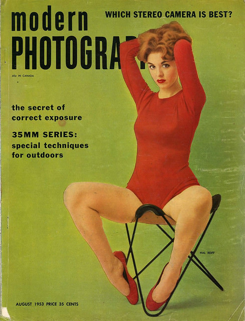
Modern Photography splashes across a bold green field, the kind of confident typography that once promised readers the newest tricks and tools in camera culture. Cover lines tease practical know-how—“the secret of correct exposure,” “35mm series,” and “special techniques for outdoors”—while a headline asks, “Which stereo camera is best?” At the bottom, “August 1953” and a “35 cents” price anchor the magazine in a mid-century moment when photography was becoming a mainstream hobby as well as a serious craft.
Front and center, an illustrated figure in a vivid red outfit sits poised on a minimalist folding chair, her raised arms and direct gaze creating a sense of staged drama. The color contrast is striking: crimson against green, softened by the printed texture and slight wear that collectors recognize as part of a magazine’s lived history. It’s cover art that sells not only a publication, but an attitude—sleek, modern, and unmistakably of its era.
Seen today, this vintage Modern Photography magazine cover offers a window into 1950s–1960s visual marketing, where technical advice and aspirational design shared the same page. The promises of better exposure, better gear, and better pictures reflect a booming consumer interest in 35mm cameras and home darkrooms, alongside the period’s fascination with stereo photography. For anyone researching mid-century graphic design, magazine illustration, or the history of photography culture, covers like this are compact time capsules worth lingering over.