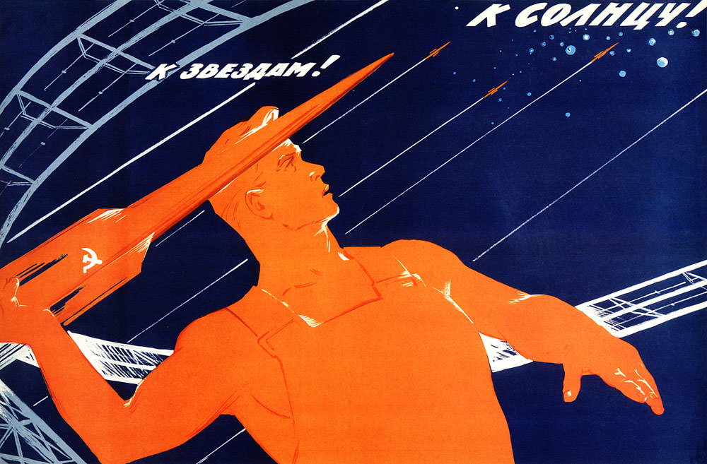
Bold, poster-like colors turn “In the name of peace” into a rallying cry that feels both artistic and political. A heroic worker figure, rendered in glowing orange, raises a red rocket marked with the hammer and sickle, aiming it toward a starry, deep-blue sky. Overhead, Cyrillic text reads “To the stars!” and “To the sun!”, framing the scene as an aspirational leap beyond Earth.
Diagonal lines streak across the background like trajectories, suggesting motion, speed, and the promise of technology. The muscular pose and upward gaze echo the visual language of Soviet propaganda art, where human strength and collective purpose are fused with machines and the cosmos. Even without a specific date or place, the design speaks to the era’s space-age optimism and the idea that progress could be portrayed as a path to stability.
Peace here is implied through triumphal symbolism: the rocket becomes not only a weapon-shaped object but also an emblem of scientific destiny and national pride, redirected toward exploration. As an artwork, the image works on two levels—graphic design built for immediate impact, and a historical artifact reflecting how space travel was woven into public messaging. For readers interested in Cold War-era posters, Soviet space propaganda, and the visual culture of utopian progress, it offers a striking window into how “peace” could be argued in the language of power and the stars.