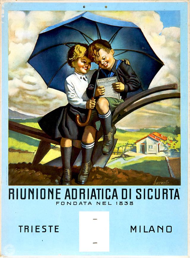
A bright, storybook-style illustration crowns this 1934 calendar for Riunione Adriatica di Sicurtà, turning an everyday object into a piece of Italian commercial art. Two schoolchildren share a large blue umbrella on a curving wooden beam, their heads bent together over a printed page, as if homework and weather are both being managed with the same quiet confidence. Soft clouds and a wide countryside backdrop give the scene a reassuring calm that suits an insurance company’s message.
At the bottom, bold typography anchors the design: “RIUNIONE ADRIATICA DI SICURTA” with the line “FONDATA NEL 1838,” followed by the city names “TRIESTE” and “MILANO.” The layout balances warmth and authority—an inviting pastoral vignette above, corporate identity below—typical of calendar advertising meant to live on a wall all year. Even the umbrella feels symbolic, suggesting protection and preparedness without needing a single dramatic gesture.
Seen today, the piece reads as more than ephemera; it’s a window into how trust was marketed in the early 20th century through idealized childhood, good manners, and a promise of shelter. The crisp colors, clean border, and carefully staged setting make it especially appealing for readers interested in vintage calendars, Italian graphic design, and insurance history. As “Artworks” go, it’s a reminder that practical print culture often carried some of the era’s most memorable visual storytelling.