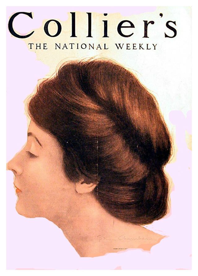
Collier’s billed itself as “The National Weekly,” and the January 18, 1908 cover leans into that confidence with a single, elegant profile rather than a busy scene. A woman’s face is turned in quiet contemplation, her features softly modeled against a pale background that lets the masthead and portrait breathe. The composition feels modern even now—more poster art than newspaper—showing how magazine design at the dawn of the twentieth century prized instant recognition on the newsstand.
Hair becomes the real headline: thick, carefully arranged, and sculpted into a full Edwardian style that signals fashion, refinement, and the era’s taste for polished presentation. Warm browns and delicate skin tones suggest a color illustration meant to catch the eye at a glance, while the clean silhouette keeps the focus on line, shape, and texture. It’s a reminder that early 1900s magazine covers often functioned as standalone artworks, bridging fine art illustration and mass-market printing.
Collectors of vintage magazines and early American illustration will find plenty to admire here, from the typography of “Collier’s” to the restrained palette and confident use of negative space. As a piece of historical ephemera, it also hints at the readership Collier’s imagined—national, aspirational, and attuned to culture as much as current events. For anyone exploring 1908 visual history, this cover offers a striking snapshot of design trends and the storytelling power of a single, well-chosen face.