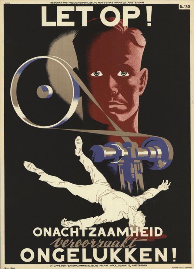
A blunt “LET OP!” shouts from the top of this 1944 poster, pairing urgent typography with a stark, cinematic composition. A large, shadowed face fixes the viewer with an unblinking stare while a curling belt or strap arcs across the scene, leading the eye toward a looming industrial mechanism rendered in cold blues. The palette—deep black, rusted red, and steel tones—turns the message into an immediate jolt, designed to be read at a glance.
Below, a white-outlined figure tumbles backward, arms flung wide, as if caught mid-fall—an emblem of how quickly routine work can turn catastrophic. The Dutch warning “ONACHTZAAMHEID veroorzaakt ONGELUKKEN!” (“Carelessness causes accidents!”) anchors the image, turning a single dramatic moment into a broader lesson about workplace safety. Even without knowing the designer, the poster’s crisp geometry and high-contrast lighting show a confident command of visual persuasion typical of mid-century public safety art.
Smaller text invites viewers to “Bezoekt het Veiligheidsmuseum,” pointing to Amsterdam and underscoring the era’s organized efforts to educate workers and the public about accident prevention. As an artwork, it works on two levels: a striking piece of graphic design and a historical artifact reflecting the anxieties and practical realities of industrial life during the 1940s. For collectors and researchers of WWII-era posters, Dutch typography, and safety propaganda, “Designer unknown, 1944” remains a powerful reminder that vigilance was framed as a civic duty as well as a personal one.