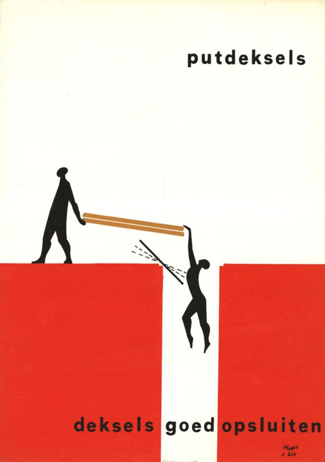
Bold blocks of red and an expanse of white set the stage for a striking piece of mid-century graphic design, dated broadly to 1959–1964 and credited to an unknown designer. Two simplified black silhouettes act out a small drama across a gap, with a narrow plank bridging the divide. The sparse, modern composition leans on high contrast and clean geometry, a visual language closely associated with postwar poster art and public information graphics.
The Dutch text—“putdeksels” and “deksels goed opsluiten”—suggests a cautionary message about securing covers or lids, and the imagery reinforces the point with an almost cinematic sense of risk. One figure stands safely on solid ground while another hangs precariously, hands stretched toward the plank, turning an everyday instruction into an urgent narrative. Minimal lines and a limited palette do the heavy lifting here, proving how efficiently a designer could communicate hazard and responsibility without clutter.
Seen as an artwork as much as a warning, the poster reflects an era when clarity, legibility, and visual punch were central to effective communication. Its anonymous authorship adds another layer of intrigue, inviting viewers to focus on the design choices rather than a signature name. For collectors, historians, and anyone interested in vintage poster design, this image offers a crisp example of how late-1950s to early-1960s graphic art balanced function, symbolism, and memorable form.