Category: Cover Art
Dive into a gallery of vintage cover art from books, magazines, and albums. Discover how graphic design and illustration reflected the moods of their times.
These covers capture the essence of cultural evolution — from bold propaganda to elegant minimalism.
-
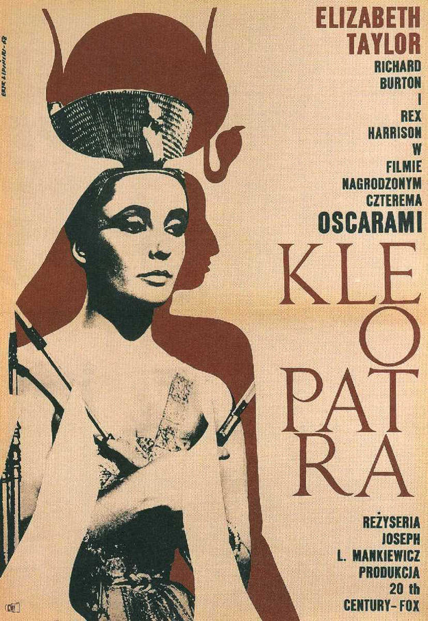
#40 Cleopatra. Artist: Eryk Lipinski. Year: 1968
Bold, graphic simplicity defines Eryk Lipiński’s 1968 cover art for “Cleopatra,” where a stylized portrait dominates the page with the authority of an icon. The figure’s high, sculptural headdress and sharply rendered features evoke the familiar screen image of Cleopatra rather than an archaeological reconstruction, leaning into the mythic glamour that popular culture attached to…
-
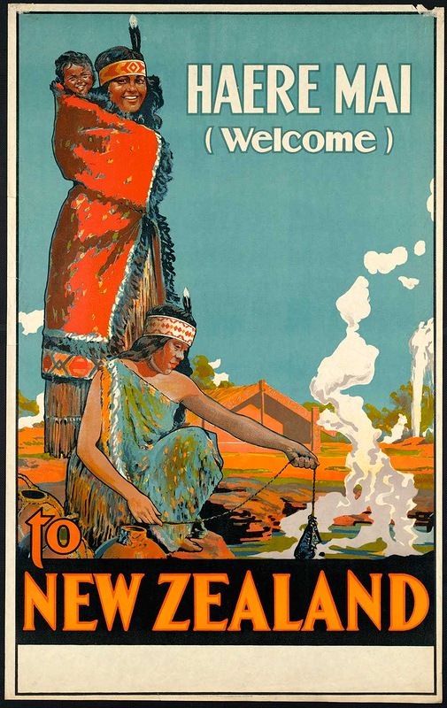
#11 Around the World in Posters: A Look at Vintage Travel Advertising #11 Cover Art
Bold lettering announces “HAERE MAI (Welcome)” above a richly colored invitation to New Zealand, where stylized figures, patterned garments, and a sweeping blue sky set an instantly memorable mood. The cover-art approach—part illustration, part graphic design—leans into high contrast and simplified shapes to read clearly at a glance, the way vintage travel advertising was meant…
-
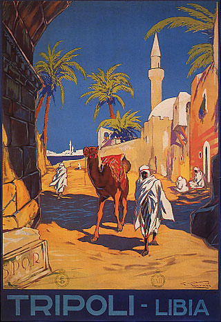
#27 Around the World in Posters: A Look at Vintage Travel Advertising #27 Cover Art
Sunlit walls and deep blue sky set the stage for a classic piece of vintage travel advertising cover art, where palm fronds sway above a narrow street and a tall minaret rises beyond whitewashed buildings. The composition leans into bold, graphic shapes and saturated color, guiding the eye from cool shadow into a warm, inviting…
-
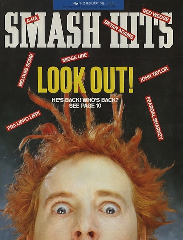
#16 Inside Smash Hits: The Iconic Magazine Covers of the 1980s #16 Cover Art
Bold, shouty, and impossible to ignore, this Smash Hits cover leans hard into the magazine’s signature 1980s pop irreverence. The masthead looms overhead while the giant “LOOK OUT!” headline does what great cover art should—stop you mid-step at the newsstand. Around it, bright red name-tags for chart fixtures like A‑HA, Bryan Adams, Midge Ure, Belouis…
-

#9 A Blast from the Past: Exploring the World of Vintage Teen Magazine Covers #9 Cover Art
Bold, oversized lettering for “TEEN” dominates the cover, while a close-up portrait draws you into an intimate moment: a young woman carefully applying eye makeup as she studies her reflection in a tabletop mirror. The styling—neat bangs, pulled-back hair, and a patterned blouse—signals the era’s ideal of tidy, camera-ready youth, and the warm, slightly faded…
-
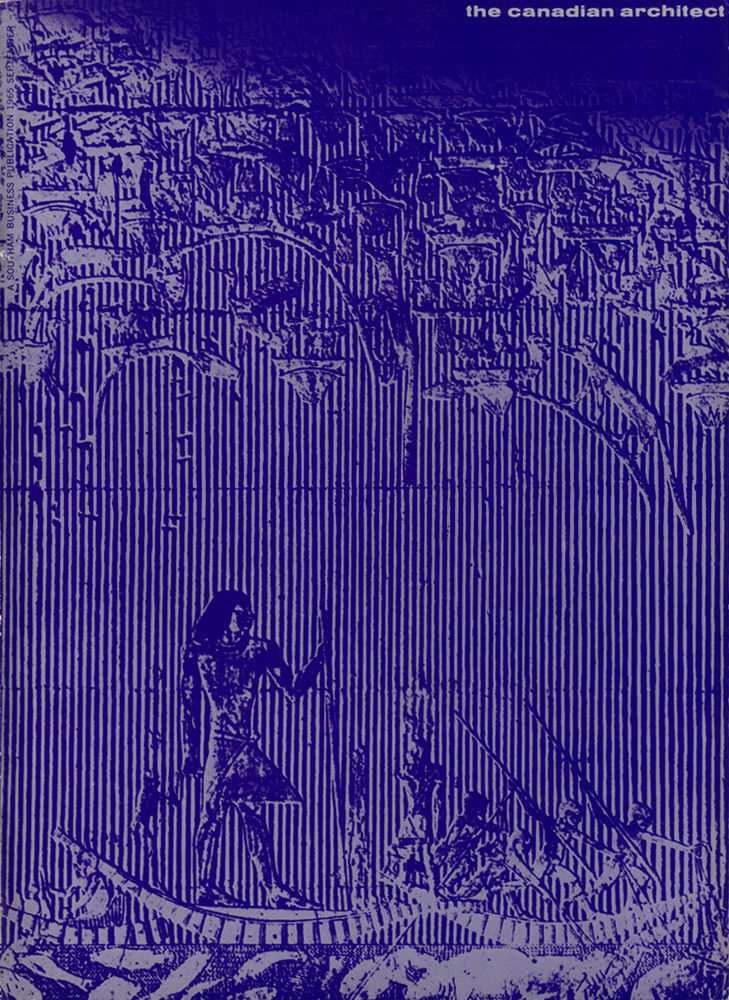
#14 The Canadian architect – September 1965
A deep indigo wash and tightly spaced vertical lines turn the September 1965 cover of *The Canadian Architect* into something that feels halfway between printmaking and blueprint. Above, a dense cityscape rises in stacked, angular silhouettes, while the foreground drops into a quieter, more human scale. The contrast is striking: an abstracted metropolis hovering overhead,…
-

#3 So Bad, They’re Good: Vintage Album Covers That Will Make You Laugh #3 Cover Art
Gaudy purple borders, a patterned yellow title plaque, and swooping script set the tone for an album cover that aims for “exotic” glamour and lands squarely in camp. The headline—“How To Make Your Husband A Sultan”—pairs with the bold “BELLY DANCE” lettering to sell fantasy as lifestyle advice, a pitch that feels both cheeky and…
-
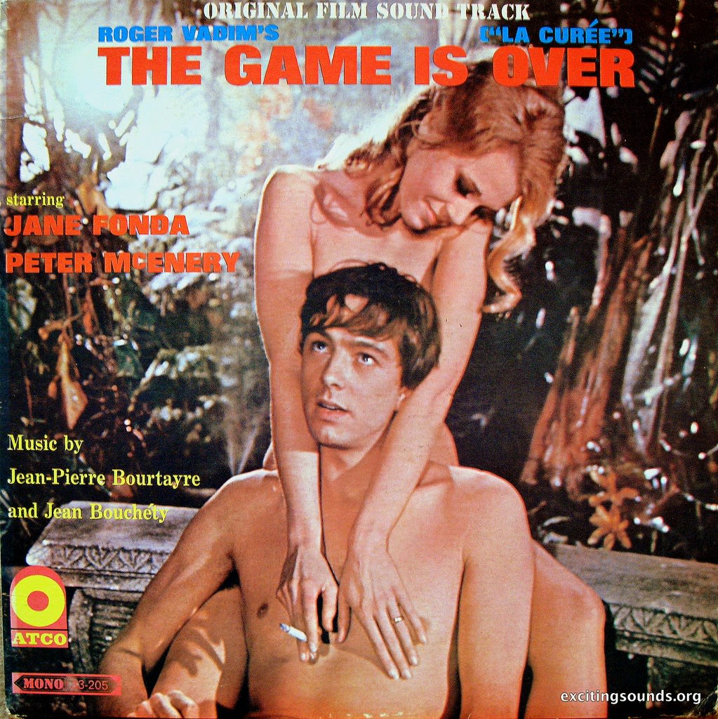
#19 So Bad, They’re Good: Vintage Album Covers That Will Make You Laugh #19 Cover Art
Loud typography and even louder melodrama collide on this soundtrack cover for “The Game Is Over,” billed as “Original Film Sound-Track (‘La Curée’).” The layout stacks credits in attention-grabbing blocks—names like Jane Fonda and Peter McEnery—while saturated colors and heavy lettering do their best to sell grand emotion at a glance. It’s a perfect snapshot…
-
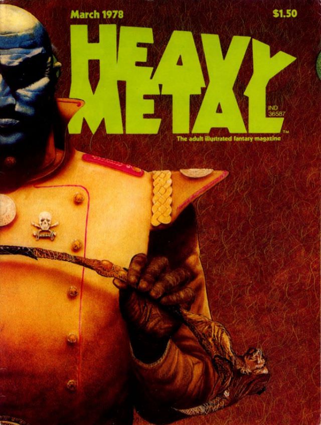
#10 Heavy Metal Magazine Covers: A 1970s Blast of Sci-Fi and Fantasy #10 Cover Art
Bold lime-green lettering shouts “HEAVY METAL” across the top of this cover, dated March 1978 and priced at $1.50, instantly anchoring it in the heyday of late-1970s magazine kiosks. A helmeted figure dominates the frame in warm, burnished tones, wearing a structured coat with braided trim and a small skull insignia that hints at danger…
-
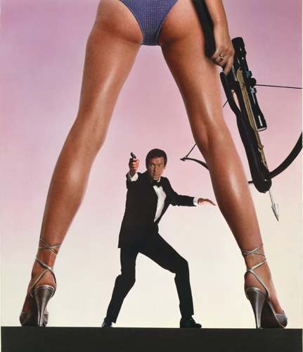
#1 The A-Frame’s Influence: How This Iconic Pose Continues to Shape Modern Fashion, Art, and Movie Posters #1
Few visual tricks in poster history feel as instantly legible as the “A-frame” stance: a confident figure planted wide, forming a human arch that frames the action. In this cover-style image, the viewer’s eye is guided through a pair of long, high-heeled legs toward a tuxedoed man in mid-motion, arm extended with a pistol, while…