Category: Cover Art
Dive into a gallery of vintage cover art from books, magazines, and albums. Discover how graphic design and illustration reflected the moods of their times.
These covers capture the essence of cultural evolution — from bold propaganda to elegant minimalism.
-
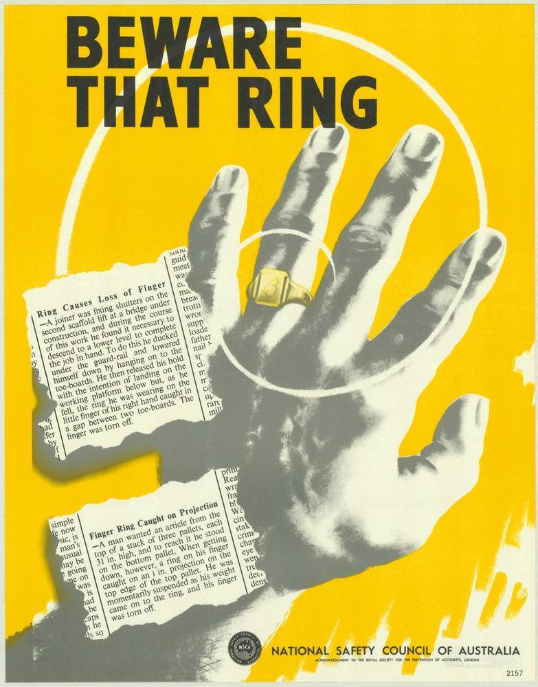
#7 National Safety Council of Australia Posters from the 1970s: Visual Messages for Keeping People Safe and Well
Bold, urgent lettering—“BEWARE THAT RING”—dominates the cover art, set against a bright yellow field designed to stop a passer-by in their tracks. A stark, high-contrast hand reaches across the page, a gold ring catching the eye as white concentric circles draw attention to the finger like a warning beacon. Alongside it, torn newspaper-style clippings hint…
-
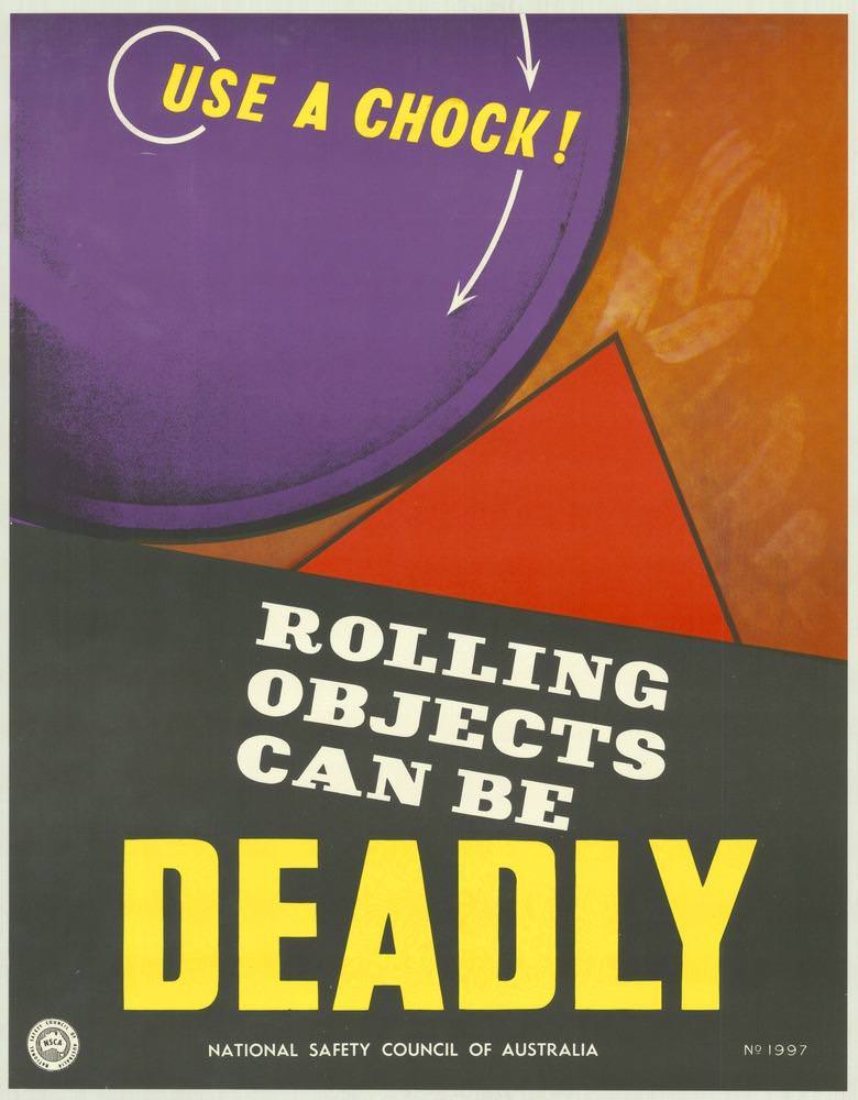
#23 National Safety Council of Australia Posters from the 1970s: Visual Messages for Keeping People Safe and Well
Bold colour and blunt typography do the heavy lifting on this National Safety Council of Australia poster, where the command “USE A CHOCK!” sits above the stark warning “ROLLING OBJECTS CAN BE DEADLY.” A purple wheel-like circle, a red wedge, and directional arrows turn a simple safety instruction into a graphic lesson about motion, weight,…
-
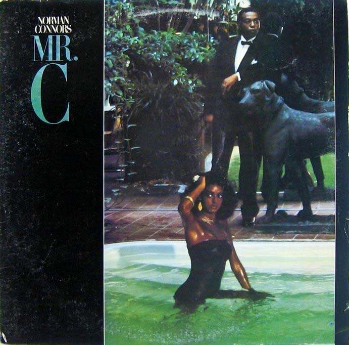
#8 The Unusual and Unconventional Album Cover Designs From the 1960s and 1970s #8 Cover Art
A cool slab of typography dominates the left side of this 1960s–1970s-style album cover: “MR. C” appears in oversized, elegant lettering beneath the artist credit “Norman Connors,” setting a tone of sleek sophistication before the eye even reaches the photograph. That stark, modern text block feels like a gallery label, daring the listener to treat…
-
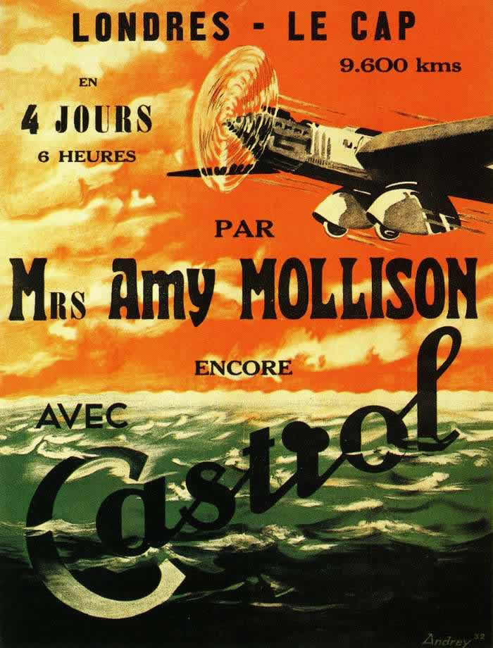
#10 Advertising the Skies: A Look at Imperial Airways Posters Promoting Early Air Travel in the 1920s and 1930s #1
Bold French lettering shouts “Londres – Le Cap” across a blazing sky, turning distance and time into spectacle: 9,600 kilometres, “4 jours 6 heures.” A sleek aircraft slices through sunlit cloud, its propeller rendered as a spinning halo, while dark green ocean swells roll beneath—an irresistible mix of speed, modernity, and romance that poster artists…
-
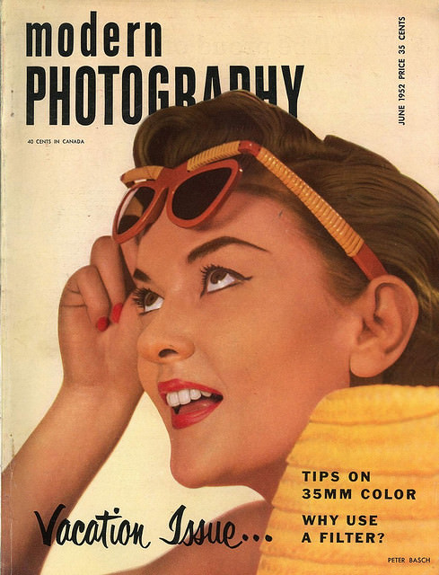
#3 A Look Back at Vintage Modern Photography Magazine Covers from the 1950s and 1960s #3 Cover Art
Bold, upbeat lettering announces *Modern Photography* across the top, framing a close-up illustration of a smiling woman lifting her sunglasses as if she’s just spotted something worth photographing. The warm palette, glossy styling, and confident graphic design evoke the optimism associated with mid-century magazine cover art, when photography culture was sold as both a hobby…
-

#19 A Look Back at Vintage Modern Photography Magazine Covers from the 1950s and 1960s #19 Cover Art
Bold typography and a kaleidoscope of smiling faces announce the era of *Modern Photography* with unmistakable mid-century confidence. The cover, marked “March 1967” and priced at “60 cents,” leans into saturated color and repetition, turning a single portrait into a pop-art pattern that feels both playful and slightly hypnotic. It’s the kind of graphic punch…
-
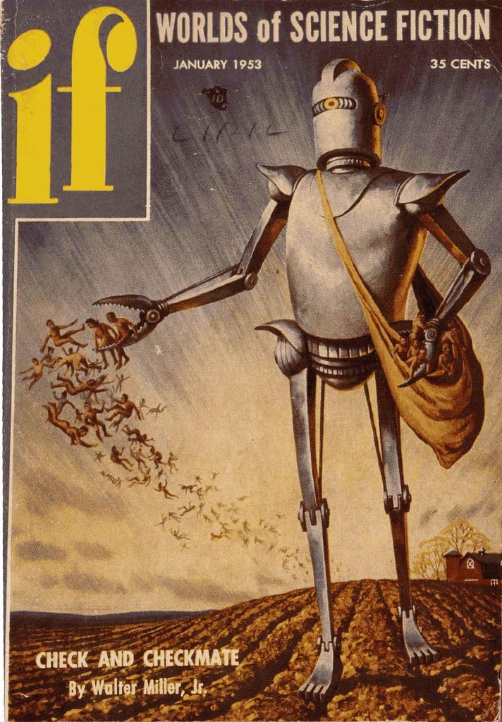
#4 If, 1953
Bold yellow lettering announces *if* while the banner “Worlds of Science Fiction” frames a striking January 1953 cover, priced at 35 cents. Center stage stands a towering robot with a smooth metal torso and jointed limbs, posed against a pale, windswept sky. Its single, visor-like eye and helmeted head give it an impassive, industrial presence…
-
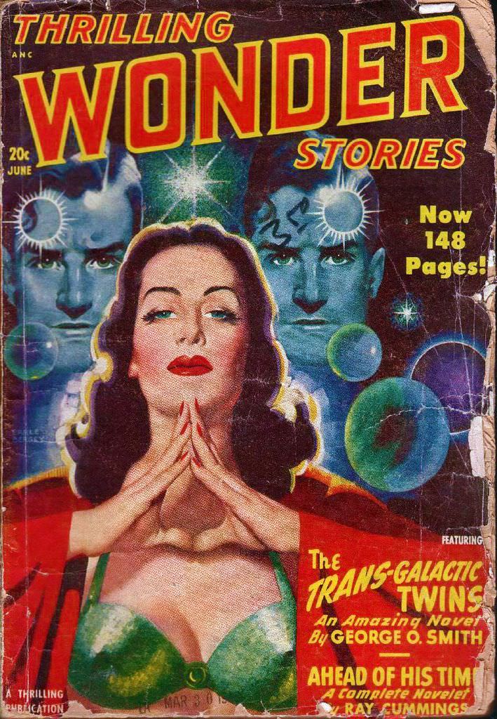
#20 Thrilling Wonder Stories, 1948
Bold pulp typography and saturated color announce **Thrilling Wonder Stories** with the breathless confidence of postwar science fiction. The cover’s dramatic composition centers on a poised woman in vivid reds and greens, framed by eerie, symmetrical male faces behind her—each marked by a glaring, starburst-like spot on the forehead that hints at psychic power, alien…
-

#16 1962: Van Gogh-style pretty
Swirls of midnight blue dominate the cover art, pulling the eye into a Van Gogh-like whirl of brushstrokes where a luminous female figure seems to emerge from the night. Her hair becomes the sky itself—windblown, painterly, and alive—while small starbursts glitter like scattered constellations. The palette feels both dreamy and electric, balancing deep indigo with…
-
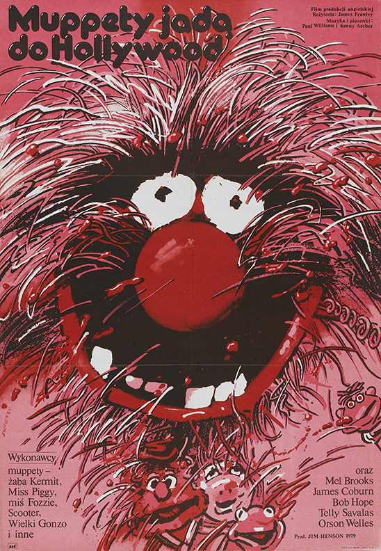
#8 The Muppet Movie. Artist: Waldemar Swierzy. Year: 1982
Bursting across the page in bold reds and inky blacks, Waldemar Świerzy’s 1982 cover art for “The Muppet Movie” leans into the anarchic charm of the Muppets with a close-up that feels both comic and slightly wild. A huge round nose, startled eyes, and explosive hair dominate the composition, while scratchy, energetic linework gives the…