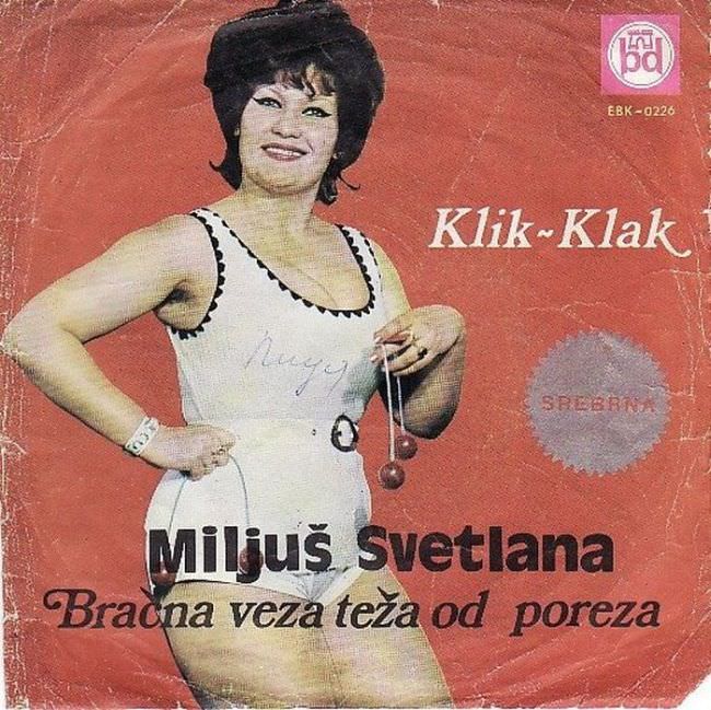
A bold red field, a studio-lit pose, and the playful “Klik-Klak” title do most of the shouting here, while the performer stands front and center in a white outfit trimmed with dark accents, smiling with the confidence of a nightclub poster. The typography fights for attention—large, heavy lettering for “Miljuš Svetlana,” plus a sweeping subtitle—creating that cluttered, high-contrast look so common in Yugoslav record cover art from the 1970s and 1980s. Even the small label mark in the corner and the circular stamp-like graphic add to the sense of a design assembled from whatever tools were at hand.
What makes this kind of Yugoslavian album art so fascinating is how it mixes glamour with awkwardness, aiming for Western-style pop polish while landing in something more homemade and offbeat. The cutout figure against a single-color background, the uneven hierarchy of fonts, and the emphasis on the singer’s persona over any scene or story all point to a market where image had to sell fast from a shop rack. It’s exactly the sort of cover that feels both brash and strangely charming, a reminder that “bad design” can be its own genre when repeated across an era.
Look closely and you can see wear and creases that hint at real circulation—handled, stored, and played—turning the sleeve into an artifact rather than just packaging. For readers interested in Balkan music history, socialist-era pop culture, and the graphic design quirks of Yugoslav vinyl and singles, this cover offers a compact lesson in how taste, technology, and marketing collided. The result is an unvarnished snapshot of a regional music industry trying to look modern, sometimes succeeding precisely because it didn’t.