Category: Cover Art
Dive into a gallery of vintage cover art from books, magazines, and albums. Discover how graphic design and illustration reflected the moods of their times.
These covers capture the essence of cultural evolution — from bold propaganda to elegant minimalism.
-
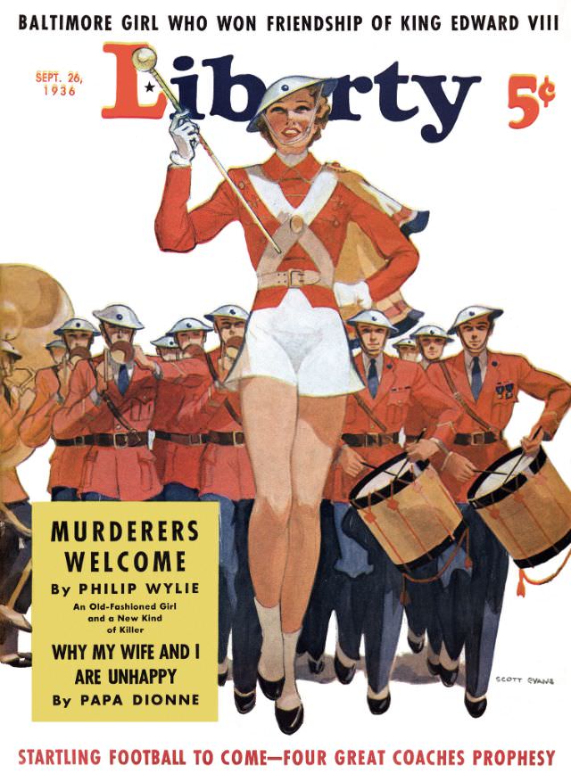
#28 Liberty cover, September 26, 1936
Boldly lettered “Liberty” crowns the September 26, 1936 cover, priced at 5¢, and the artwork strides straight into your attention with a drum majorette leading a marching band. Dressed in crisp red and white with a cape flaring behind her, she raises a baton high while uniformed musicians and drummers keep formation in the background.…
-
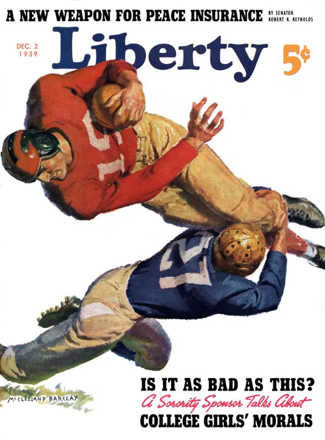
#44 Liberty cover, December 2, 1939
Bold typography and kinetic illustration make the Liberty cover dated December 2, 1939 feel like it’s already in motion before you read a word. The masthead dominates the top, priced at 5¢, while two football players collide mid-tackle—one in a red jersey clutching the ball, the other in blue wrapped around him—capturing the era’s taste…
-
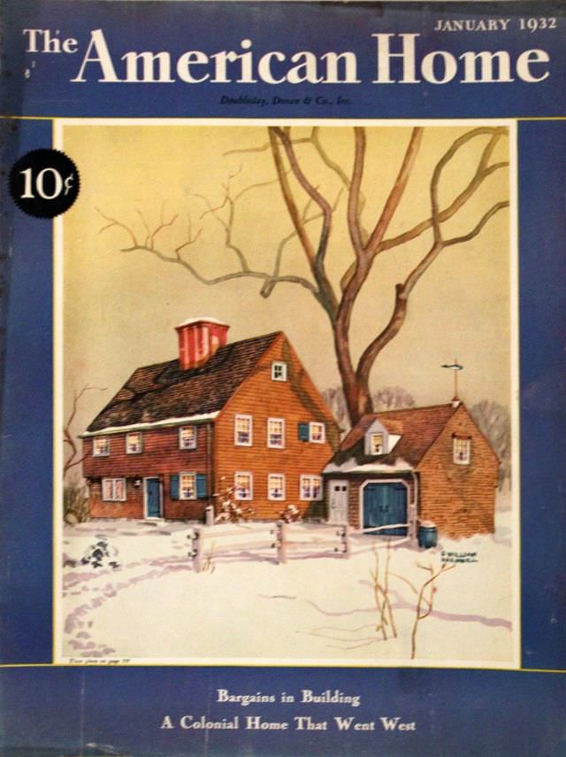
#13 The American Home cover, January 1932
January 1932 sits at the top of this *The American Home* cover, framed in deep blue with the bold magazine masthead and a clear 10¢ price tag. The design feels purposeful and optimistic, offering readers an inviting promise of domestic stability at the start of a new year. Even the small lines of cover text…
-
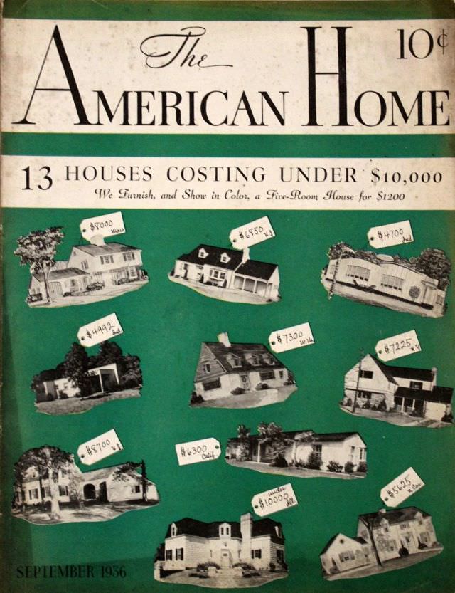
#29 The American Home cover, September 1936
A bold green field and crisp lettering announce *The American Home*, with the September 1936 cover priced at 10 cents—an instant snapshot of how mass-market magazines sold aspiration along with practicality. The design feels like a showroom wall, inviting readers to browse possibilities at a glance while the elegant masthead signals taste and authority in…
-

#5 Popular magazine cover, November 7, 1920
Bold lettering declares “The Popular Magazine” across the top, framed by promises of being the “Best Fiction Magazine in America,” issued twice a month for 25 cents. The cover is dated November 7, 1920, and the design balances crisp typography with a dramatic painted scene below, the kind of newsstand invitation that made early twentieth-century…
-
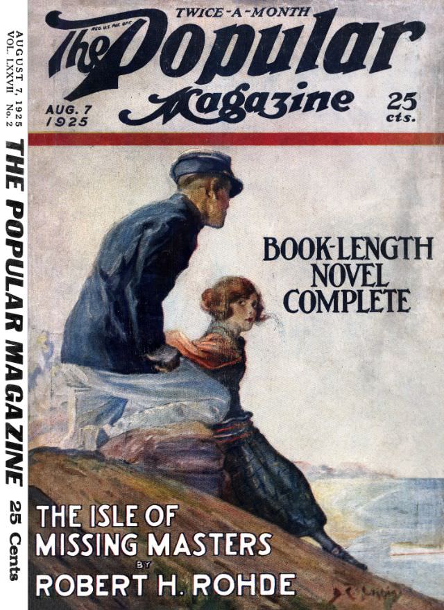
#21 Popular magazine cover, Augsut 7, 1925
Bold lettering crowns the August 7, 1925 cover of *The Popular Magazine*, announcing its twice-a-month rhythm and the 25-cent price that helped bring adventure fiction to a wide readership. The design balances the sweeping masthead with a clean field of text, including the promise of a “BOOK-LENGTH NOVEL COMPLETE,” a marketing hook that speaks to…
-

#37 Popular magazine cover, April 28, 1928
Bold, slanted lettering for *The Popular Weekly* crowns this April 28, 1928 magazine cover in a blaze of orange-red, complete with the 15¢ price line and a note for Canadian readers. Below the masthead, the artwork pivots into action: a tense crowd scene rendered in moody, painterly tones, where bodies press together and faces turn…
-
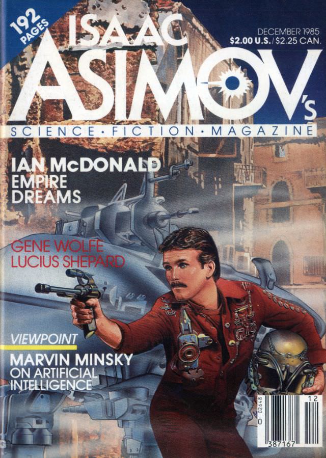
#8 Asimov’s Science Fiction cover, December 1985
Bold, oversized lettering crowns the December 1985 issue of Isaac Asimov’s Science Fiction Magazine, framing a kinetic piece of cover art that leans into pulp adventure and high-tech suspense. A determined figure in a red outfit pushes forward with a ray-gun in hand, while a looming spacecraft and industrial cityscape stack the background with metallic…
-

#24 Asimov’s Science Fiction cover, Mid-December 1987
Bold yellow lettering dominates the Mid-December 1987 cover of *Isaac Asimov’s Science Fiction*, instantly signaling the magazine’s newsstand confidence at the height of late–Cold War genre publishing. The issue callouts—“192 pages” and the printed price “$2.00 U.S./$2.50 CAN.”—anchor it in its original consumer world, while the typography and layout feel unmistakably 1980s: big, declarative, and…
-
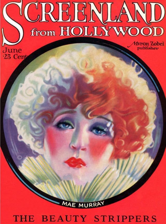
#5 Screenland magazine cover, June 1923
Bold red typography and a glossy, poster-like palette announce *Screenland from Hollywood* in a way that feels unmistakably 1920s—loud, modern, and built to catch the eye at a newsstand. The June 1923 issue is marked at “25 cents,” with the publisher credit “Myron Zobel” printed near the masthead, signaling the magazine’s confident place in the…