Category: Cover Art
Dive into a gallery of vintage cover art from books, magazines, and albums. Discover how graphic design and illustration reflected the moods of their times.
These covers capture the essence of cultural evolution — from bold propaganda to elegant minimalism.
-

#41 101 Dalmatians. Artist: Liliana Baczewska. Year: 1967
Bold typography dominates the upper margin, where a huge “101” in deep red announces the theme with poster-like confidence. Beneath it, the Polish title “Dalmatińczyków” and the phrase “Walta Disneya” anchor the design in the world of translated Disney editions, while a simple silhouette of two Dalmatians adds a quiet, affectionate counterpoint to the loud…
-
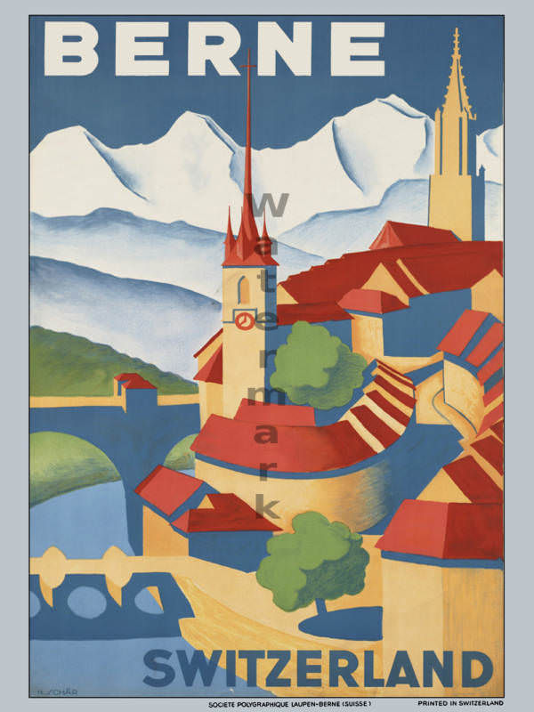
#12 Around the World in Posters: A Look at Vintage Travel Advertising #12 Cover Art
Bold lettering announces “BERNE” above a stylized sweep of rooftops and church spires, set against crisp, snow-bright mountains that promise alpine air and postcard views. The design leans into clean shapes and saturated color blocks—deep blues, warm reds, and creamy yellows—turning the city into an inviting pattern of towers, bridges, and river curves. Even at…
-

#1 Inside Smash Hits: The Iconic Magazine Covers of the 1980s #1 Cover Art
Bold, blocky lettering shouts “SMASH HITS” across a hot red backdrop, instantly evoking the glossy, loud confidence of 1980s pop culture. Three young men pose with a mix of swagger and comedy—one in a white vest, another in a cap with arms folded, and a third tipping dark sunglasses—turning the cover into a stage rather…
-

#17 Inside Smash Hits: The Iconic Magazine Covers of the 1980s #17 Cover Art
Bold block lettering across the top announces SMASH HITS, setting the tone for a decade when pop journalism was as visually loud as the music itself. The cover pairs a close, studio-style portrait with punchy, tabloid-like cover lines, using high-contrast makeup, sculpted hair, and a moody backdrop to pull readers straight into 1980s style. Even…
-

#10 A Blast from the Past: Exploring the World of Vintage Teen Magazine Covers #10 Cover Art
Bold, blocky lettering shouting “TEEN” crowns a warm orange cover dated Nov. 1970, instantly anchoring this piece of vintage teen magazine cover art in its era. The layout is classic newsstand persuasion: bright color, confident typography, and a stack of quick-hit promises—beauty tips, “super skin,” and straight-talk advice—designed to pull a young reader into the…
-

#15 The Canadian architect – October 1965
A dramatic upward angle turns the October 1965 cover of *The Canadian Architect* into a study of modern ambition, with a sweeping tower edge cutting across a brooding sky. The building’s curved silhouette and tight grid of windows emphasize rhythm and repetition—hallmarks of mid-century architectural photography—while the generous negative space above lends the composition a…
-

#4 So Bad, They’re Good: Vintage Album Covers That Will Make You Laugh #4 Cover Art
Bold yellow lettering declares “Little David WILKINS” with the boastful subtitle “King Of All The Taverns,” while a small blue price sticker sits in the corner like an accidental badge of thrift-store glory. The cover leans hard into personality: a man caught mid-laugh, head tipped back, framed by soft greenery and a brick wall that…
-

#20 So Bad, They’re Good: Vintage Album Covers That Will Make You Laugh #20 Cover Art
Bold red lettering shouts “Santa! watch your claws” over a living-room scene that’s equal parts holiday cheer and awkward comedy. A woman poses with one hand on her hip while a weary-looking Santa slumps in an armchair, beard askew and expression resigned. The mismatched energy—glamour meets exhaustion—turns what should be seasonal sweetness into the kind…
-
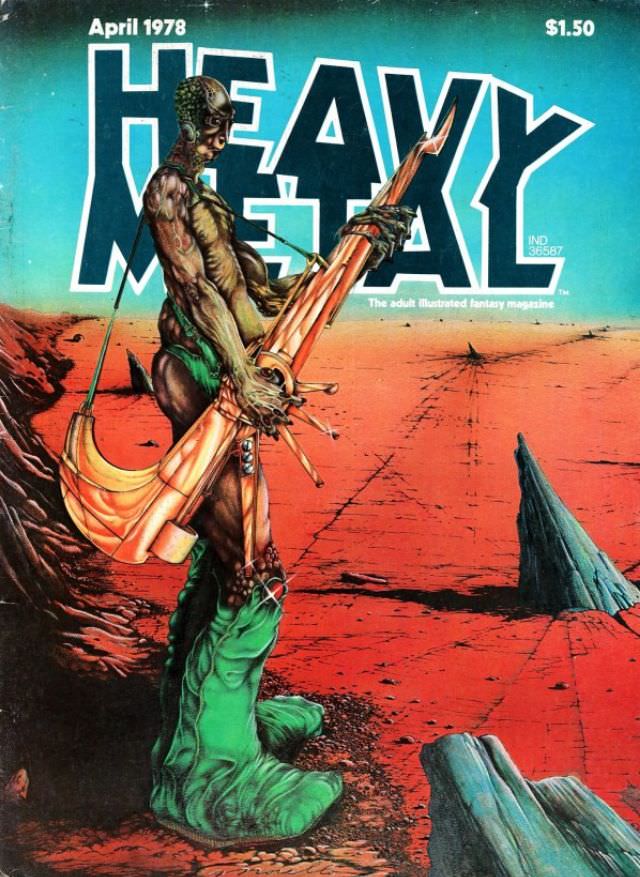
#11 Heavy Metal Magazine Covers: A 1970s Blast of Sci-Fi and Fantasy #11 Cover Art
April 1978 sits boldly at the top of this Heavy Metal magazine cover, priced at $1.50, with the title’s block letters towering over an alien-red landscape. A lone, sinewy figure dominates the foreground, rendered with biomechanical details that blur the line between flesh, armor, and something grown rather than built. Slung across the body is…
-
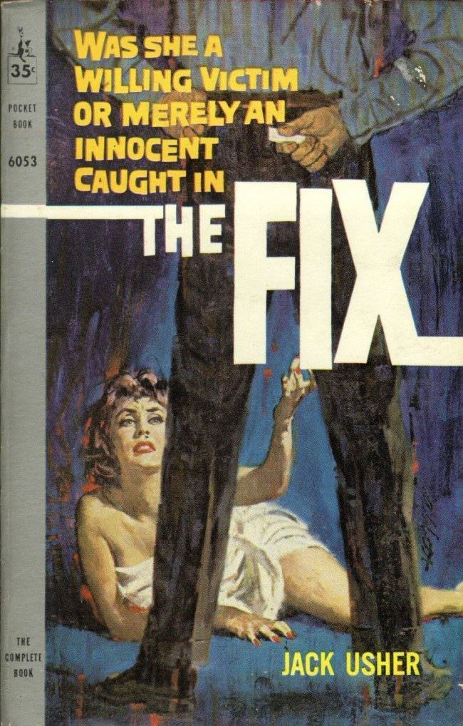
#2 The A-Frame’s Influence: How This Iconic Pose Continues to Shape Modern Fashion, Art, and Movie Posters #2
Bold pulp typography and a tightly staged silhouette do most of the storytelling here: a towering figure in dark trousers stands like an A-frame over a woman on the ground, while the massive title “THE FIX” slices across the center. The composition forces your eye to read power and peril through geometry—legs planted wide, the…