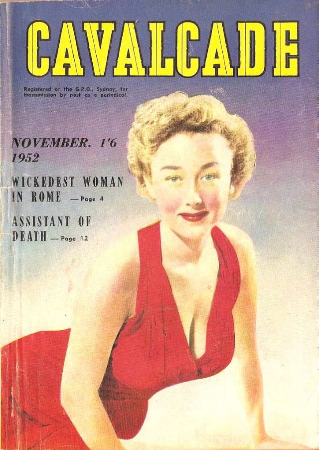
Bold yellow lettering announces CAVALCADE across the top, setting a confident tone for this November 1952 magazine cover. A glamorous illustrated woman dominates the page in a vivid red dress, her blonde curls and carefully rouged cheeks rendered in that unmistakable mid-century style. The background fades into soft blues and creams, giving the figure a spotlight-like prominence that would have stood out on any newsstand.
On the left, the cover lines tease dark, sensational reading—“Wickedest Woman in Rome” and “Assistant of Death”—with page numbers that promise quick entry into the stories inside. A small publication note mentions Sydney, hinting at the magazine’s distribution and adding a trace of real-world bureaucracy to the fantasy of pulp drama. Even the scuffs and creases visible on the cover are part of its appeal, evidence of a well-handled object that traveled through time.
As cover art, this piece is a compact lesson in 1950s popular publishing: high-contrast typography, pin-up elegance, and lurid intrigue packaged for instant attention. For collectors and researchers of vintage magazines, Cavalcade’s November 1952 cover offers both graphic design history and a window into the era’s storytelling appetites. It’s a striking example of how illustration, headline copy, and color were orchestrated to sell mood as much as content.