Category: Cover Art
Dive into a gallery of vintage cover art from books, magazines, and albums. Discover how graphic design and illustration reflected the moods of their times.
These covers capture the essence of cultural evolution — from bold propaganda to elegant minimalism.
-
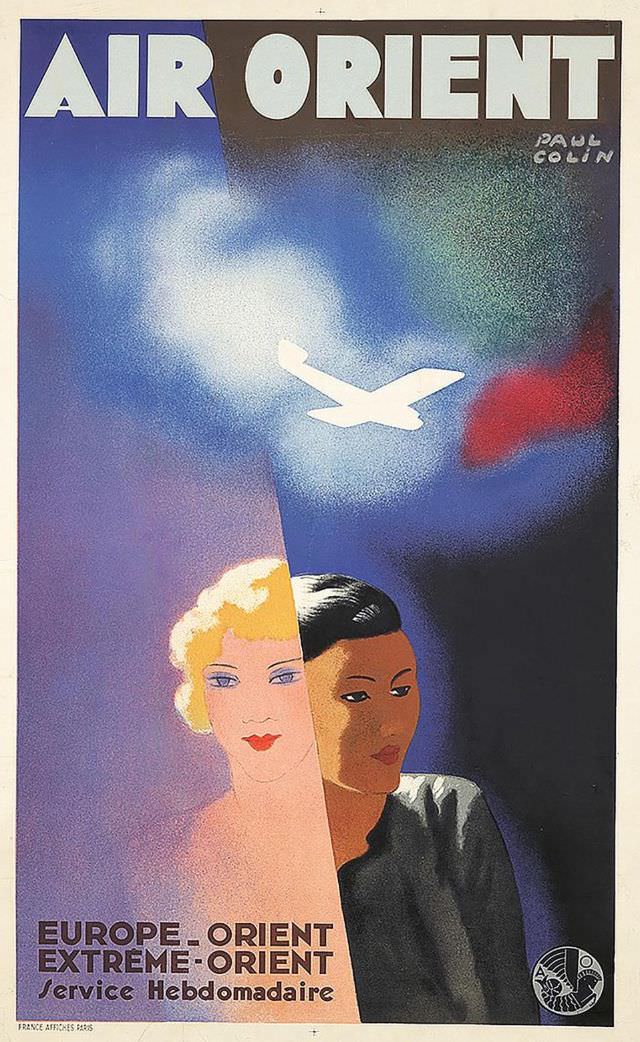
#29 Air Orient, 1932
Bold typography and saturated color announce the promise of modern flight in this Air Orient cover art from 1932. A white aircraft silhouette cuts across a nocturnal sky, while misty blues and a flare of red suggest speed, altitude, and the glamour of the route. The artist’s name, Paul Colin, appears at the top, anchoring…
-
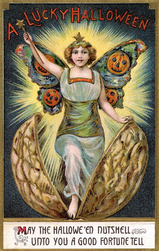
#5 A Lucky Halloween
Radiant and theatrical, the cover art titled “A Lucky Halloween” pairs old-season mischief with a charm of good fortune. A winged figure rises from a cracked walnut shell, framed by a burst of light that turns the scene into a miniature stage. Overhead lettering in bold red announces the greeting, giving the design the feel…
-
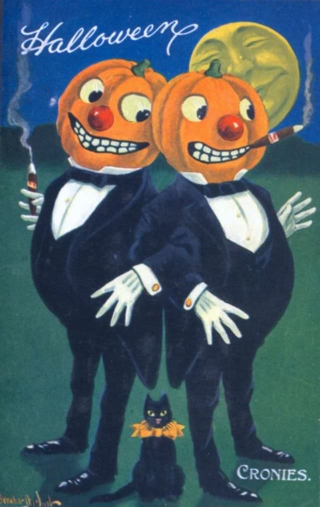
#21 Halloween Cronies
Under a broad, watchful moon, two pumpkin-headed gentlemen pose like vaudeville partners in matching tuxedos, their grins carved into something gleefully impish. One leans in with a cigarette, the other flashes a cigar, and both wear crisp white gloves that heighten the stagey sense of mischief. The painted night sky and deep green ground keep…
-
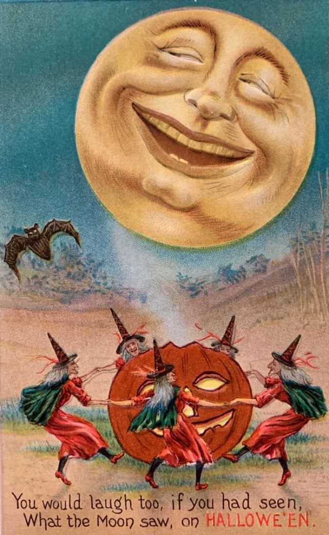
#37 What the Moon Saw
High overhead, a broad, sleepy-eyed Moon grins as if it’s in on a private joke, its face rendered in the playful, storybook style that made early cover art so instantly memorable. Below, the Halloween world becomes a stage: four witches in pointed hats whirl hand-in-hand around a carved jack‑o’‑lantern, their skirts and capes flaring with…
-
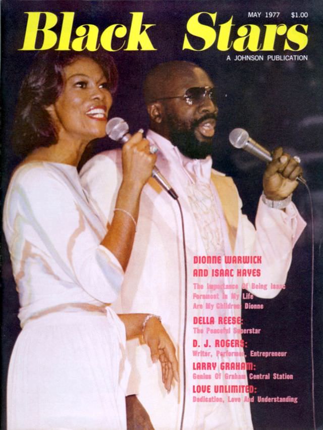
#13 Dionne Warwick and Isaac Hayes, May 1977
Bold “Black Stars” lettering crowns this May 1977 cover, where Dionne Warwick and Isaac Hayes are pictured mid-performance with microphones in hand, faces turned toward the crowd. Warwick’s bright smile and flowing light-toned outfit contrast with Hayes’s tailored look, tinted glasses, and commanding presence, giving the scene the charged feel of a live duet. The…
-
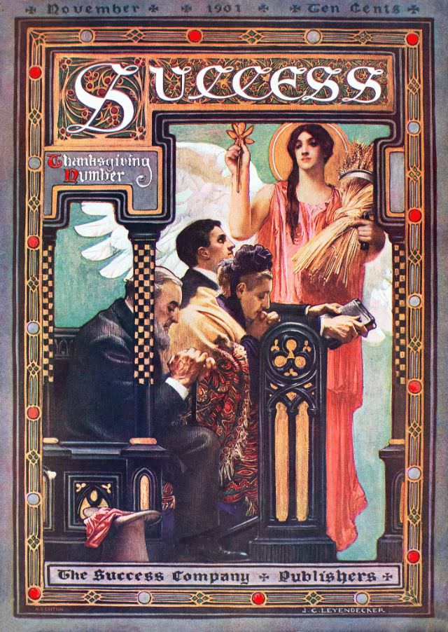
#3 Success magazine, Thanksgiving number, 1901
November 1901 sits proudly across the top of this ornate cover for *Success* magazine’s “Thanksgiving Number,” priced at ten cents and framed like a gilded Art Nouveau panel. The masthead curls in decorative lettering, surrounded by jewel-like dots and patterned borders that feel as much like a theater proscenium as a magazine front. Even before…
-
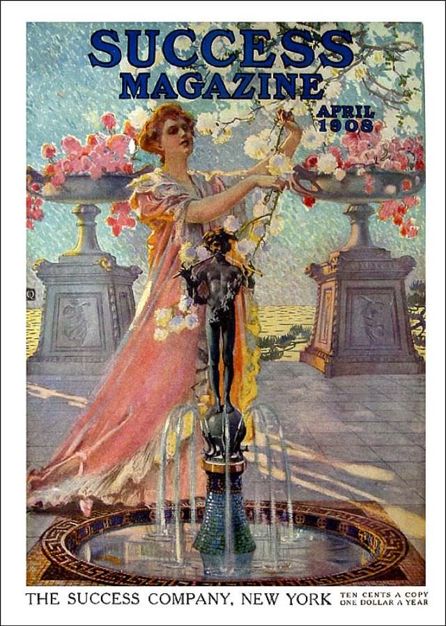
#19 Success magazine, April 1908
Across the top, bold lettering announces “SUCCESS MAGAZINE,” with “APRIL 1908” set to the side, framing a lush piece of cover art that feels both aspirational and theatrical. At center, an elegantly dressed woman reaches up toward flowering branches, her flowing gown catching the light in painterly strokes. The scene unfolds on a formal terrace…
-
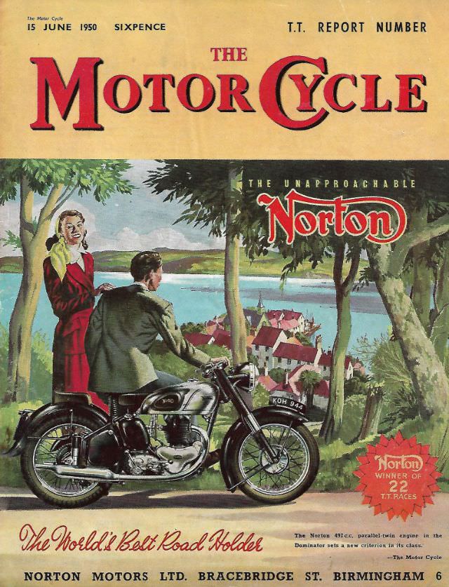
#9 The Motor Cycle magazine, June 15, 1950
Bold lettering across the masthead announces *The Motor Cycle* and fixes the moment: June 15, 1950, priced at sixpence and billed as a “T.T. Report Number.” The cover art immediately leans into postwar optimism, pairing big, confident typography with a full-color illustration designed to stop readers at the newsstand and pull them into the world…
-
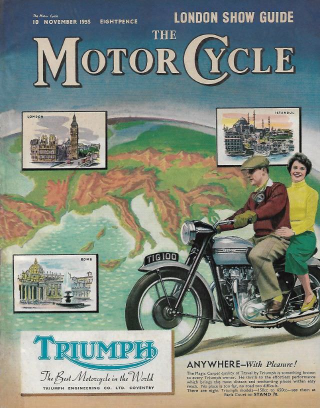
#25 The Motor Cycle magazine, November 10, 1955
Bright mid-century optimism radiates from the cover of *The Motor Cycle* magazine dated November 10, 1955, promoted as a “London Show Guide” and priced at eightpence. Across a stylized map of Europe, the bold masthead dominates in classic lettering, setting the tone for a postwar world eager for speed, mobility, and modern engineering. The design…
-
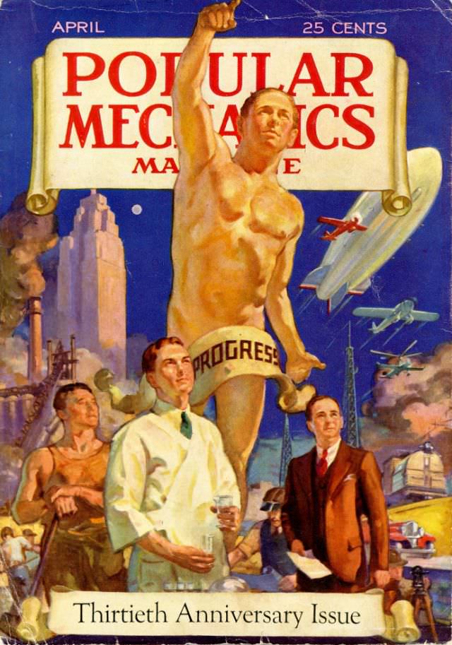
#6 Popular Mechanics magazine cover, April 1932
April 1932 arrives in bold color on this Popular Mechanics magazine cover, a confident piece of cover art that announces its “Thirtieth Anniversary Issue” and even prices itself at 25 cents. The composition is dominated by a towering, idealized figure raising an arm toward the sky, framed by the familiar masthead and a deep blue…