Category: Cover Art
Dive into a gallery of vintage cover art from books, magazines, and albums. Discover how graphic design and illustration reflected the moods of their times.
These covers capture the essence of cultural evolution — from bold propaganda to elegant minimalism.
-
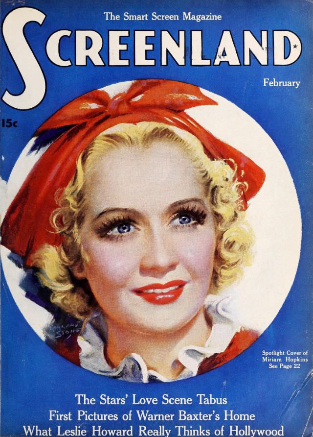
#27 Screenland magazine cover, February 1936
Bold blue lettering crowns the February 1936 cover of *Screenland*, billed as “The Smart Screen Magazine,” with a 15-cent price tucked along the left margin. At center, a glamorous illustrated portrait fills a white circular frame: a blonde star with glossy red lipstick and bright eyes, styled in soft curls and topped with an oversized…
-
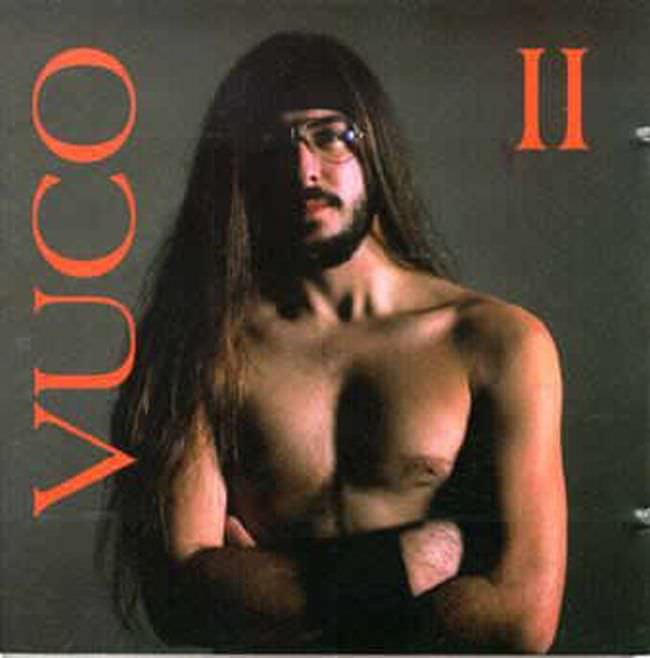
#8 The Ugly Truth About Yugoslavian Album Art in the 1970s and 1980s #8 Cover Art
Stark, confrontational, and a little bewildering at first glance, the cover leans hard into an austere studio look: a shirtless long-haired figure with glasses, arms crossed, set against a flat grey background. Bold orange typography frames the portrait—“YUCO” running vertically at the left and a large “II” at the top right—creating an awkward balance between…
-
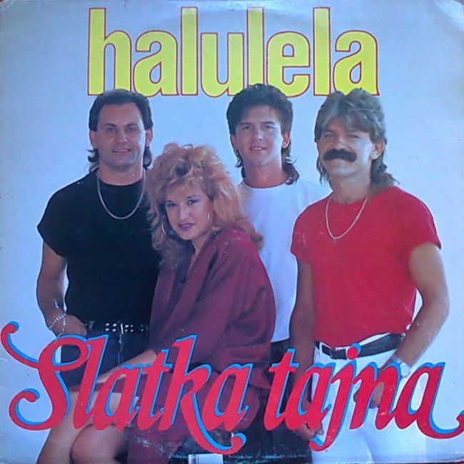
#24 The Ugly Truth About Yugoslavian Album Art in the 1970s and 1980s #24 Cover Art
Neon lettering, studio haze, and a carefully arranged lineup of bandmates announce the era before you even read the title: “halulela” hovering overhead and “Slatka tajna” sweeping across the bottom in flamboyant script. The design leans hard into high-contrast colors and oversized type, letting the text compete with the portrait instead of supporting it. That…
-
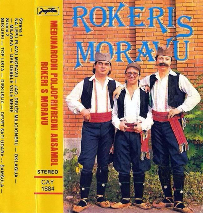
#40 The Ugly Truth About Yugoslavian Album Art in the 1970s and 1980s #40 Cover Art
Bold, blocky lettering shouts “ROKERI S MORAVU” across a brick wall backdrop, setting the tone for a kind of Yugoslav-era cover art that prized clarity over subtlety. Three band members stand front and center in traditional-style clothing—vests, wide sashes, and caps—posed with the stiff confidence of a studio portrait transplanted outdoors. The overall effect is…
-
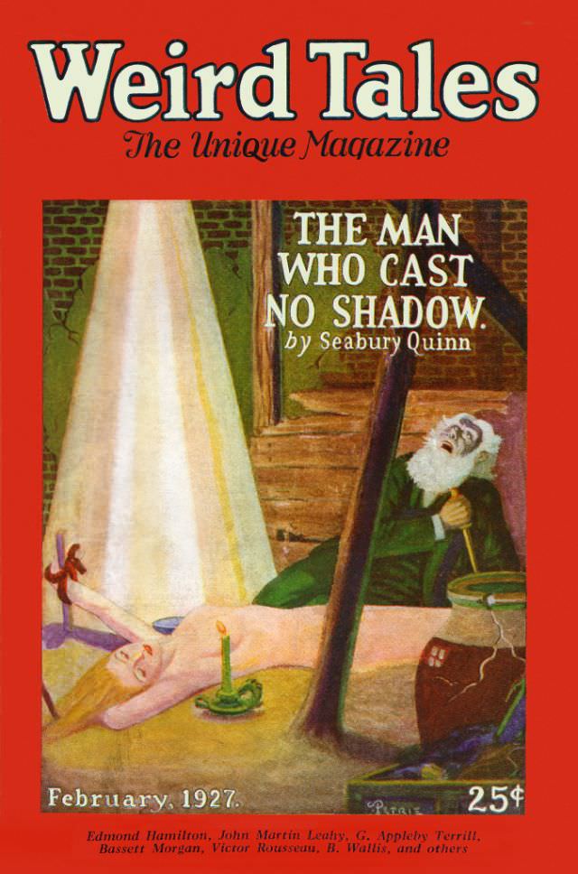
#16 Weird Tales cover, February 1927
Bold red borders and oversized lettering announce **Weird Tales** with the proud tagline “The Unique Magazine,” pulling the eye straight into the lurid drama that made pulp fiction unforgettable. The February 1927 cover promises chills with the featured story title, “The Man Who Cast No Shadow,” credited to Seabury Quinn, a name closely associated with…
-

#32 Weird Tales cover, November 1928
Bold red framing and towering “Weird Tales” lettering announce the magazine’s pulpy confidence, while the tagline “The Unique Magazine” promises readers something stranger than ordinary fiction. At the center, the illustrated scene stages a moment of high tension: a sombrero-wearing figure in a striped serape looms with a raised whip, and a woman in a…
-
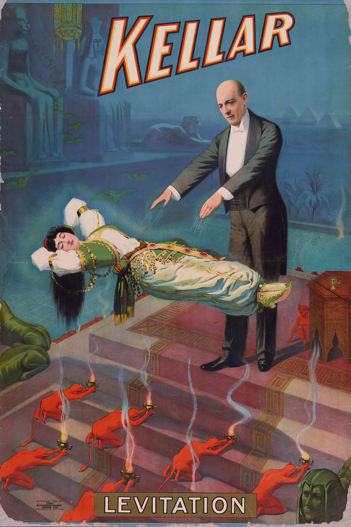
#3 Magician Harry Kellar, Levitation, 1900.
Bold letters spelling “Kellar” dominate the top of this dramatic cover art, pulling the viewer into a staged world of turn-of-the-century stage magic. At center, magician Harry Kellar stands in formal evening wear with arms extended, seemingly guiding a woman who floats horizontally above a set of steps. The illustration leans into theatrical mystery: saturated…
-

#6 High School Hellcats (1958).
Painted in lurid mid-century color, the cover art for *High School Hellcats (1958)* leans hard into the era’s fascination with teen rebellion and moral panic. A blonde young woman, rendered in dramatic highlights and flushed rouge, tilts back as a dark-haired figure crowds in close, turning intimacy into spectacle. Above them, the provocative tagline—“…what must…
-
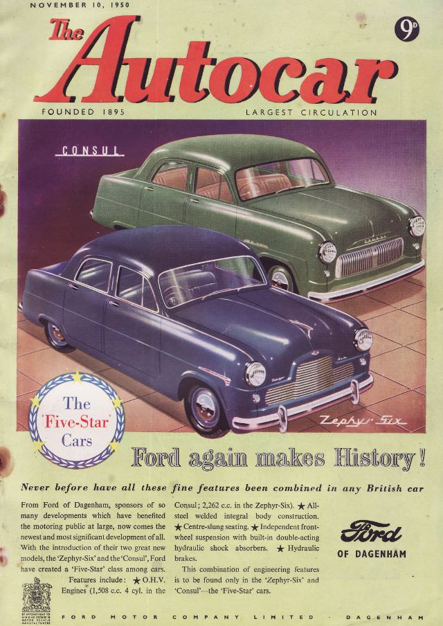
#2 The Autocar magazine cover, November 10, 1950
Bold, sweeping lettering announces *The Autocar* with the issue date clearly printed at the top: November 10, 1950. The cover design feels unmistakably mid-century, balancing a clean cream border with a saturated central panel, and even the small price mark (“9d”) helps place the magazine in its original shop-window world. For collectors of automotive ephemera…
-
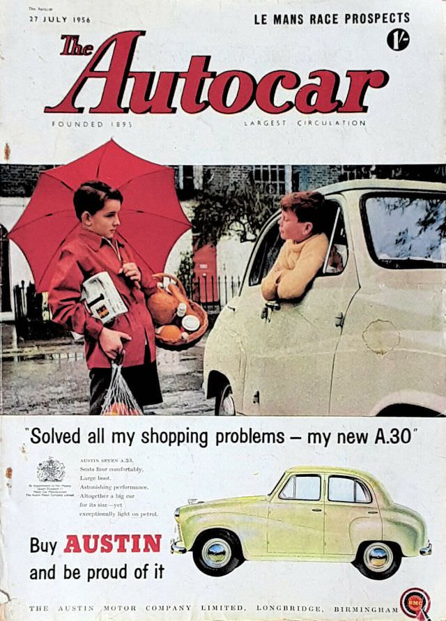
#18 The Autocar magazine cover, July 27, 1956
July 27, 1956 lands with a burst of mid-century confidence on the cover of The Autocar, where bold red lettering crowns a scene that feels half everyday life, half sales pitch. A rainy street encounter—complete with a wide umbrella, a bundle of groceries, and a child leaning from a small car window—turns domestic routine into…