Category: Cover Art
Dive into a gallery of vintage cover art from books, magazines, and albums. Discover how graphic design and illustration reflected the moods of their times.
These covers capture the essence of cultural evolution — from bold propaganda to elegant minimalism.
-
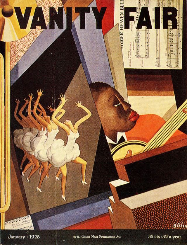
#15 Vanity Fair cover, January 1928
Bold typography and sharp geometry set the stage on the Vanity Fair cover for January 1928, where the magazine’s title spans the top like a marquee. The composition leans into an Art Deco mood—angled planes, patterned textures, and warm, saturated color blocks that feel both theatrical and modern. Even at a glance, it reads as…
-
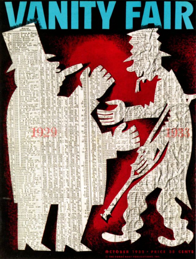
#31 Vanity Fair cover, October 1933
Bold turquoise lettering crowns the October 1933 Vanity Fair cover, immediately framing a tense, theatrical scene rendered in stark silhouettes. Two towering figures, built from dense columns of tiny printed listings, close in around a smaller character whose body language suggests strain and resistance. Against a deep red ground, the angular hands, bent knees, and…
-

#7 Puck magazine cover, March 1, 1882
Across the top of the March 1, 1882 cover, Puck announces itself with theatrical flair—an impish figure peeks from behind the curling banner, while the magazine’s bold lettering sprawls across a decorative field. The masthead details are part of the charm: volume and issue information, a ten-cent price, and the New York publishing imprint that…
-
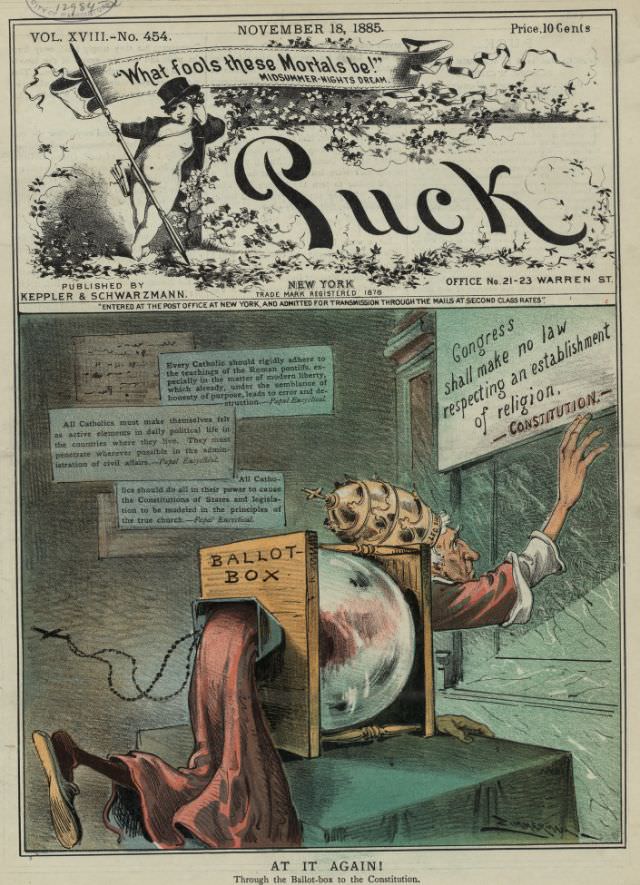
#23 Puck magazine cover, November 18, 1885
Dated November 18, 1885, this Puck magazine cover pairs theatrical wit with a pointed warning, framed by the publication’s signature bold masthead and decorative flourishes. A banner quoting “What fools these mortals be!” nods to Shakespeare, setting a tone that blends satire and civic commentary. Even before the main scene unfolds, the typography and layout…
-

#39 Puck magazine cover, May 20, 1896
Bold lettering spells out “Puck” across the top of this May 20, 1896 cover, immediately setting the tone for one of America’s most influential satirical magazines. Beneath the masthead, a flamboyantly dressed pair ride oversized bicycles, their exaggerated bodies and confident expressions doing the cartoonist’s work before a reader ever reaches the issue’s contents. The…
-
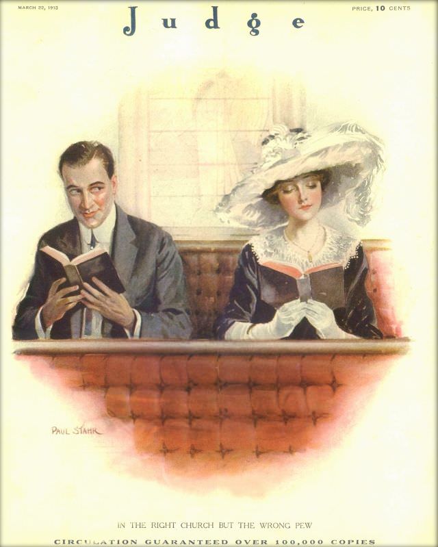
#11 Judge magazine, March 22, 1913
Across the top, the masthead “Judge” and the date March 22, 1913 frame a softly painted scene of two well-dressed churchgoers sharing a pew. A man in a dark suit turns a knowing glance while holding a small book, and beside him a woman in an elaborate wide-brimmed hat reads demurely, her white gloves and…
-
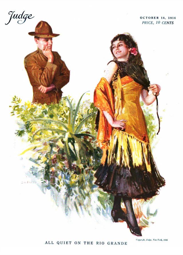
#27 Judge magazine, October 14, 1916
Bold color and theatrical posture set the tone on this Judge magazine cover dated October 14, 1916, priced at 10 cents. A stylish young woman in a fringed shawl and layered skirt turns with a confident glance, while a man in a brimmed hat lingers behind foliage, posed in a thoughtful, half-hidden stance. The composition…
-
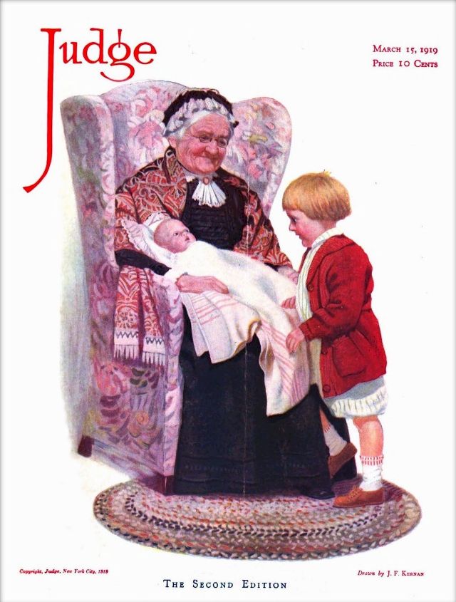
#43 Judge magazine, March 15, 1919
Warm domesticity takes center stage on the Judge magazine cover dated March 15, 1919, where an elderly woman settles into a high-backed upholstered chair, smiling down at a swaddled infant in her lap. A small child in a bright red coat stands close, leaning in with curiosity and a hint of pride, as if welcoming…
-

#2 Pianos, Pin-Ups, and Party Tunes: Exploring the Wild World of Honky-Tonk Records #2 Cover Art
Honky-tonk cover art rarely aimed for subtlety, and this sleeve leans into the genre’s rowdy promise with a piano at center stage and a nightclub fantasy swirling around it. The bold lettering for “HONKY TONK PIANO” and the name “Eddie Pianola Barnes” frame a scene that feels halfway between a vaudeville gag and a late-night…
-
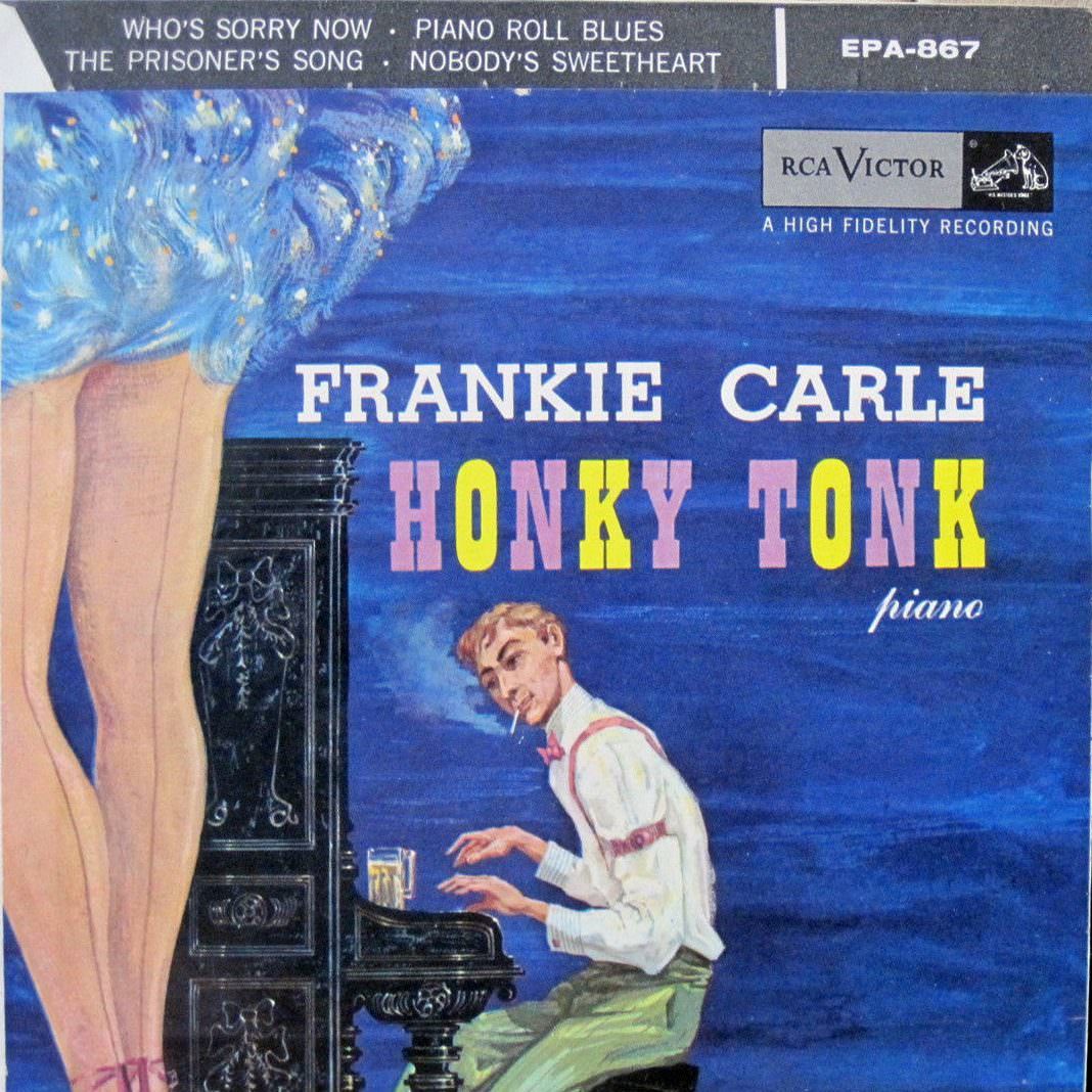
#18 Pianos, Pin-Ups, and Party Tunes: Exploring the Wild World of Honky-Tonk Records #18 Cover Art
Sultry legs in the foreground, a drink perched near the keys, and a pianist caught mid-glance—this honky-tonk record cover leans hard into nightlife fantasy. Bold lettering announces “FRANKIE CARLE” and “HONKY TONK piano,” while the deep blue backdrop and nightclub-ready illustration sell the promise of rowdy, after-hours entertainment. Even before the needle drops, the artwork…