Category: Cover Art
Dive into a gallery of vintage cover art from books, magazines, and albums. Discover how graphic design and illustration reflected the moods of their times.
These covers capture the essence of cultural evolution — from bold propaganda to elegant minimalism.
-

#15 Popular magazine cover, October 20, 1923
Bold red lettering spells out *The Popular Magazine* across the top, dated Oct. 20, 1923, with the enticing promise of “Complete book-length novel each issue” and a 20-cent cover price. The typography alone is a window into early twentieth-century newsstand competition, when strong mastheads and punchy taglines had to grab a passerby in an instant.…
-

#31 Popular magazine cover, August 20, 1927
Bold lettering for The Popular Magazine dominates the top of this August 20, 1927 cover, framed as “The Big National Fiction Magazine” and priced at 25 cents. The typography and layout do more than announce a publication; they sell urgency, adventure, and a promise of fast-paced storytelling in the twice-a-month rhythm of popular pulp culture.…
-
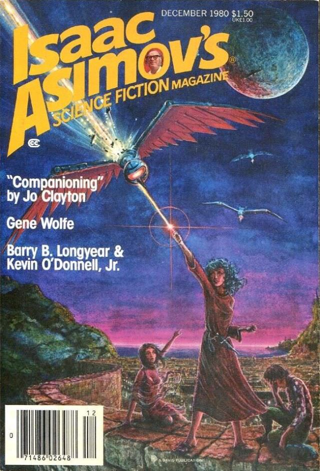
#2 Asimov’s Science Fiction cover, December 1980
Bold yellow lettering announces *Isaac Asimov’s Science Fiction Magazine* across a deep, star-dusted sky, with “December 1980” and the cover price printed along the top edge. Beneath the masthead, the illustration launches into drama: a winged, mechanical figure streaks overhead like a futuristic bird, and a brilliant beam or flare cuts through the scene as…
-
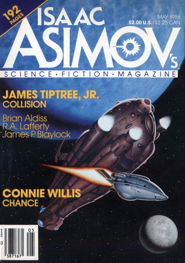
#18 Asimov’s Science Fiction cover, May 1986
Bold, high-contrast typography announces ISAAC ASIMOV’S SCIENCE FICTION MAGAZINE across a cool blue field, with “May 1986” printed at the upper right alongside the cover price. A “192 pages” burst and the familiar magazine masthead frame the issue as a substantial slice of mid-1980s genre publishing, when newsstand science fiction still sold itself through big…
-

#34 Asimov’s Science Fiction cover, October 1989
October 1989 arrives in bold typography across the top of this Asimov’s Science Fiction cover, with the magazine’s title looming large in red and the familiar period details—“192 pages” and the $2.00 U.S./$2.50 CAN price—anchoring it in late‑1980s newsstand culture. The layout balances big-name branding with a crisp, readable roster of contributors, making it immediately…
-
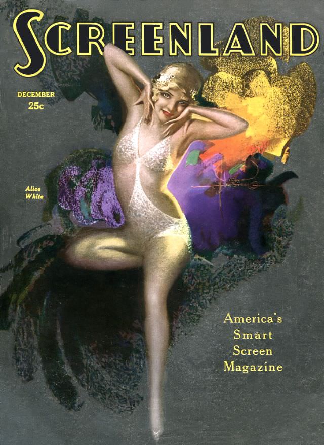
#15 Screenland magazine cover, December 1929
Bold lettering spells “Screenland” across the top of this December 1929 magazine cover, immediately setting the tone for late–silent era glamour on the brink of the 1930s. A shimmering figure in a pale, sequined costume strikes a theatrical pose against a dark, velvety backdrop, while painterly bursts of purple, gold, and orange add a modern,…
-
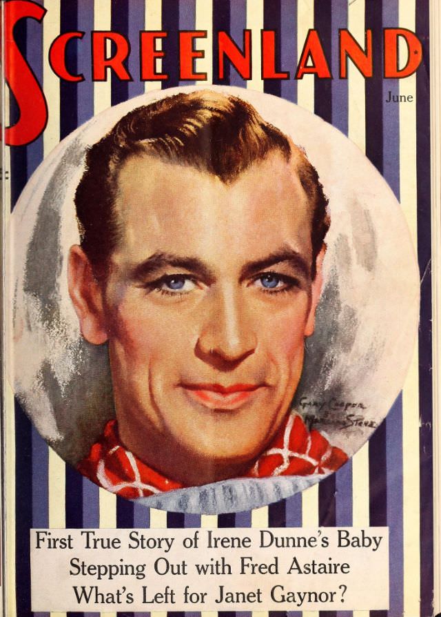
#31 Screenland magazine cover, June 1937
Bold red lettering spelling “Screenland” crowns this June 1937 magazine cover, set against crisp vertical stripes that feel both nautical and theatrical. At center, a painted portrait of a clean-cut leading man is framed in a circular vignette, his blue eyes and warm skin tones rendered with the smooth, glamorous finish typical of Golden Age…
-

#12 The Ugly Truth About Yugoslavian Album Art in the 1970s and 1980s #12 Cover Art
A blazing orange backdrop and the stark silhouette of a long-haired figure in heels make this Yugoslav album sleeve hard to ignore, even before you notice the animal pelt slung down the body like a trophy. Minimal typography—“LISICA” stamped in the corner—leans into that era’s appetite for blunt, catchy branding, while the tilted framing and…
-

#28 The Ugly Truth About Yugoslavian Album Art in the 1970s and 1980s #28 Cover Art
Neon sports glamour collides with pop bravado on this cover for SNEKI, where a posed figure stretches against a football goalpost while a Puma ball anchors the scene in unmistakable late-20th-century style. The loud, blocky title lettering and saturated color palette do more than sell a record—they broadcast an era’s idea of modernity, confidence, and…
-

#4 Weird Tales cover, September 1925
Bold red framing and oversized lettering announce *Weird Tales* as “The Unique Magazine,” setting a pulpy, sensational tone before the eye even reaches the artwork. The cover centers on the promised shock of “THE STOLEN BODY,” credited to H. G. Wells, a headline designed to pull curious readers straight into macabre science-fiction and horror. Typography,…