Category: Cover Art
Dive into a gallery of vintage cover art from books, magazines, and albums. Discover how graphic design and illustration reflected the moods of their times.
These covers capture the essence of cultural evolution — from bold propaganda to elegant minimalism.
-
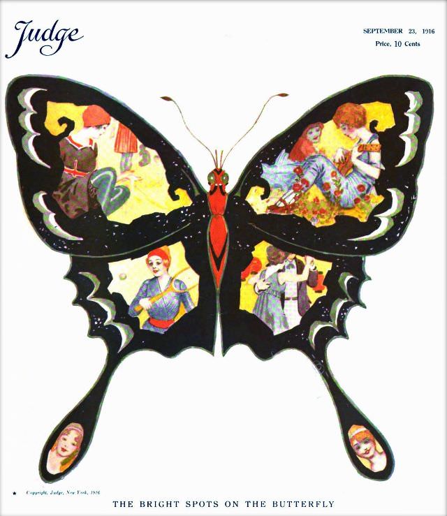
#29 Judge magazine, September 23, 1916
A bold butterfly dominates the cover of *Judge* magazine dated September 23, 1916, its dark wings turning the white page into a stage for color and commentary. The masthead sits in the upper left, while the issue’s date and “Price, 10 Cents” anchor the opposite corner, framing the illustration like a poster in a shop…
-
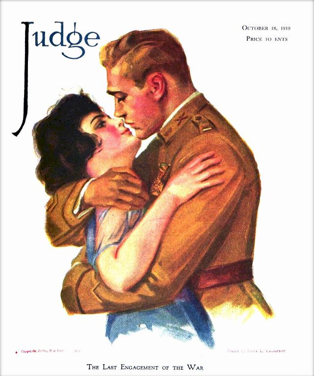
#45 Judge magazine, October 18, 1919
Boldly lettered “Judge” crowns this October 18, 1919 cover, while a tender embrace takes over the page: a uniformed man holds a young woman close as they lean in, caught in a moment that feels both romantic and uneasy. The artist’s soft shading, flushed cheeks, and carefully rendered fabric folds give the couple a stage-lit…
-
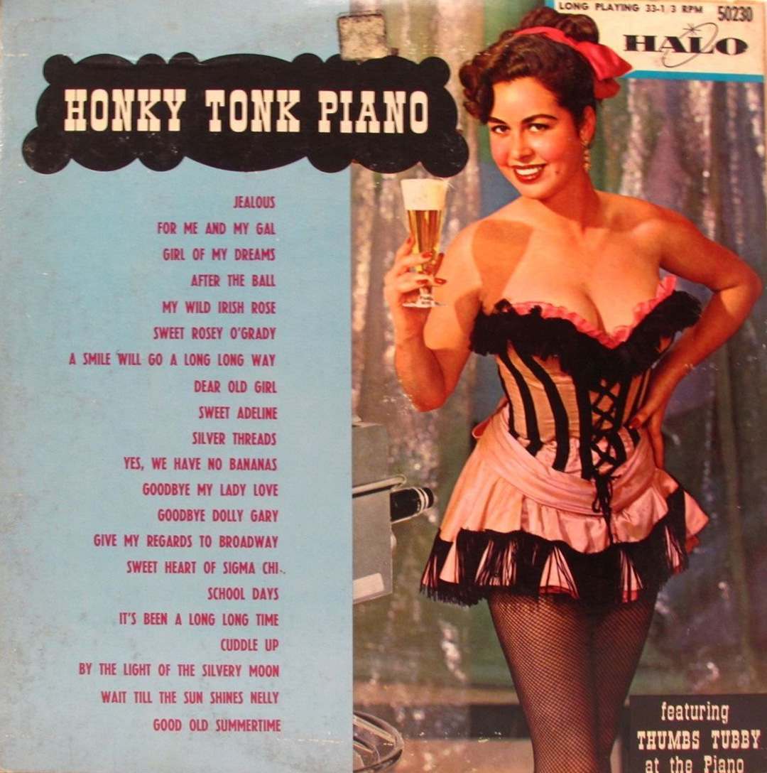
#5 Pianos, Pin-Ups, and Party Tunes: Exploring the Wild World of Honky-Tonk Records #5 Cover Art
Honky-tonk cover art rarely bothered with subtlety, and “Honky Tonk Piano” leads with a bold, saloon-style title block that promises noise, beer, and a good-time soundtrack. The design splits its attention between nightclub glamour and jukebox practicality: a long list of familiar party standards runs down the left, advertising the sing-along repertoire as plainly as…
-
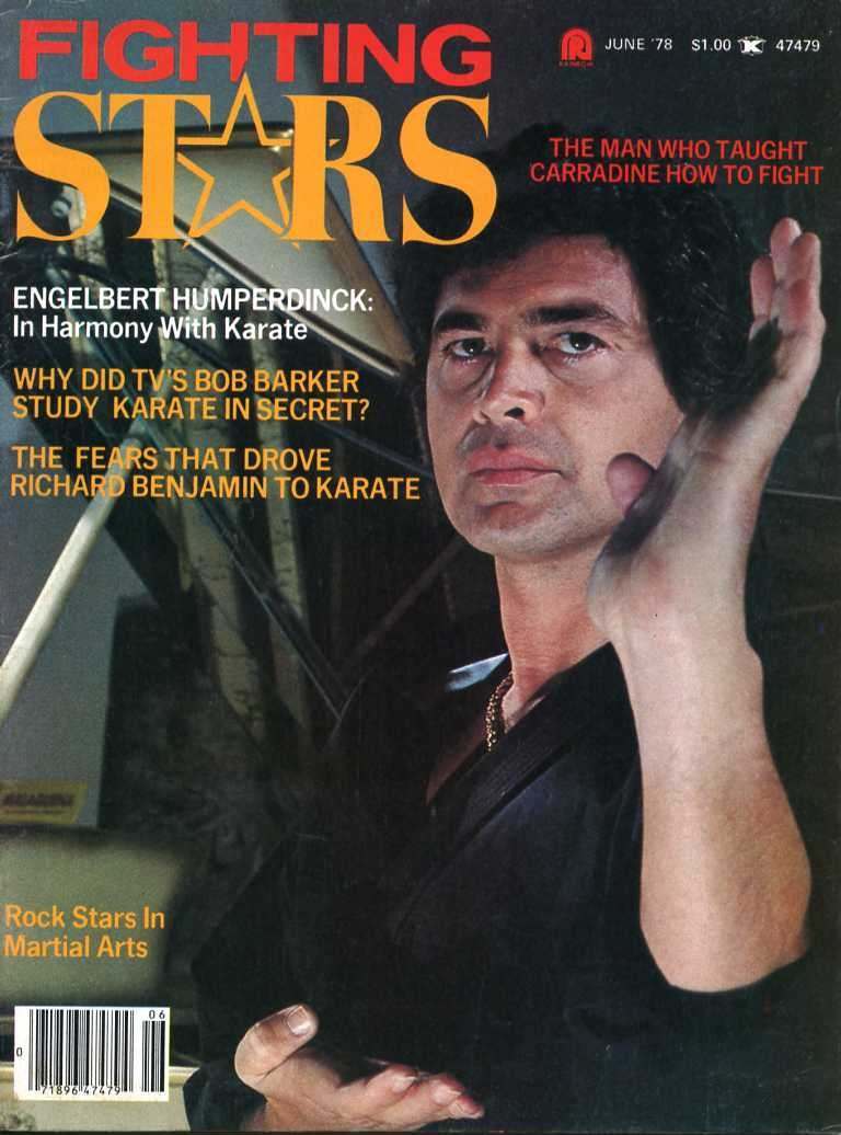
#1 Everybody Was Kung Fu Fighting: Exploring the Heyday of Martial Arts Mags in the 1970s and 1980s #1 Cov
Bright, blockbuster typography screams “FIGHTING STARS” across this magazine cover, pairing celebrity culture with the mystique of karate at the height of the martial arts media boom. A stern-faced man in a dark gi holds a poised open-hand guard, framed like a movie close-up, while cover lines promise insider stories about famous names learning to…
-
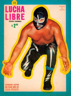
#5 Blood, Masks, and Glory: A Visual Tour Through Lucha Libre Magazine Covers of the 1970s #5 Cover Art
Bold color blocks and oversized lettering pull you straight into the pulpy excitement of a 1970s lucha libre magazine cover, where spectacle mattered as much as sport. “LUCHA LIBRE” dominates the top in loud, confident type, while the pricing and small Spanish copy ground it in the everyday reality of newsstands and weekly purchases. The…
-
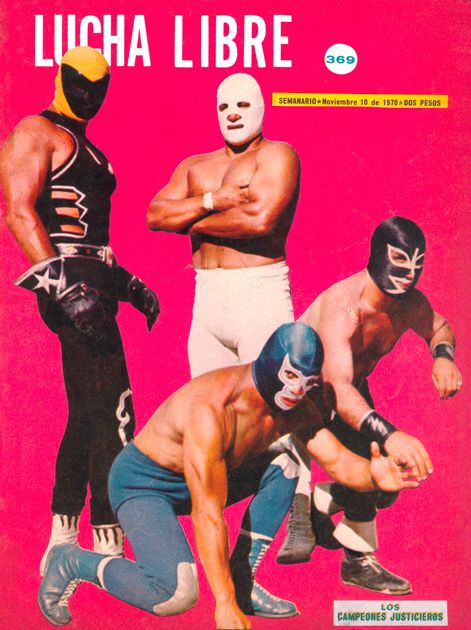
#21 Blood, Masks, and Glory: A Visual Tour Through Lucha Libre Magazine Covers of the 1970s #21 Cover Art
Hot pink explodes behind the bold “LUCHA LIBRE” masthead, turning this 1970s magazine cover into pure arena-style spectacle before you even notice the wrestlers. Four masked athletes pose like living posters—one standing tall in black with star motifs, another bare-chested in a stark white mask and trunks, and two crouched low as if frozen mid-feint.…
-
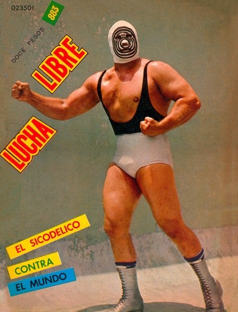
#37 Blood, Masks, and Glory: A Visual Tour Through Lucha Libre Magazine Covers of the 1970s #37 Cover Art
Bold color blocks and oversized lettering leap off this Lucha Libre cover, framing a masked wrestler in a squared, ready stance that feels halfway between a pin-up and a challenge. The design is spare but loud: a plain backdrop, the fighter centered, and the title “LUCHA LIBRE” slashed diagonally like a promoter’s shout across a…
-
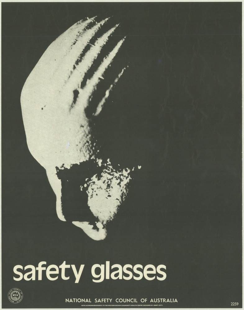
#3 National Safety Council of Australia Posters from the 1970s: Visual Messages for Keeping People Safe and Well
A stark profile floats out of a near-solid black field, its pale surface marked by deep scratches that read like an injury as much as a design choice. Beneath it, the blunt lowercase message—“safety glasses”—lands with the force of a warning label, leaving no room for doubt about the poster’s purpose. The National Safety Council…
-
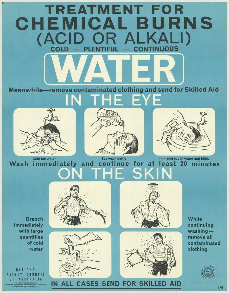
#19 National Safety Council of Australia Posters from the 1970s: Visual Messages for Keeping People Safe and Well
Bold typography and a cool blue field pull the reader straight into a no-nonsense lesson: “TREATMENT FOR CHEMICAL BURNS (ACID OR ALKALI).” The poster’s central command—WATER—appears in oversized lettering, backed by the brisk rhythm of “cold – plentiful – continuous,” a slogan-like triad that reflects the National Safety Council of Australia’s 1970s approach to public…
-

#4 The Unusual and Unconventional Album Cover Designs From the 1960s and 1970s #4 Cover Art
Bold hair, matching dresses, and a hand-lettered promise to “WALK WITH ME” immediately place this cover in the exuberant world of mid-century record design, where charisma mattered as much as typography. Two performers pose against a softly scenic backdrop, their coordinated outfits framed by a candy-striped panel that draws the eye straight to their faces…