Category: Cover Art
Dive into a gallery of vintage cover art from books, magazines, and albums. Discover how graphic design and illustration reflected the moods of their times.
These covers capture the essence of cultural evolution — from bold propaganda to elegant minimalism.
-
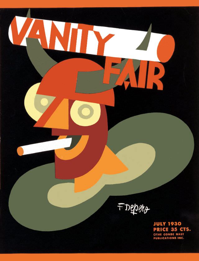
#20 Vanity Fair cover, July 1930
Bold geometry and sly humor dominate the Vanity Fair cover for July 1930, where a stylized figure peers out through round spectacles beneath curving, horn-like shapes. A cigarette juts from a smiling mouth, and the palette—burnt orange, olive green, cream, and deep black—leans into the crisp, modern look associated with Art Deco-era design. The oversized…
-

#36 Vanity Fair cover, April 1935
Bold lettering for “VANITY FAIR” crowns this April 1935 cover, where a ringmaster in a bright red jacket raises his arms as if conducting a spectacle just beyond the page. The art leans into theatrical exaggeration—arched eyebrows, sweeping gestures, and a tiny birdcage perched above like a prop in a visual joke. Even before reading…
-
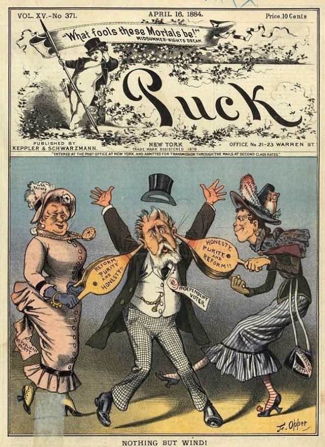
#12 Puck magazine cover, April 16, 1884
Bold lettering spells out “Puck” beneath a springtime banner dated April 16, 1884, with the magazine’s New York imprint and its familiar air of theatrical mischief. The top vignette frames the title like a stage proscenium, complete with a ribboned quotation—“What fools these mortals be!”—that signals the satirical tone inside. Even before the main scene…
-
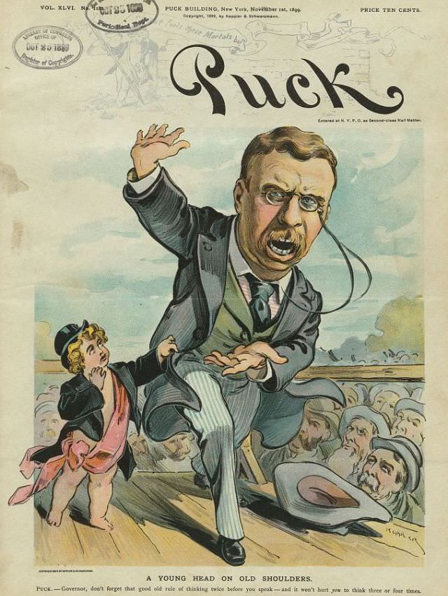
#44 Puck magazine cover, November 1, 1899
Boldly lettered “Puck” crowns this November 1, 1899 magazine cover, a vivid slice of Gilded Age satire rendered in color. At center, a mustachioed man in a dark suit and striped trousers lurches forward on a wooden platform, one arm raised as if caught mid-speech, the other thrust out for balance. Behind him, a small…
-
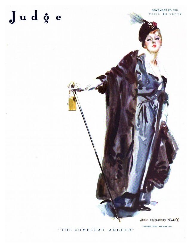
#16 Judge magazine, November 28, 1914
Elegance takes center stage on the cover of *Judge* magazine dated November 28, 1914, where a stylish woman poses with the cool assurance of someone used to being watched. A feathered hat crowns her neatly arranged hair, and her expression—half aloof, half amused—adds a theatrical note that suits the magazine’s famed wit. The title “Judge”…
-
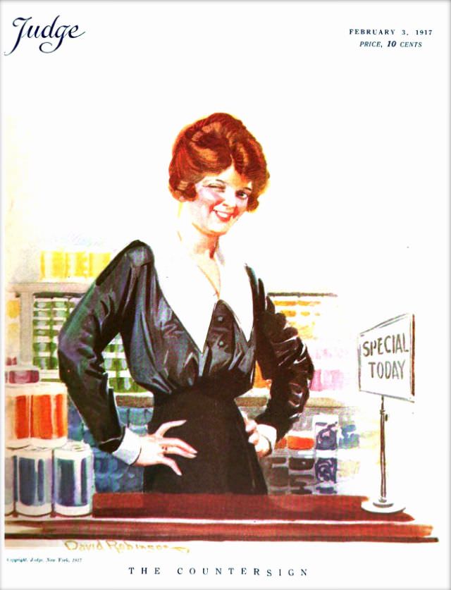
#32 Judge magazine, February 3, 1917
Judge magazine’s February 3, 1917 cover leans into bright, inviting color and a knowing smile, presenting a stylish woman posed confidently at a shop counter. Behind her, shelves and stacked goods suggest a bustling retail interior, while her dark dress and crisp white collar give the illustration a polished, early-20th-century look that still reads clearly…
-

#7 Pianos, Pin-Ups, and Party Tunes: Exploring the Wild World of Honky-Tonk Records #7 Cover Art
Warm, smoky reds and amber light set the stage for a piece of honky-tonk record cover art that sells atmosphere before the needle ever drops. A piano dominates the foreground, its keys catching the glow as a hat-brimmed player leans in, cigarette in hand, suggesting late-night tunes and a room that’s never quite quiet. The…
-
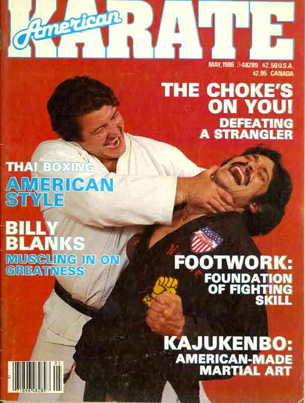
#3 Everybody Was Kung Fu Fighting: Exploring the Heyday of Martial Arts Mags in the 1970s and 1980s #3 Cov
Bold, high-contrast cover art like this is a time capsule from the heyday of martial arts magazines, when every newsstand promised secrets to fighting skill in big block letters. The red backdrop, oversized masthead, and staged action pose lean hard into the era’s pulp energy—part instruction, part spectacle—selling intensity before you even read a single…
-
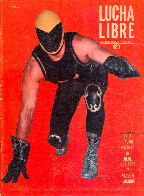
#7 Blood, Masks, and Glory: A Visual Tour Through Lucha Libre Magazine Covers of the 1970s #7 Cover Art
A punch of red dominates the cover, turning the page into a stage where masked bravado feels larger than life. Center frame, a wrestler lunges forward in a low, predatory stance, his yellow-and-black mask and black gear sharply silhouetted against the flat background. The bold “LUCHA LIBRE” masthead towers at the top, while scuffs and…