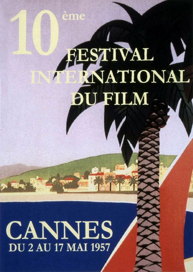
Sunlit and graphic in a way that still feels modern, this 1957 cover art sells a dream of the Riviera more than it sells cinema. A bold palm tree dominates the foreground like a souvenir stamp, while the shoreline and clustered buildings sit back in pastel calm, inviting the eye to drift toward the water. The typography leans into French elegance—“10ème Festival International du Film”—but the overall mood is pure vacation brochure.
CANNES anchors the bottom in confident capitals, with the dates “DU 2 AU 17 MAI 1957” printed beneath, leaving no doubt about the event while saying almost nothing about the films themselves. That restraint is part of the charm: instead of spotlighting stars, cameras, or reels, the designer chooses atmosphere—sea, sky, and a promise of warm evenings. It’s easy to see why the title jokes about an all-inclusive holiday; the poster’s first message is leisure, not programming.
As a piece of mid-century graphic design, it’s also a neat lesson in how cultural festivals branded themselves during the postwar boom, when travel and glamour became shorthand for international prestige. The simplified forms, limited palette, and clean lettering create instant readability at a distance—perfect for street display and perfect for modern SEO searches around Cannes Film Festival 1957 poster art, vintage festival prints, and retro travel-style design. Whether you arrive for film history or for the aesthetics, this image whispers the same thing: come here, linger, and let the coastline do the talking.