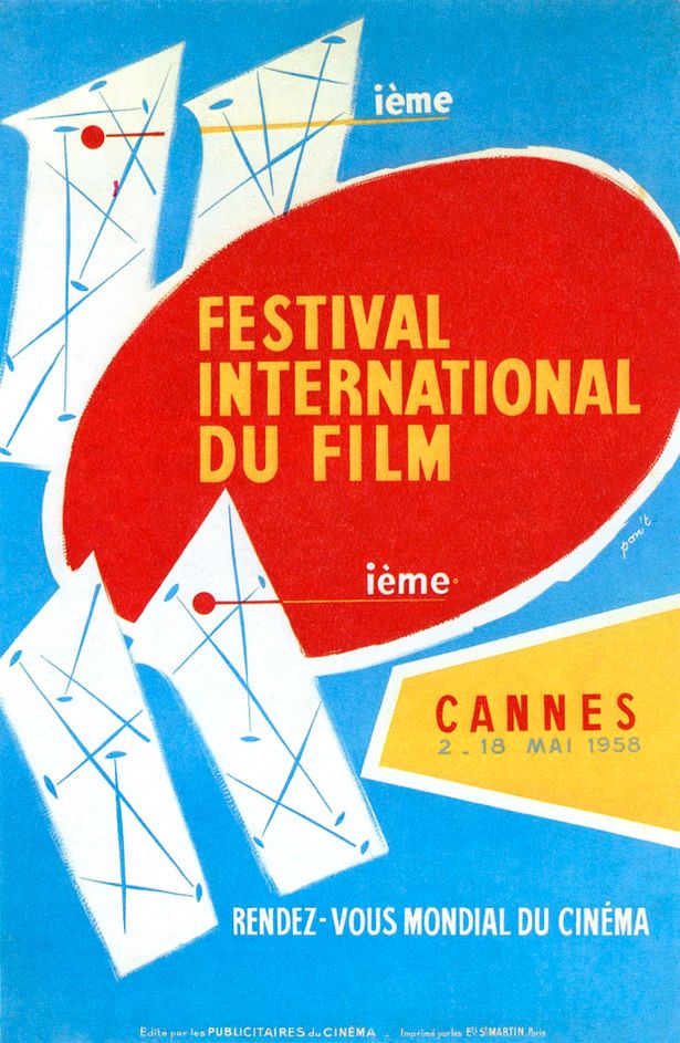
Bold mid-century design takes center stage in this 1958 cover art for the “Festival International du Film,” where a sweeping red oval and crisp yellow lettering announce cinema with the confidence of a marquee. Angular white forms and delicate linework—punctuated by small red dots—lean into the era’s taste for abstraction, the kind of graphic language that could be mistaken for a modern art poster at first glance. Yet the message is unambiguous: this is an international film gathering, presented with the visual energy of postwar optimism.
French text anchors the piece in its original context, with “Cannes” clearly printed alongside the dates “2–18 Mai 1958,” and the phrase “Rendez-vous mondial du cinéma” promising a global meeting point for the screen. The composition feels kinetic, as if the shapes are spotlights or stylized festival banners cutting across a bright blue sky. Typography and color do the heavy lifting, delivering an instantly legible, highly collectible example of classic film festival poster design.
Seen today, the poster also hints at the playful tension suggested by the title: a film festival isn’t necessarily a modern art festival, even when its promotional art borrows modernist tricks. That overlap—between cinema culture and contemporary graphic experimentation—helps explain why Cannes film festival memorabilia from the 1950s remains so searchable and admired. For anyone interested in vintage cinema advertising, French poster art, or the visual history of international film festivals, this 1958 design is a vivid reminder of how movies were sold as an event worth traveling to.