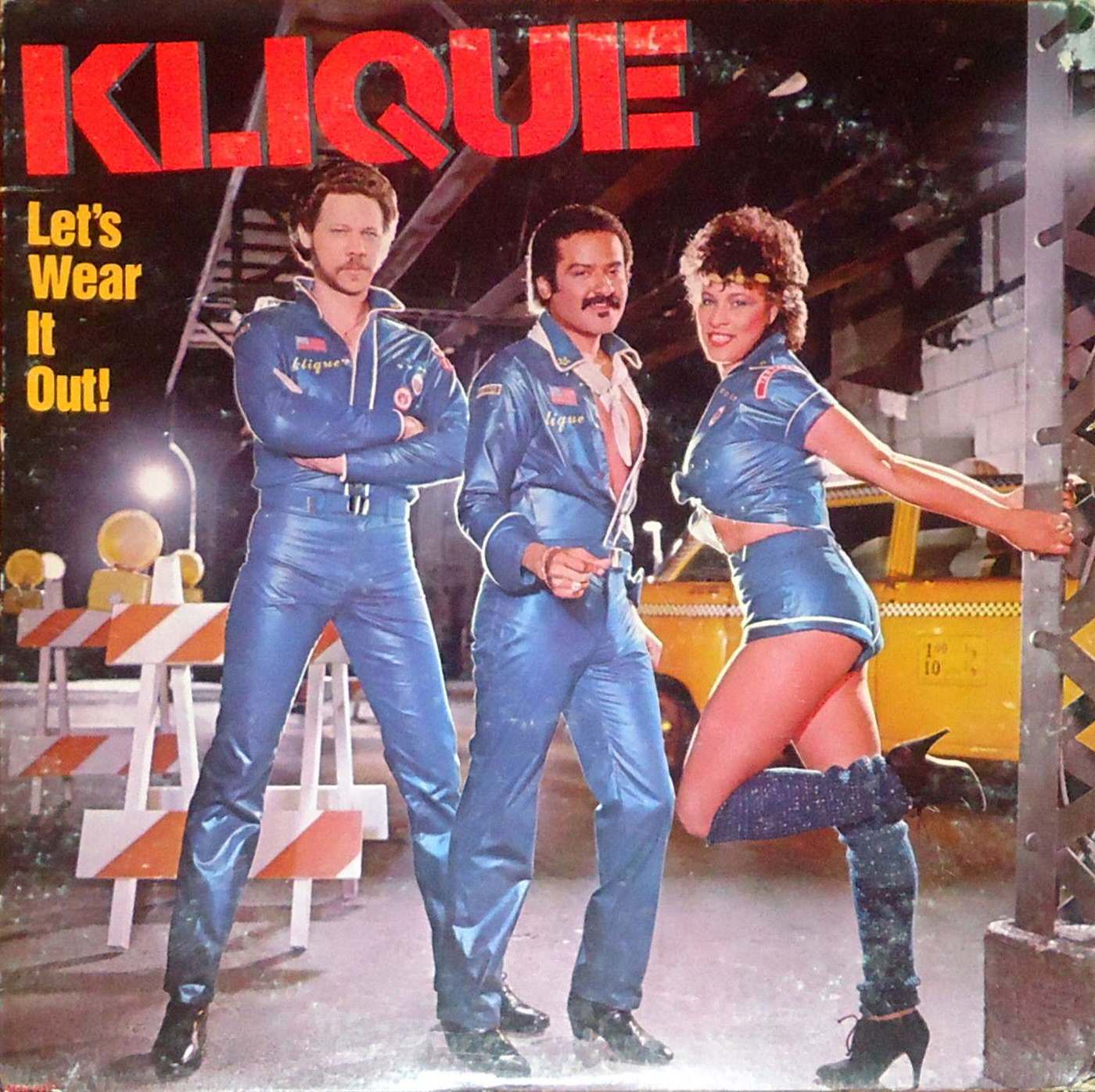
Neon-red lettering shouting “KLIQUE” and the cheeky tagline “Let’s Wear It Out!” set the tone for an era when album cover design was as loud, flirtatious, and unapologetically theatrical as the music it wrapped. Three performers pose in matching, shiny blue outfits that blur the line between workwear and stage costume, styled with patches and zippers that read like a pop-culture wink. The glossy finish, high-contrast colors, and bold typography make it feel less like packaging and more like a billboard for attitude.
Behind the trio, an urban, after-dark backdrop—complete with striped barricades, bright lights, and a yellow vehicle—adds a cinematic street-scene energy that was common in 1960s and 1970s cover art experiments. Rather than aiming for quiet sophistication, the composition leans into spectacle: strong poses, deliberate styling, and a sense of playful provocation meant to stop a record-shop browser in their tracks. It’s design as performance, using costume, setting, and slogan to sell a mood before a single note is heard.
Collectors and design lovers still return to covers like this because they capture the period’s fearless approach to branding, where disco-adjacent glamour, tongue-in-cheek innuendo, and fashion-forward photography collided. The image also hints at how musicians and labels used visual storytelling to build a scene—suggesting nightlife, swagger, and escapism through a single staged moment. As part of a look back at unusual and unconventional album cover designs from the 1960s and 1970s, this one stands as a vivid reminder that vinyl-era cover art didn’t just accompany the music; it advertised a whole persona.