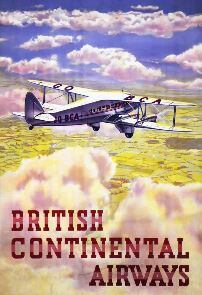
High above a quilt of fields and drifting cloudbanks, a sleek biplane cruises through a sky painted in soft blues and pinks, its wing markings and cabin windows rendered with the confident clarity of poster art. The composition leans into optimism: open air, wide horizons, and a machine that looks both sturdy and graceful, inviting the viewer to imagine distance shrinking beneath its wings. Bold, block lettering anchors the lower half, turning the scene into a persuasive promise of modern movement.
Imperial Airways posters of the 1920s and 1930s often sold more than tickets—they sold an idea of flight as orderly, comfortable, and within reach for an aspirational public. Here, the aircraft is framed as a calm, reliable presence rather than a daredevil contraption, floating above weather that reads as atmospheric drama rather than danger. Details like visible passengers hint at a new kind of travel experience, one where sightseeing began before landing and the journey itself became part of the luxury.
For collectors and design lovers, these early air travel advertisements are a rich blend of Art Deco-era typography, streamlined engineering, and carefully staged romance. The poster’s clean shapes and high-contrast text make it instantly readable, while the luminous clouds do the emotional work of making flight feel inevitable and exhilarating. As cover art for a deeper look at Imperial Airways promotion, it’s a vivid reminder of how airlines first “advertised the skies” and taught audiences to desire the view from above.