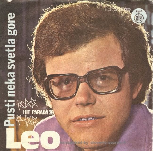
A tight, full-frame portrait dominates the cover, pushing the singer’s face and oversized square glasses almost to the edge of the sleeve. The typography is blunt and loud—“Leo” in huge block letters, with “Pustineka svetla gore” running vertically—while doodled starbursts and a “Hit Parada” note try to sell excitement on a cramped canvas. Even the record label mark sits like a stamp of authority, reminding you this was mass-market pop packaging as much as personal image-making.
There’s a particular Yugoslav 1970s–1980s design vibe here: confident in its own way, yet oddly mismatched in color, font choices, and visual hierarchy. The palette leans warm and slightly washed, the lighting feels studio-flat, and the layout relies on scale rather than finesse—big letters, big face, big promise. If the title of this post hints at an “ugly truth,” it’s that many sleeves weren’t aiming for sleek Western minimalism; they were built to be instantly legible in a shop bin, even when the aesthetics turned clunky.
Look closer and the awkwardness becomes a kind of charm, a snapshot of how music marketing, printing limits, and trends collided in the region’s pop culture economy. The cover reads like a billboard reduced to LP size, where personality substitutes for visual storytelling and decorative scribbles stand in for polish. For anyone searching Yugoslavian album art, 1970s and 1980s cover art, or the everyday graphic design of the socialist-era record industry, this piece offers an unfiltered example of how bold ambition could outpace tasteful execution.