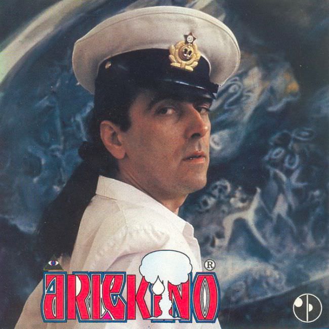
A man in a crisp white naval-style cap turns to the camera with a guarded, almost suspicious glance, his face lit in a way that makes the pose feel staged yet uneasy. Behind him, a soft-focus swirl of smoky blues and vague shapes reads like airbrushed fantasy—half mural, half fog machine—while the overall color palette leans into that peculiar late-20th-century mix of seriousness and kitsch. Dominating the lower portion, bold, blocky lettering (“ARLEKINO”) and a theatrical mask graphic announce the record’s identity with the kind of visual confidence that doesn’t always match the mood of the portrait.
Yugoslavian album cover art from the 1970s and 1980s often lived in a tension between aspiration and constraint, and this design sits right on that fault line. The uniform suggests authority and spectacle at once, as if borrowing from official symbolism to sell entertainment, while the hazy backdrop tries to conjure drama without giving the viewer a clear story. Typography becomes the real star here: thick outlines, saturated colors, and logo-like treatment that prioritizes shelf impact—an approach that can look awkward today, yet remains instantly recognizable to collectors of ex-Yugoslav vinyl and pop-rock ephemera.
What makes the “ugly truth” compelling isn’t simple bad taste, but the way these sleeves reveal their production realities—limited budgets, quick studio shoots, and graphic choices aimed at standing out in crowded record bins. The result can feel mismatched: a stern portrait paired with playful branding, symbolic costume paired with an abstract, almost accidental background. For anyone researching Yugoslavian cover art, retro record design, or Eastern European music packaging, this image is a small, vivid lesson in how aesthetics, marketing, and cultural cues collided on LP jackets of the era.