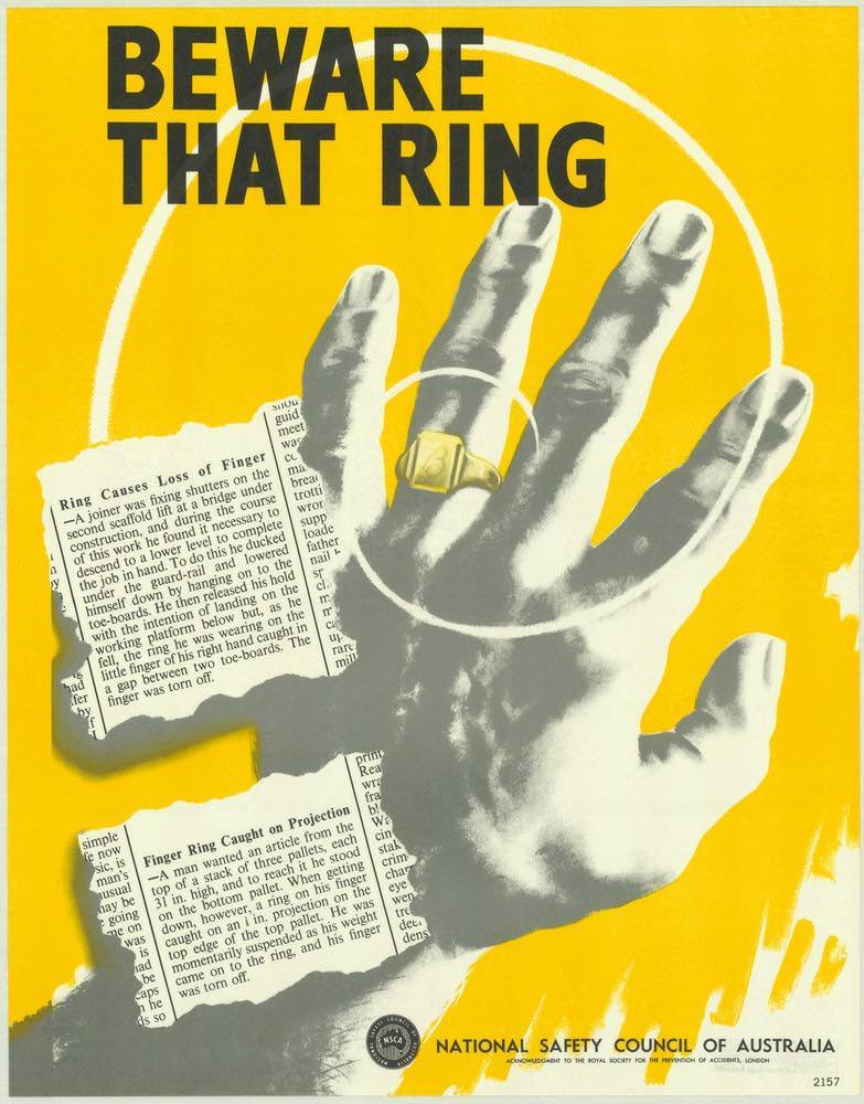
Bold, urgent lettering—“BEWARE THAT RING”—dominates the cover art, set against a bright yellow field designed to stop a passer-by in their tracks. A stark, high-contrast hand reaches across the page, a gold ring catching the eye as white concentric circles draw attention to the finger like a warning beacon. Alongside it, torn newspaper-style clippings hint at real-world incidents, turning a simple accessory into a potential workplace hazard.
Graphic design from the 1970s often leaned on clarity and shock value, and this National Safety Council of Australia poster uses both with precision. The limited palette, sharp shadows, and cut-paper collage feel give the message a public-information immediacy, as if the viewer has stumbled upon evidence rather than advertising. Even without showing a factory floor or tools, the visual language suggests machinery, snag points, and the sudden violence of an avoidable accident.
For readers exploring National Safety Council of Australia posters from the 1970s, this piece stands as a memorable example of how safety campaigns translated everyday habits into life-and-limb warnings. It speaks to a broader history of occupational health messaging—where typography, colour, and a single charged detail could stand in for training manuals and long lectures. As cover art, it also works as a time capsule of Australian safety culture, reminding us how public posters once carried the weight of keeping people safe and well.