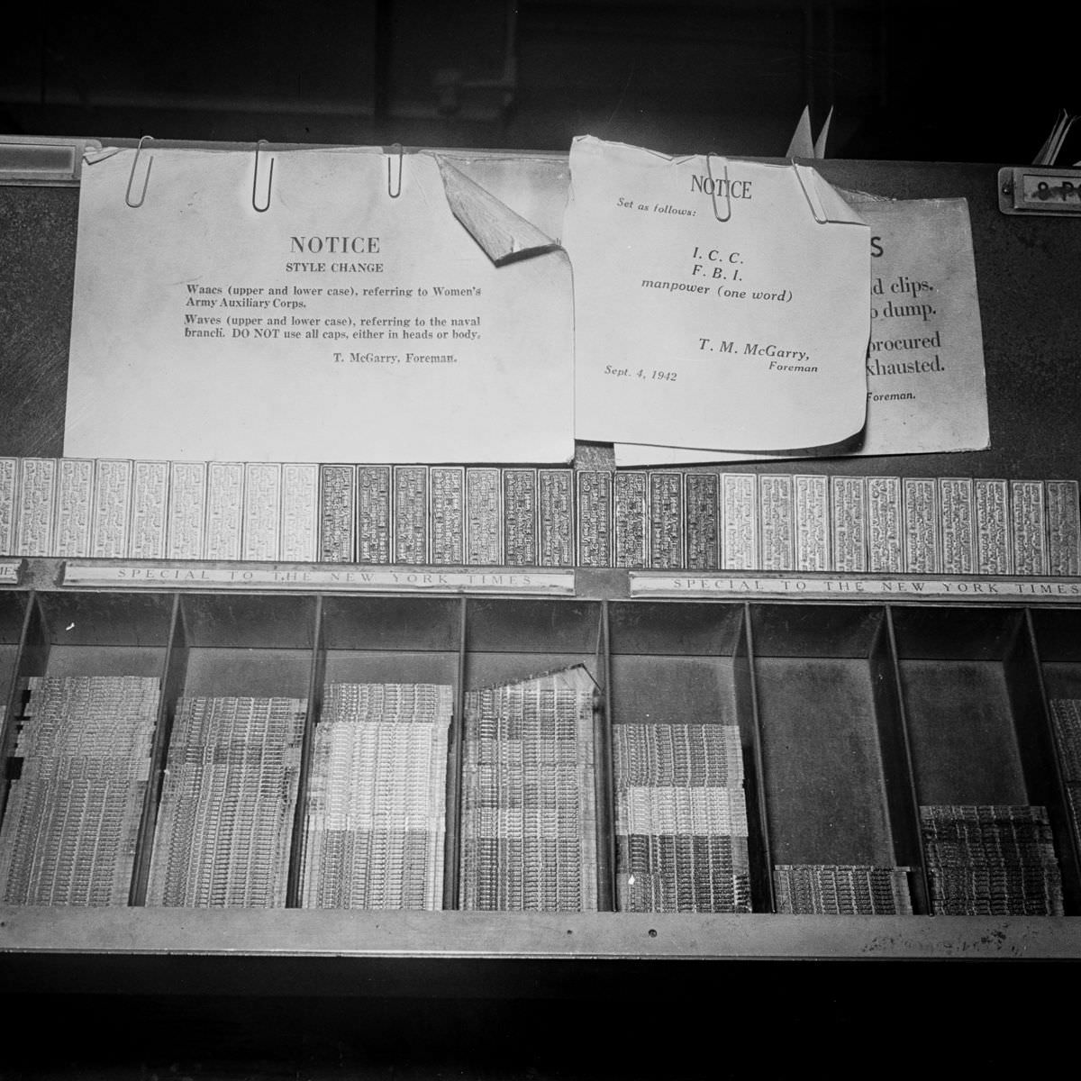
Pinned above a case of neatly sorted metal type, two plain “NOTICE” sheets turn a busy composing room into a place of rules and reminders. One memo is headed “STYLE CHANGE” and instructs compositors on how to set “Waves” in upper and lower case, with a firm warning not to use all caps. The other lays out additional directions—down to whether “manpower” should be one word—showing how editorial policy traveled to the workbench in the simplest possible way: a clipped piece of paper.
Along the bottom edge, the type case itself reads “SPECIAL TO THE NEW YORK TIMES,” anchoring the scene in the world of newspaper production and the machinery of daily deadlines. Each compartment holds tiny rows of characters, the building blocks of headlines and body text, waiting to be lifted with practiced fingers and assembled into lines. The contrast between the rigid order of the trays and the casual curl of the notices suggests a workplace where precision was constant, even as language and style kept evolving.
Notices like these are a small but revealing artifact of print history, capturing how standardization happened before digital style guides and instant updates. They also hint at a broader moment when terminology around wartime organizations and public life demanded careful, consistent treatment on the page. For readers interested in typography, newsroom routines, and the behind-the-scenes discipline of publishing, the photo offers a sharp glimpse of how a newspaper’s voice was literally set in type.