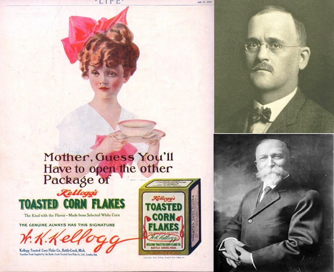
Brightly colored advertising art dominates the scene, pairing a poised young woman—hair piled high, a vivid bow perched above—with a breakfast bowl held like a prop on a stage. The slogan’s playful insistence about “the other package” points to a new consumer habit taking shape: packaged, branded foods that promised consistency and modern convenience. Even at a glance, the design leans on trust and familiarity, presenting corn flakes not as a novelty, but as a staple.
Alongside the illustration sit two formal portraits that anchor the marketing sheen to the people behind the idea, reinforcing the post’s theme of inventions and the rise of industrial food. The title “Corn Flakes (1894) by Kellogg Brothers” evokes the moment when processed grain moved from kitchen experiment to mass-market product, reshaping how breakfast could be bought, served, and imagined. Typography, signature-like branding, and the carefully drawn cereal box all work together to make the product feel official and enduring.
What makes this historical image especially useful for a WordPress post is how clearly it connects food history with the evolution of advertising: the art sells a lifestyle as much as a recipe. For readers interested in the origins of breakfast cereal, Kellogg’s corn flakes, and early twentieth-century print design, the piece offers rich visual evidence of how companies built recognition and loyalty. It’s a reminder that everyday inventions often spread not only through factories and patents, but through persuasive pictures and memorable words.