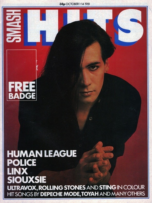
Bold block lettering shouting “HITS” against a saturated red field sets the tone immediately, with the masthead stacked in white and blue like a pop-art billboard. Centered beneath it, a moody studio portrait leans into the era’s drama: heavy fringe, dark clothing, and a direct stare that feels equal parts glamorous and confrontational. Even the small callout—“FREE BADGE”—adds to the tactile promise of 1980s music magazines, when cover lines and extras were part of the ritual of buying an issue.
Along the top edge, the cover prints a price of 38p and an October date range in 1981, anchoring this piece of Smash Hits history in a specific moment of British pop culture. The typography is clean and loud, while the layout leaves generous space for the face to do the selling, a classic strategy of the decade’s cover art. Down the left side, a tight stack of artist names—Human League, Police, Linx, Siouxsie, plus mentions of Ultravox, the Rolling Stones, Sting, and Depeche Mode—reads like a snapshot of the charts and the new-wave conversation at the time.
For anyone searching “Smash Hits magazine covers 1980s” or exploring vintage music magazine design, this cover is a compact lesson in how the period looked and felt on the newsstand. It’s not just nostalgia; it’s graphic design history—high-contrast color, assertive sans-serif type, and personality-driven photography working together to signal what was current and cool. In the context of iconic Smash Hits cover art, this issue stands as a vivid artifact of the early ’80s pop press, where attitude, fashion, and fandom met in a single, collectible page.