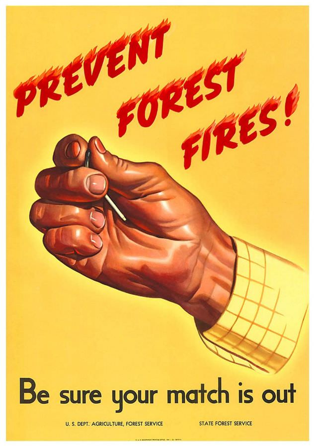
Bold red lettering streaks across a warm yellow field—“PREVENT FOREST FIRES!”—as a realistically painted hand pinches a match between thumb and forefinger. The design is all urgency and simplicity, using flame-like typography and a close-up gesture to turn a tiny object into a looming threat. At the bottom, the blunt reminder lands with equal force: “Be sure your match is out.”
Created in 1944, this forest fire prevention poster reflects an era when public-service artwork leaned on direct, memorable visuals to shape everyday behavior. Rather than depicting blazing trees or firefighters at work, it focuses on the moment before disaster, where carelessness can ignite catastrophe. The credited agencies—U.S. Department of Agriculture, Forest Service, alongside state forest service partners—underscore how conservation messaging was coordinated and widely circulated.
For modern readers and collectors of wartime-era posters, the piece offers a compelling example of mid-20th-century graphic persuasion and environmental communication. Its clean composition, saturated colors, and tight focus make it instantly readable, whether viewed as historical ephemera, Americana, or early wildfire prevention advocacy. In a time when wildfires remain a pressing concern, the poster’s warning feels less like nostalgia and more like a message that still demands attention.