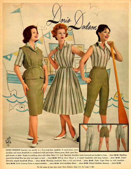
Against a playful seaside backdrop, three smiling models pose in coordinated separates and a striped day dress, styled to feel crisp, sporty, and effortlessly put-together. The illustration’s clean lines and sunny palette lean into that mid-century optimism, while the nautical cues—sail, waves, and a long oar—frame the outfits as ready for vacation days and boardwalk breezes. Above them, the scripted brand name “Doris Dodson” anchors the scene in classic magazine-ad glamour.
What stands out is the emphasis on mix-and-match practicality: a fitted short-sleeve jacket with a pencil skirt, a belted sleeveless striped dress, and high-waisted shorts paired with a matching top. The silhouettes are tidy and tailored rather than wildly experimental, yet the look still reads “groovy” in its confident coordination and graphic striping. Details like cinched waists, neat collars, and low heels signal the era’s ideal of polished youthfulness—fashion meant to look grown-up, but still fun.
For readers drawn to 1960s fashion history and Seventeen magazine cover art aesthetics, this piece offers a vivid snapshot of how teen style was marketed through aspirational illustration and bold, lifestyle-forward settings. It’s as much about selling a mood as it is about selling clothes: sunshine, friendship, and the promise that the right outfit could carry you anywhere. As a WordPress post feature, it’s a strong example of vintage advertising design, retro wardrobe inspiration, and the visual language that shaped youth culture on the page.