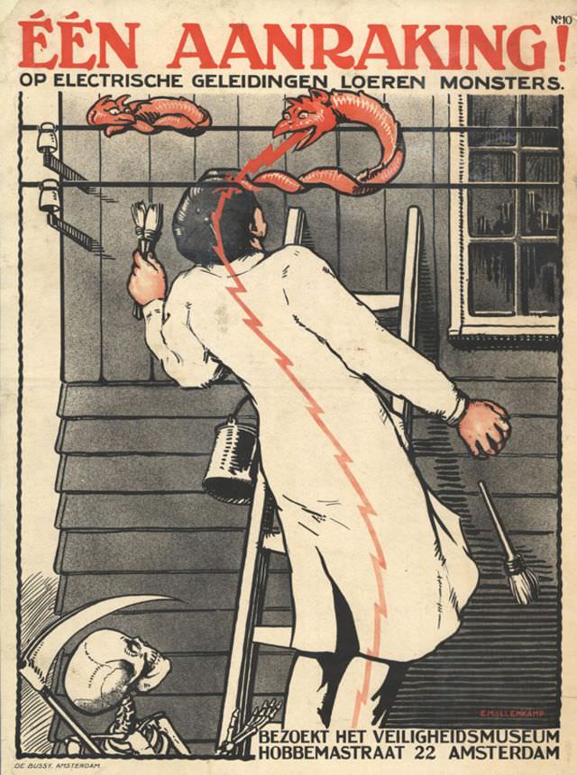
Bold Dutch lettering shouts “EÉN AANRAKING!” across the top, framing a dramatic lesson in electrical danger. A worker in a white coat jerks backward as a jagged red bolt races through his body, while a monstrous, serpent-like creature lunges from the wires above—an unforgettable metaphor for the invisible threat of current. The stark interior setting, with tools, a ladder, and a bucket at hand, grounds the warning in everyday work routines where one careless moment can turn hazardous.
Evert Möllenkamp’s poster art leans into theater to make safety memorable, pairing clean industrial lines with a shock of color and caricature. The “monster” and lightning motif turns abstract risk into something almost tangible, reflecting a period when electrification was widespread and public education campaigns pushed hard for caution around installations and overhead lines. The design is simple enough to read at a glance, yet detailed enough to hold attention—exactly what effective safety propaganda aimed to achieve.
Near the bottom, the call to “BEZOEKT HET VEILIGHEIDSMUSEUM” points viewers toward a safety museum on Hobbemastraat 22 in Amsterdam, anchoring the message to a real place of instruction. That invitation reveals the broader purpose behind the artwork: not merely to scare, but to persuade workers and the public to seek training and adopt safer habits around electrical conductors. For anyone browsing historical posters, Dutch graphic design, or workplace safety history, this striking piece captures how mid-century public messaging used vivid imagery to turn prevention into a shared civic responsibility.