Category: Cover Art
Dive into a gallery of vintage cover art from books, magazines, and albums. Discover how graphic design and illustration reflected the moods of their times.
These covers capture the essence of cultural evolution — from bold propaganda to elegant minimalism.
-
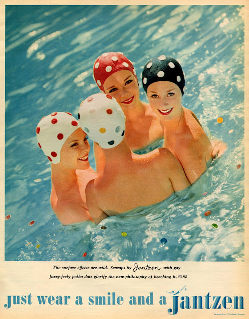
#1 Groovy Threads and Bold Ads: A Trip Through 1960s Fashion in Seventeen Magazine #1 Cover Art
Pool water glitters behind four smiling swimmers, each wearing a polka-dot swim cap that turns a simple moment into a piece of mid-century design. The palette is bright and sunlit, with playful spots in red, black, and white echoing the era’s love of bold graphics and clean, optimistic styling. Even without a full magazine frame…
-
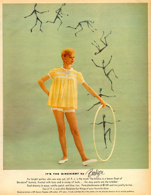
#17 Groovy Threads and Bold Ads: A Trip Through 1960s Fashion in Seventeen Magazine #17 Cover Art
Bright, airy color fields and a playful sense of motion set the stage for this Seventeen magazine cover art, where a model in a lemon-yellow babydoll set with white trim strikes a poised, mid-century stance. The look reads as part lingerie, part loungewear, and wholly youth-market fantasy—short, sweet, and intentionally uncomplicated. Behind her, sketch-like figures…
-

#16 Chemin de Fer de Paris-Lyon-Méditerranée, L’Andalousie-Vue de Grenade, circa 1890s
Bold lettering for *Chemins de Fer de Paris-Lyon-Méditerranée* crowns an illustrated travel poster that sells “L’Andalousie” as both romance and itinerary, with “Vue de Grenade” set proudly against pale, snow-tinted mountains. A woman in a rich red shawl anchors the foreground, her profile turned toward a glowing cityscape of towers and walls—an inviting, staged threshold…
-
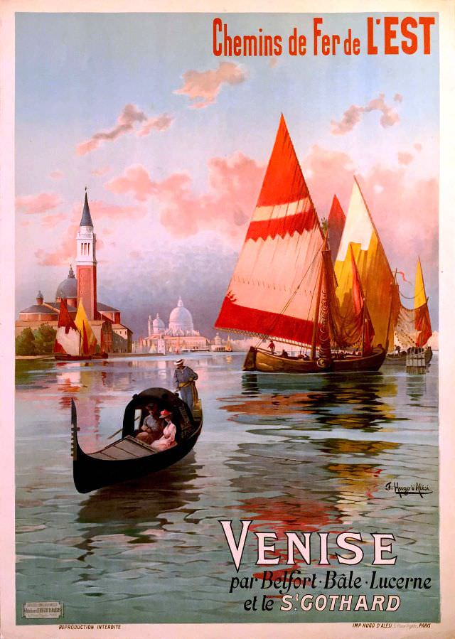
#32 Venise par Belfort, Bâle, Lucerne et le St. Gothard, circa 1890s
Warm Venetian light spills across calm water in this circa-1890s cover art, where a gondola glides in the foreground and tall, vividly colored sails catch the breeze beyond. The composition leans into atmosphere—pink clouds, shimmering reflections, and a skyline of domes and towers—inviting the viewer to linger in a romantic vision of the lagoon. Even…
-
#16 Cavalcade magazine cover, October 1952
Bold yellow lettering spells “CAVALCADE” across the top, anchoring an October 1952 cover designed to stop a passerby at the newsstand. Beneath the title sits the crisp pricing line “OCTOBER, 1952. 1/6,” along with small-print postal registration text that hints at the practical machinery behind mass-circulation magazines. It’s a front page that balances branding, bureaucracy,…
-

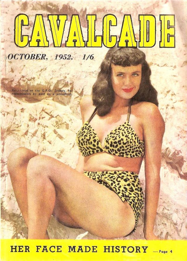
#32 Cavalcade magazine cover, October 1954
Bold red “CAVALCADE” lettering crowns the October 1954 cover, instantly evoking the confident graphic style of mid-century magazine design. Against a pale blue sky and sunlit sand, a smiling model poses in a leopard-print two-piece, the saturated color palette and clean composition leaning into an idealized, carefree beach mood. Small period details—like the printed “OCTOBER,…
-
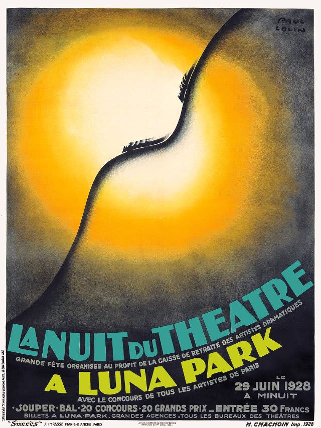
#8 La Nuit du Théâtre à Luna Park, 1928
A blazing halo of yellow and orange floods the page, turning the central silhouette into pure theatre—an elegant curve that reads at once as stage, body, and spotlight. The composition feels unmistakably late‑1920s in its modernist confidence: minimal lines, dramatic contrast, and a sense of movement created by light alone. Even before you read a…
-
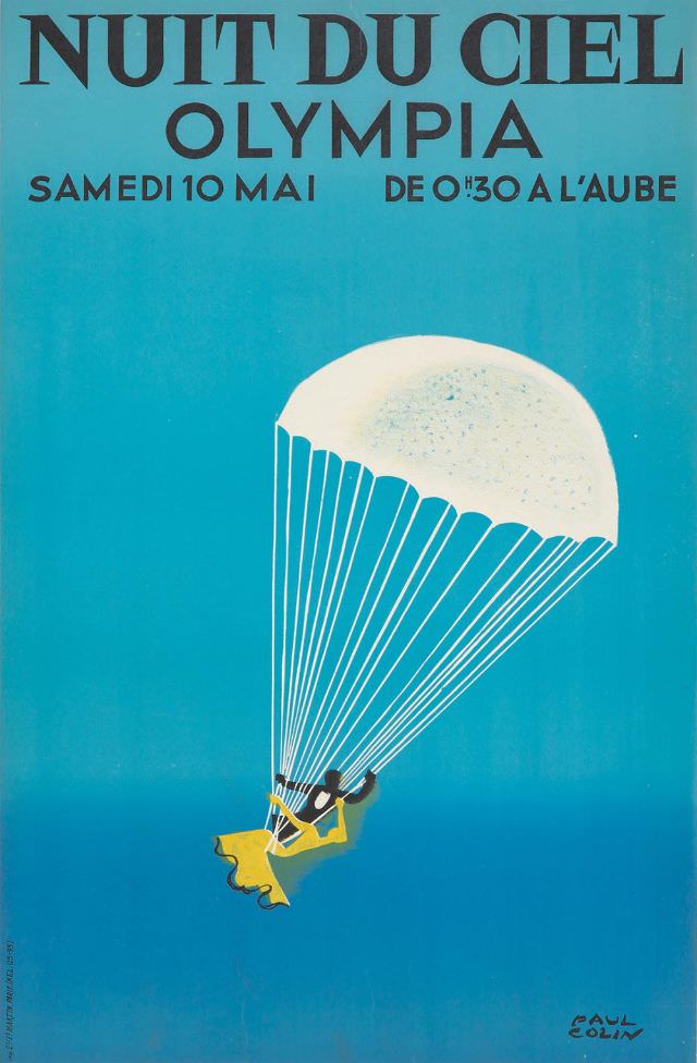
#24 Nuit du Ciel, circa 1930
Bold lettering at the top announces “NUIT DU CIEL” and “OLYMPIA,” setting the tone for a French cover-style poster that feels both elegant and daring. Beneath the title, the event details read “SAMEDI 10 MAI” and “DE 0H30 A L’AUBE,” promising a night that stretches into dawn. The overall design uses a cool, saturated blue…
-

#40 Balto Cigarettes Regie Française, 1938
Sailing across a stylized, wind-chopped sea, a tall ship dominates the cover art for “Balto Cigarettes” under the bold header “Régie Française.” The composition leans into motion and drama: billowing sails, sweeping rigging lines, and a simplified hull rendered in clean, graphic shapes. At the center, the cigarette pack itself becomes a floating emblem, framed…
-
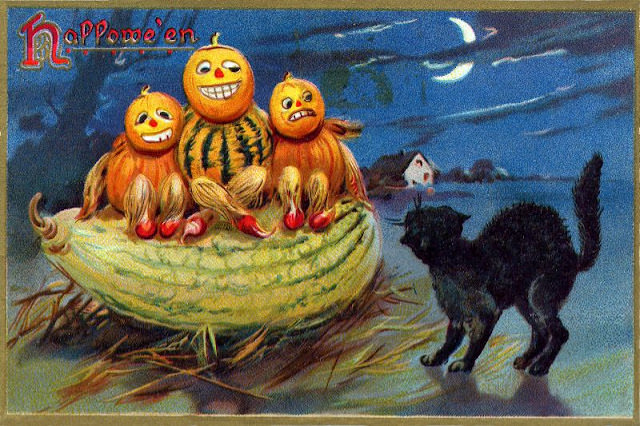
#16 Hallowe’en
Bright autumn color and playful mischief set the tone on this “Hallowe’en” cover art, where grinning jack-o’-lantern heads sit atop cob-like bodies in a whimsical harvest masquerade. The oversized melon cradle beneath them reads like a makeshift stage, complete with scattered husks and little red shoes that add a comic, storybook charm. Even the hand-lettered…