Category: Cover Art
Dive into a gallery of vintage cover art from books, magazines, and albums. Discover how graphic design and illustration reflected the moods of their times.
These covers capture the essence of cultural evolution — from bold propaganda to elegant minimalism.
-

#24 Donna Summer, November 1979
Striking and glamorous, the November 1979 cover of *Black Stars* places Donna Summer front and center, her over-the-shoulder pose and flowing hair framed against a deep blue backdrop. Bold yellow typography announces her name across the bottom alongside the tagline “The Diva of Disco,” underscoring the era when Summer’s voice and style helped define late-1970s…
-
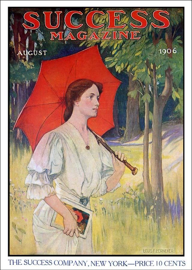
#14 Success magazine, August 1906
Bold lettering at the top announces **SUCCESS MAGAZINE**, framing a richly colored cover dated **August 1906**. A young woman in a pale dress walks through a sunlit grove, the scene softened by greens and golds that suggest late-summer warmth. The brilliant red parasol behind her head turns the whole composition into a striking poster-like silhouette,…
-
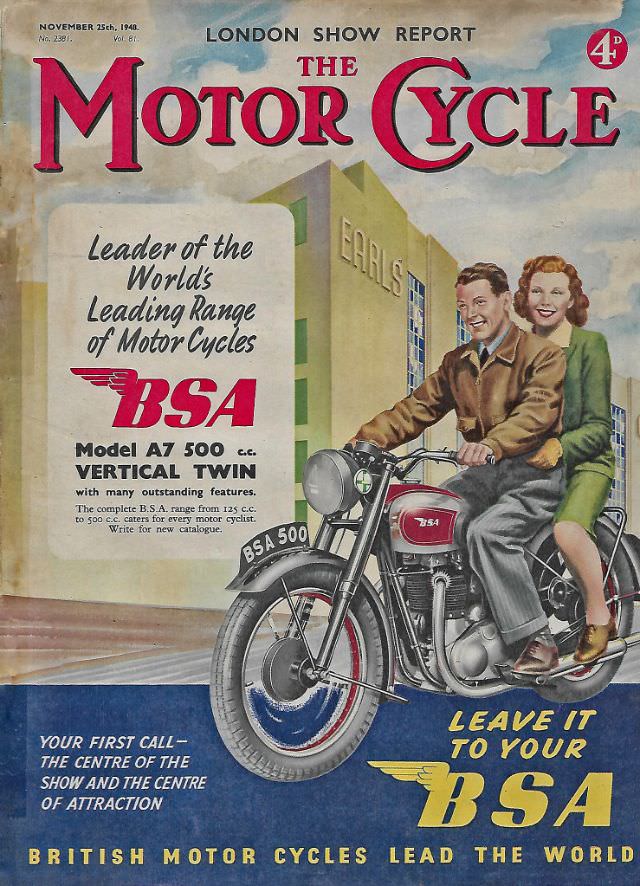
#4 The Motor Cycle magazine, November 25, 1948
Bold typography and confident illustration set the tone on the November 25, 1948 cover of The Motor Cycle magazine, carrying a “London Show Report” banner that immediately places it in the postwar world of exhibitions and new-model excitement. The familiar red title lettering dominates the sky, while a prominent “4d” price mark and issue details…
-
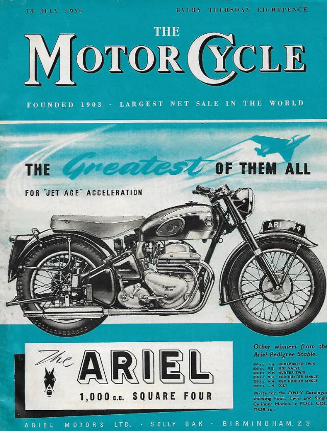
#20 The Motor Cycle magazine, July 14, 1955
Bold teal framing and confident typography set the tone on the July 14, 1955 cover of *The Motor Cycle*, a weekly that proudly bills itself as “founded 1903” and “largest net sale in the world.” Even the cover line—“Every Thursday Eightpence”—anchors the magazine in everyday mid-century routine, when enthusiasts could pick up the latest issue…
-
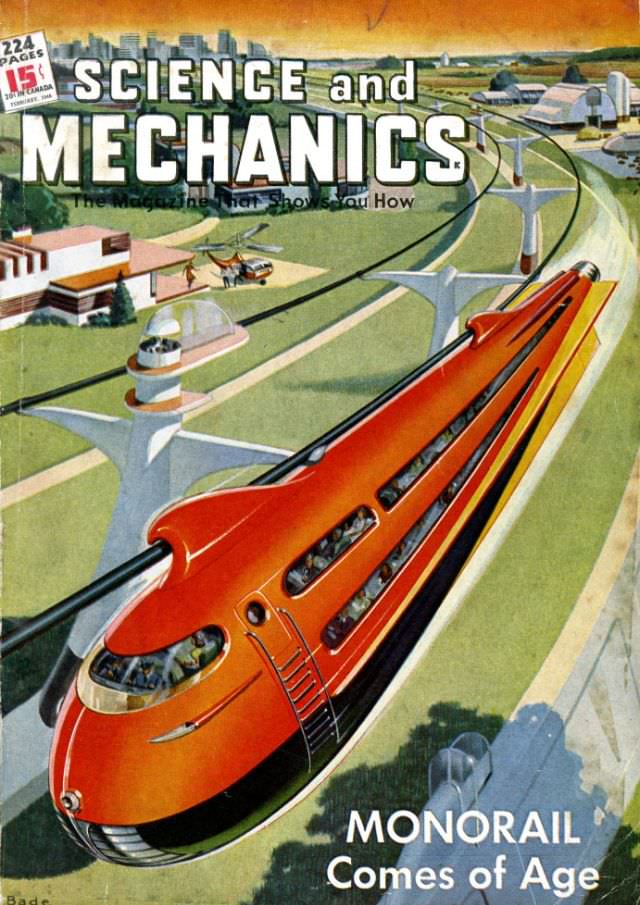
#1 Popular Mechanics magazine cover, February 1946
Bold, futuristic lettering crowns the February 1946 cover of Popular Mechanics, and beneath it a streamlined red monorail rockets along an elevated guideway. The artist leans into speed and modernity: wide windows reveal passengers inside, the nose is shaped like a projectile, and the track curves past a cleanly planned landscape. Even the tagline—“the magazine…
-
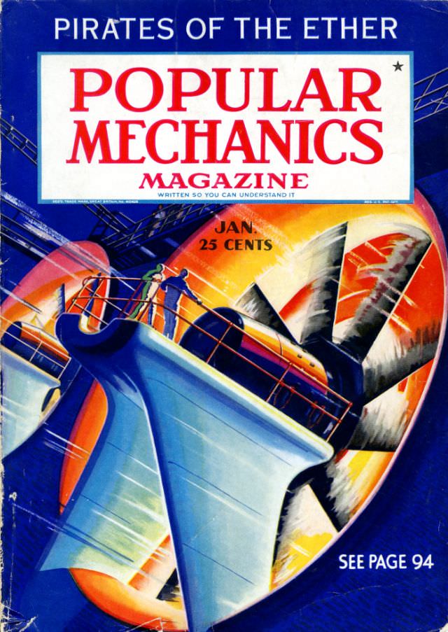
#17 Popular Mechanics magazine cover, January 1936
Bold typography crowns the January 1936 cover of Popular Mechanics magazine, framed by the teaser “Pirates of the Ether” and the familiar promise that it is “written so you can understand it.” The price—25 cents—sits like a small time capsule beside the month, instantly placing the issue in an era when practical science and modern…
-
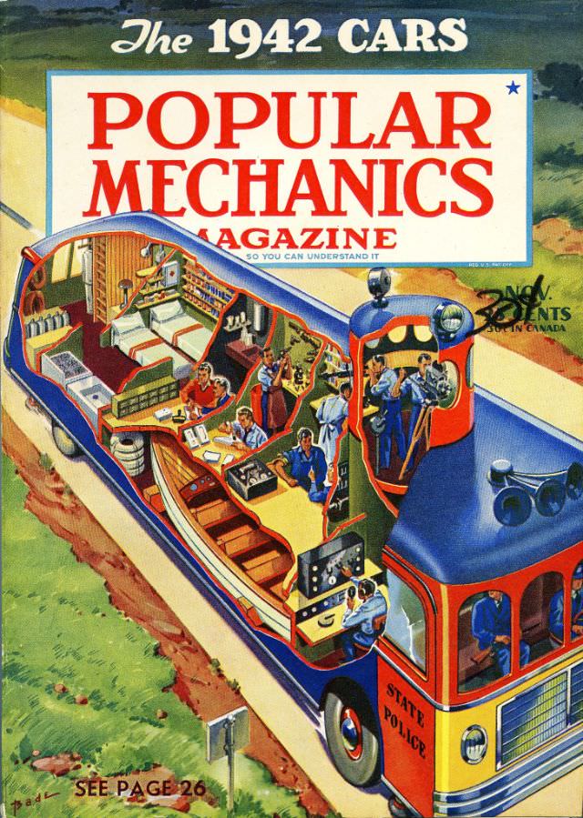
#33 Popular Mechanics magazine cover, November 1941
Bold color and confident lettering announce “Popular Mechanics Magazine” beneath the banner “The 1942 Cars,” setting an upbeat, forward-looking tone even with a November 1941 cover date. The artwork feels like a promise of what modern engineering could deliver next, with streamlined design cues and a clean, optimistic layout that draws the eye from the…
-
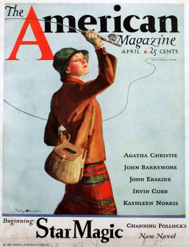
#9 The American Magazine cover, April 1933
April 1933 arrives in bold color on the cover of *The American Magazine*, where a stylish figure in a cloche hat pauses mid-step to lift a slender, trumpet-like instrument toward the sky. A looping line curls behind them like a drawn melody, turning the pale background into a stage for motion and sound. The oversized…
-
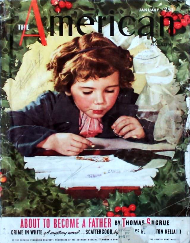
#25 The American Magazine cover, January 1938
January 1938 arrives in full color on the cover of *The American Magazine*, where a child with tousled hair leans close over a tabletop, utterly absorbed. Small hands hover near a sheet of paper as if writing or drawing, while a dark bird rests nearby, turning the quiet moment into a gentle scene of curiosity…
-
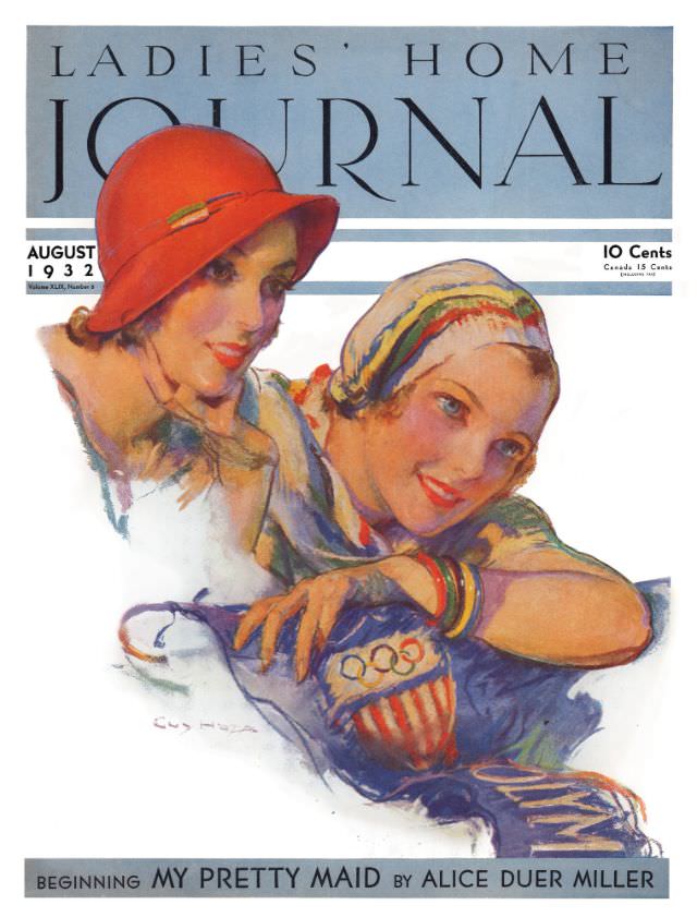
#3 Ladies’ Home Journal, August 1932
Bold masthead lettering and soft, painterly color set the tone on the Ladies’ Home Journal, August 1932 cover, where two stylish women lean close in an intimate, friendly pose. One wears a vivid red cloche-style hat while the other is wrapped in a patterned headscarf, and both are rendered with the kind of glossy, magazine-illustration…