Category: Cover Art
Dive into a gallery of vintage cover art from books, magazines, and albums. Discover how graphic design and illustration reflected the moods of their times.
These covers capture the essence of cultural evolution — from bold propaganda to elegant minimalism.
-

#11 A Blast from the Past: Exploring the World of Vintage Teen Magazine Covers #11 Cover Art
Glossy teen magazines once served as handheld mood boards, and this Teen cover leans fully into that promise with bold typography, breathless cover lines, and a close-up portrait designed to stop readers at the newsstand. The banner touts a “Swingin’ Entertainment Issue,” while the subtitle frames the publication as “Young America’s Beauty-Fashion & Entertainment Magazine,”…
-

#16 The Canadian architect – January 1966
Bold, inky shapes and scraped textures dominate the cover of *The Canadian Architect – January 1966*, turning the page into a study of light, shadow, and surface. The title sits quietly at the top right while the rest of the composition feels almost architectural in itself—blocks, voids, and roughened planes arranged like a façade seen…
-

#5 So Bad, They’re Good: Vintage Album Covers That Will Make You Laugh #5 Cover Art
Svetlana Gruebbresolvik stares straight past the viewer, recorder lifted to her mouth, as if she’s about to begin a solemn recital in a room that looks more like a practice space than a stage. A metal music stand with sheet music sits to the left, while a bulky piece of audio gear or turntable setup…
-

#21 So Bad, They’re Good: Vintage Album Covers That Will Make You Laugh #21 Cover Art
A lurid burst of red lettering crowns the scene as two men tussle in a patch of bright green brush, frozen mid-motion like a pulp paperback brought to life. One figure looms in a tight white long-sleeve shirt, fist raised and face twisted into a theatrical snarl, while the other lies pinned below, looking up…
-
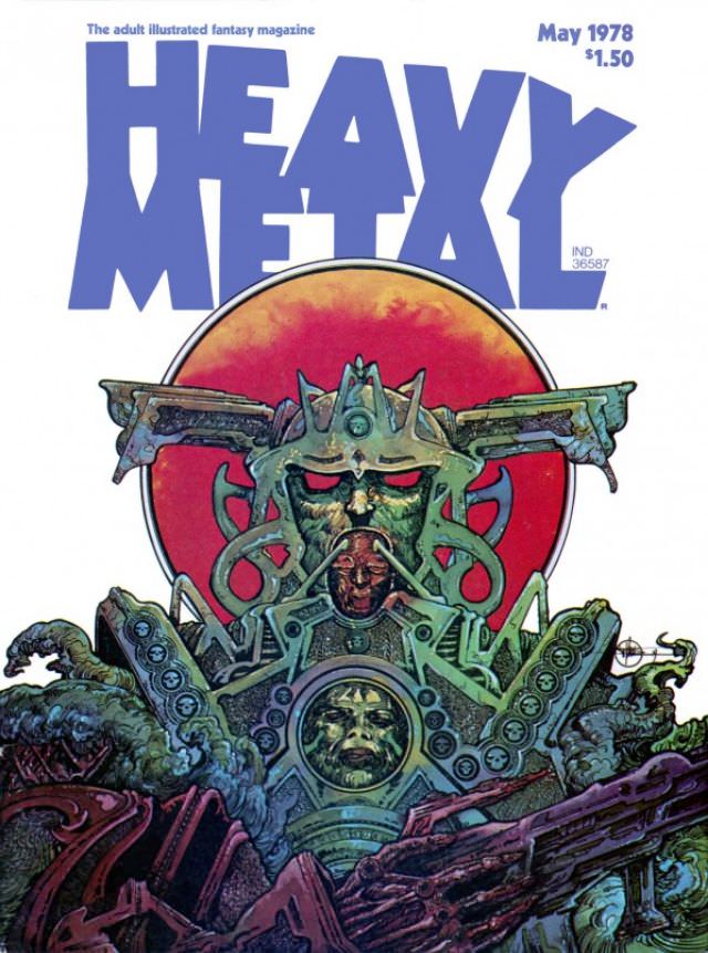
#12 Heavy Metal Magazine Covers: A 1970s Blast of Sci-Fi and Fantasy #12 Cover Art
Bold block letters spelling “HEAVY METAL” dominate the top of the cover, immediately setting a loud, oversized tone that feels inseparable from late-1970s pop culture. In the corner, “May 1978” and the $1.50 price anchor the piece in its moment, when illustrated fantasy magazines were treated like portals rather than mere periodicals. Even the small…
-
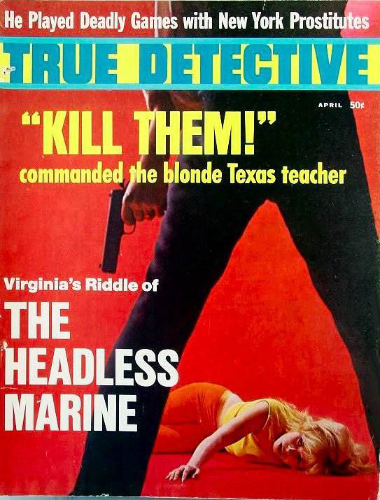
#3 The A-Frame’s Influence: How This Iconic Pose Continues to Shape Modern Fashion, Art, and Movie Posters #3
Bold pulp typography and a shock-red backdrop collide on this True Detective cover, where the composition is driven by a commanding “A-frame” stance in the foreground. The cropped figure’s legs form a hard triangular gateway, pulling the eye down to the prone blonde figure and amplifying the sense of danger without needing to show a…
-

#19 The A-Frame’s Influence: How This Iconic Pose Continues to Shape Modern Fashion, Art, and Movie Posters #19
A bold Spanish-language cover shouts “ARANDÚ” with the subtitle “EL PRÍNCIPE DE LA SELVA,” pairing pulp adventure energy with a stage-like composition that instantly draws the eye. Dominating the foreground, a looming figure plants their legs wide in a rigid, triangular stance while the scene beneath them—lush greens, dramatic gestures, and a startled central character—plays…
-
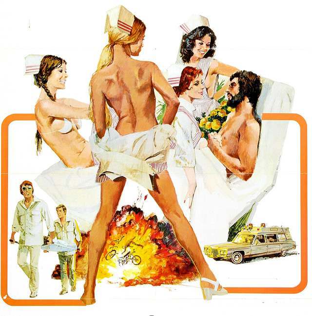
#12 Candy Stripe Nurses (1974)
Painted like bold 1970s cover art, “Candy Stripe Nurses (1974)” leans into the era’s pulp sensibility with bright whites, warm skin tones, and the unmistakable candy-striped uniform accents. The composition is staged for maximum drama: nurses clustered around a reclining man in a hospital bed, smiles and gestures playing up a mix of care, flirtation,…
-

#11 The Psychological Appeal of Women Running from Houses on Gothic Romance Covers #11 Cover Art
Mid‑century gothic romance cover art thrives on motion and menace, and the pairing here makes that formula unmistakable: a woman in a vivid purple dress/coat set against looming architecture, wind-tossed hair, and a sky that feels charged with threat. On the left, “Shadow Over Grove House” (Mary Linn Roby) frames its heroine in an anxious…
-

#27 The Psychological Appeal of Women Running from Houses on Gothic Romance Covers #27 Cover Art
Two classic gothic romance covers face each other here, each built around the same irresistible jolt: a solitary woman, dressed for a ball or a dream, caught outdoors with a looming house behind her. On the left, the palette burns with murky reds and browns as a bright gown and pale wrap flare against gravestones…