Category: Cover Art
Dive into a gallery of vintage cover art from books, magazines, and albums. Discover how graphic design and illustration reflected the moods of their times.
These covers capture the essence of cultural evolution — from bold propaganda to elegant minimalism.
-
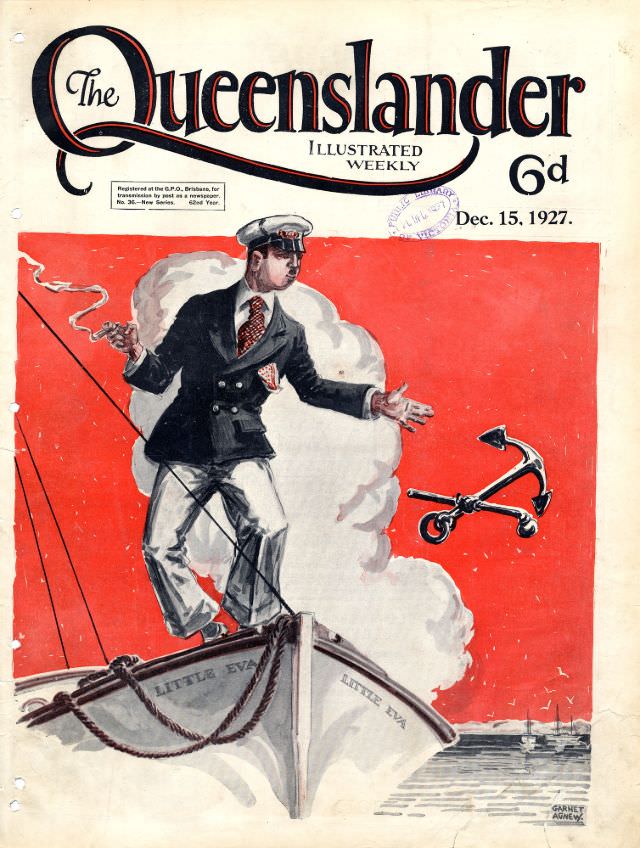
#4 Illustrated front cover from The Queenslander, December 15, 1927
Bold lettering crowns this illustrated front cover of *The Queenslander* (Illustrated Weekly), priced at 6d and dated December 15, 1927, complete with the small formal notices and a faint stamp that hint at the magazine’s journey through hands and institutions. The graphic design feels deliberately theatrical: sweeping typography, generous white space, and a vivid red…
-
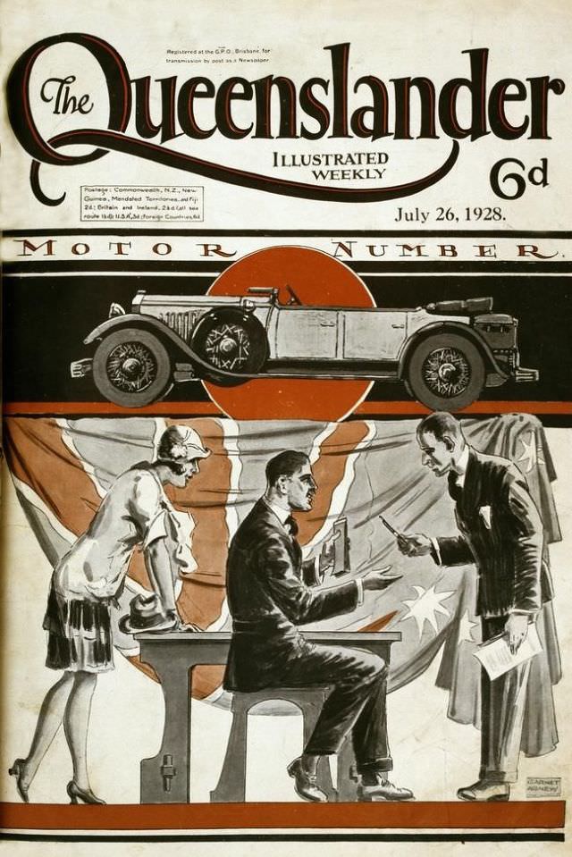
#20 Illustrated front cover from The Queenslander, 26 July 1928
Bold typography crowns the masthead of *The Queenslander Illustrated Weekly*, priced at 6d and dated July 26, 1928, setting an immediate tone of modern confidence. The design balances sweeping letterforms with crisp layout, the kind of cover meant to catch the eye on a newsstand and signal that this was a magazine attuned to contemporary…
-
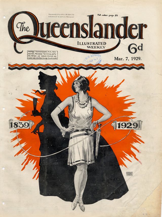
#36 Illustrated front cover from The Queenslander, March 7, 1929
Bold typography and confident colour announce this issue of *The Queenslander* as an “Illustrated Weekly,” priced at 6d and dated March 7, 1929. The sweeping masthead dominates the top of the page, while a bright burst of orange-red behind the central figure creates instant drama against the cream background. Even before reading a word, the…
-

#12 Sensual Cover Photos of Radio Control Modeler Magazines that featured beautiful women from the 1970s and 1980s
Bold, candy-colored lettering crowns a classic **Radio Control Modeler** cover, while a smiling model poses with a large radio-controlled airplane finished in bright yellow with dark accents. The studio setup leans into a playful illusion—billowy “clouds” at her feet and a painted sky behind—making the aircraft look ready to leap into open air. On the…
-

#28 Sensual Cover Photos of Radio Control Modeler Magazines that featured beautiful women from the 1970s and 1980s
Bold block lettering across the top announces RC Modeler, with the cover line calling it “the world’s leading magazine for radio control enthusiasts,” and a small date and price printed nearby. Beneath that masthead, a smiling woman poses outdoors beside a large model aircraft finished in striking red, white, and blue panels, the wings stretched…
-
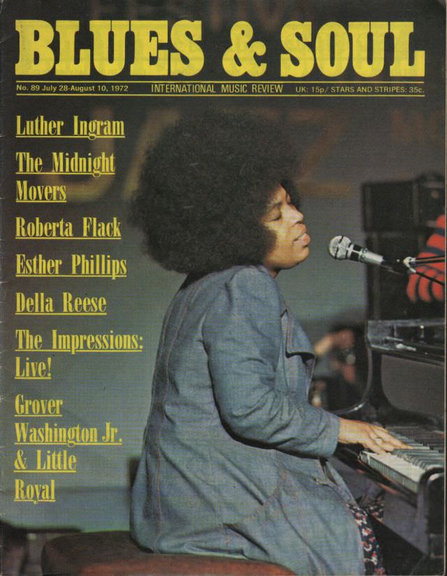
#14 Roberta Flack, July 28-August 10, 1972
Golden block letters spelling “BLUES & SOUL” crown this striking cover, an “International Music Review” issue dated July 28–August 10, 1972. Along the left margin, a roster of featured artists—Luther Ingram, The Midnight Movers, Roberta Flack, Esther Phillips, Della Reese, The Impressions (Live!), and Grover Washington Jr. & Little Royal—signals a moment when soul, blues,…
-
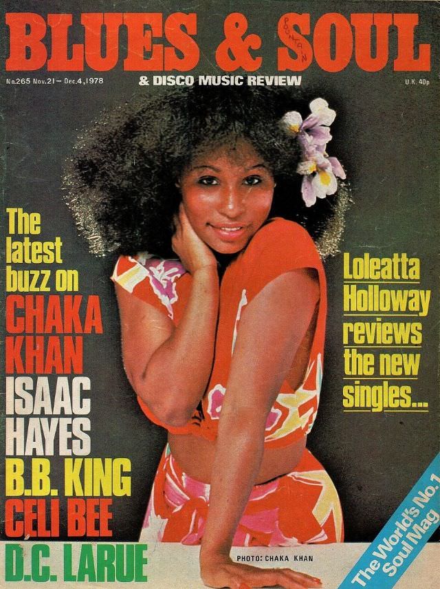
#30 Chaka Khan, November 21-December 4, 1978
Front and center on the cover of *Blues & Soul & Disco Music Review*, Chaka Khan is styled in vivid late-1970s color—bold patterned fabric, a warm smile, and a dramatic halo of natural hair accented with a flower. The masthead and bright block lettering frame her as the headline attraction, with the issue dated November…
-
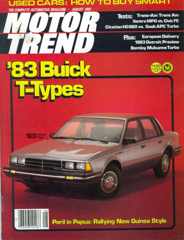
#9 Motor Trend, August 1982
Bold, high-contrast design and oversized typography make the August 1982 issue of Motor Trend feel like a time capsule from the early Reagan-era car market. The cover leans hard into practical optimism—“USED CARS: HOW TO BUY SMART”—framing the magazine as both a buyer’s guide and a performance authority at a moment when shoppers were weighing…
-
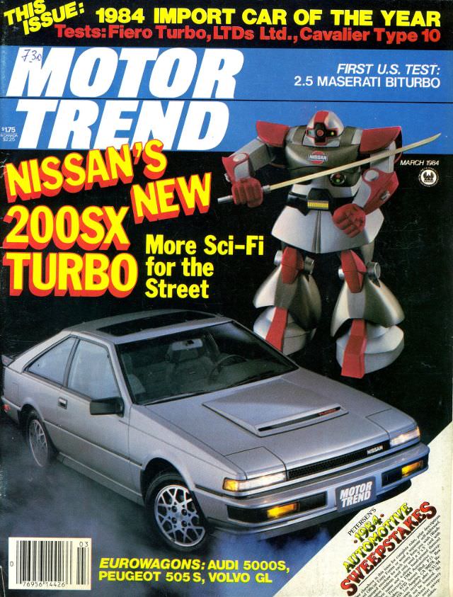
#25 Motor Trend, March 1984
March 1984 arrives in loud, confident typography as Motor Trend leans into the era’s twin obsessions: turbocharged performance and futuristic style. The cover spotlights Nissan’s 200SX Turbo in silver, framed like a hero car and sold with the promise of “More Sci‑Fi for the Street,” a perfect snapshot of early-1980s automotive marketing.
-
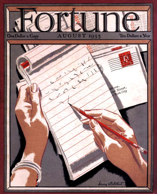
#14 Cover of Fortune Magazine, August 1935
Fortune’s August 1935 cover turns a quiet act—writing a letter—into a sharp emblem of modern business life. Two hands frame the scene: one steadies a ruled notepad while the other guides a red pencil across neat lines, suggesting decisions being drafted in real time. The composition is intimate and deliberate, drawing the eye from the…