Category: Cover Art
Dive into a gallery of vintage cover art from books, magazines, and albums. Discover how graphic design and illustration reflected the moods of their times.
These covers capture the essence of cultural evolution — from bold propaganda to elegant minimalism.
-

#3 Chemin de Fer d’Orléans, Excursions en Auvergne, 1894
Bold lettering sweeps across the poster—“Excursions en Auvergne”—as the Chemin de Fer d’Orléans sells the romance of rail travel with a painterly panorama of central France. A winding valley, clustered rooftops, and distant peaks set the scene, while the design’s saturated reds and greens give the advertisement the irresistible energy of late‑19th‑century tourism. The title…
-

#19 Chemins de fer P.L.M., Le Mont Blanc, circa 1890s
Bold lettering announces “Chemins de fer P.L.M.” and “Le Mont Blanc,” framing the Alps as both destination and dream in this circa-1890s railway poster. Snow-bright peaks rise under sweeping clouds, while warmer tones wash the lower slopes, guiding the eye from rugged rock to a gentler valley below. The composition balances grandeur with approachability—an invitation…
-

#3 Cavalcade magazine cover, June 1951
CAVALCADE shouts from the top of the page in bold block lettering, setting a confident tone for this June 1951 magazine cover. Below it, a sunbathing woman reclines across warm sand in a yellow two-piece, her windswept hair and relaxed pose selling a mid-century fantasy of leisure and summer escape. The color palette leans into…
-
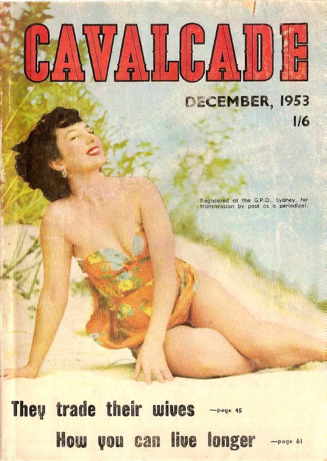
#19 Cavalcade magazine cover, December 1953
Bold red lettering announces CAVALCADE across the top, with “December, 1953” and the price “1/6” printed to the right, instantly placing the cover in the mid-century magazine rack. A smiling model reclines in a patterned strapless swimsuit against a soft, beach-like backdrop of pale sand and leafy greens, rendered in warm, slightly painterly tones typical…
-
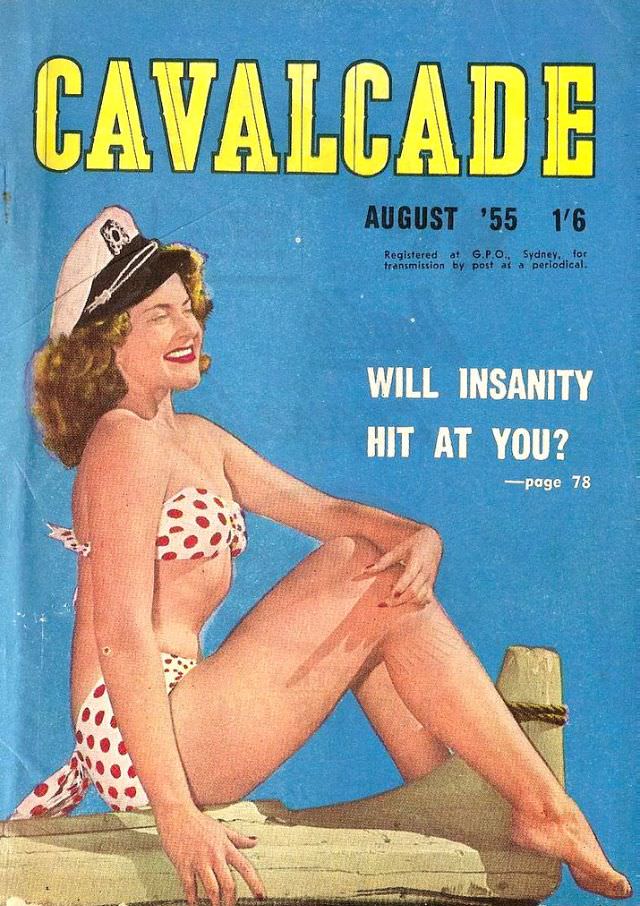
#35 Cavalcade magazine cover, August 1955
Bold yellow lettering announces “CAVALCADE” across a sea-blue field, immediately setting the punchy, high-contrast tone typical of mid-century magazine design. Beneath the masthead sits the issue line “AUGUST ’55” and the price “1/6,” along with small print noting registration at the G.P.O., Sydney—details that anchor this cover in its period without needing any extra context.…
-
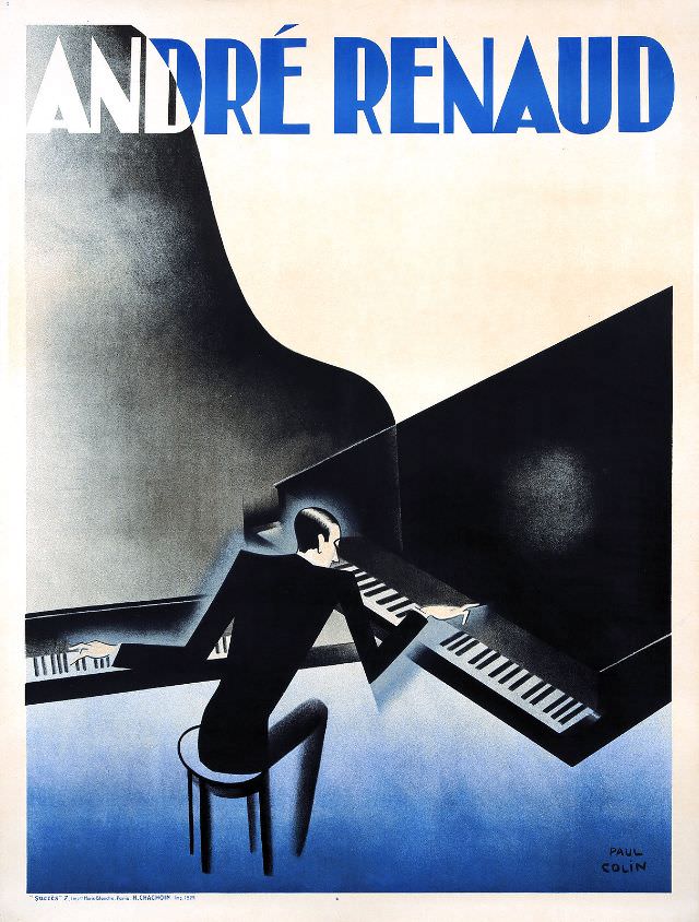
#11 André Renaud, 1929
Bold, modern lettering spells out “ANDRÉ RENAUD” across the top, immediately framing this 1929 cover art as a product of its moment—when graphic design embraced clarity, speed, and a confident sense of style. The palette leans into cool blues and deep blacks, with soft gradients that feel almost smoky, giving the composition a theatrical hush.…
-
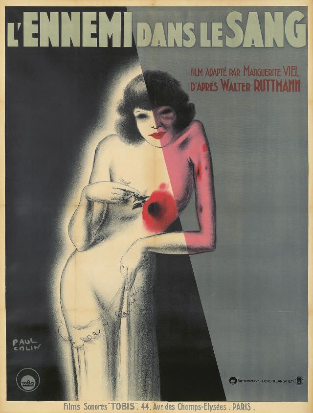
#27 L’Ennemi dans le Sang, 1931
Bold lettering crowns the design—“L’Ennemi dans le Sang”—and immediately sets a mood of menace and intimacy, the kind of promise that made early-1930s film advertising impossible to ignore. The cover art leans into drama with a stylized, theatrical figure rendered in smooth gradients and sharp contrasts, guiding the eye from the title down into the…
-
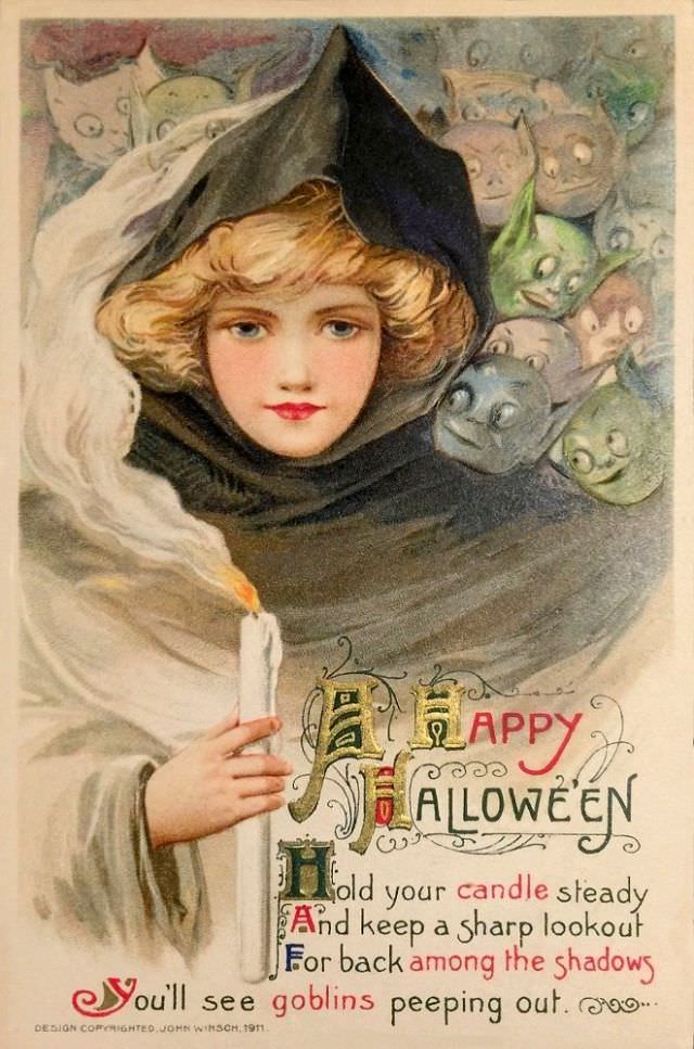
#3 A Happy Halloween
A cloaked figure with rosy cheeks and bright eyes steps forward in this richly colored Halloween cover art, holding a tall white candle whose flame glows against the dark hood. Soft curls frame the face, and the draped fabric suggests a costume that’s more storybook than frightening, inviting viewers into a playful, old-fashioned October mood.…
-
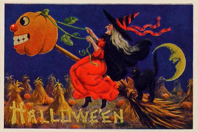
#19 Hallowe’en
A riot of autumn color and mischief opens this “Hallowe’en” cover art, where a wild-eyed jack-o’-lantern with a bulbous nose rides at the end of a vine like a living lantern on a stick. The pumpkin’s exaggerated grin and cartoonish features lean into the playful side of Halloween imagery, more prank than terror, while the…
-
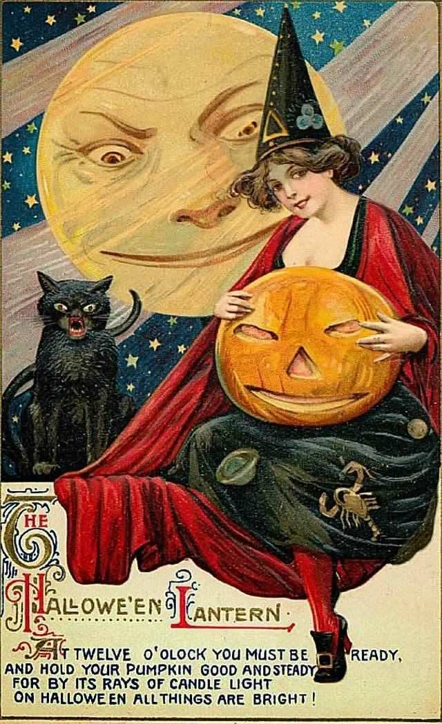
#35 The Halloween Lantern
Under a star-sprinkled sky, a knowing full moon leans in like an amused spectator, its expressive face setting a playful, slightly eerie mood. In the foreground, a costumed young woman in a pointed cap and flowing red wrap cradles a carved pumpkin lantern, the grinning jack-o’-lantern echoing the moon’s mischievous smile. A bristling black cat…